Twenty Design Styles Of Bird Logos For Startup Inspiration
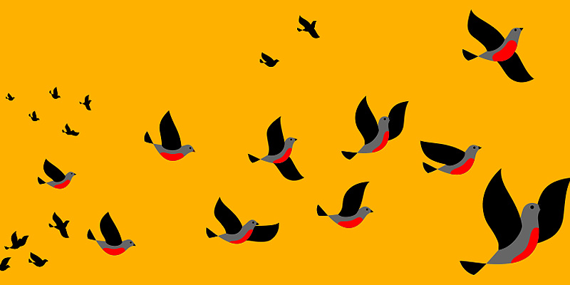
Feature Image Source: Freepik.com
Is your startup ready to fly free?
Not if you don’t have a logo!
Your business logo is an important and integral part of your overall brand. It’s often the first introduction that a potential customer has to your company. And a lot of the time, a memorable, appealing logo can make the difference between a customer that opts to move forward with your company, and a consumer that goes to a competitor instead.
So why are we addressing bird logos, specifically?
The Appeal Of Flying Free
Logos are designed a certain way for a reason. They can evoke a particular reaction, stimulate a certain mood, or draw a connecting line with previous associations.
When looking for an evocative logo, a bird design is a great way to hit all the high points.
Birds are often associated with youth, good weather such as in the spring, growth, nature, and freedom. They’re easy to dress up or down. Whether you’re looking for something realistic or something more stylized, bird logos are very adaptable.
But they also lend themselves well to simplicity. And, as designer Lindon Leader said, great design is born of “simplicity and clarity.”
On the whole, birds just tend to make for an attractive design that is appealing across the board.
And while it’s true that some bird logos do kind of look generic, it’s not actually all that hard to take a bird-based logo and make it your own.
In these ZillionDesigns contest entries we’ve collected to illustrate twenty different design styles, a wide range of bird design is covered. So take your time, take a look, and see if you can find your own inspiration for your startup business in these high-flying logo ideas.
Monogram Logo
Image Source: ZillionDesigns
Monogram or lettermark logos are basically what they sound like. They’re based around a letter or a few letters of your company name. Often, the font itself is what defines the logo.
But the bird motif can also be incorporated within the monogram or lettermark, as seen above. This can be done either by using an adapted form of an existing typeface, or by creating your own bespoke type for your startup.
Breaking Out Of The Background
Image Source: ZillionDesigns
Background shapes are a great way to contain and define your logo, but they don’t have to be the rule. This logo above stretches the main elements of the logo beyond the confines of the background, reducing the shape behind to a definition point rather than a cage.
Contained In The Background
Image Source: ZillionDesigns
On the other hand, the shape can provide a bold outline, clearly defining your logo’s beginning and end. This is a little more traditional, with the logo remaining contained within the circular shape.
Location Based Logo
![]()
Image Source: ZillionDesigns
Some businesses are truly inspired by their physical location, and this business is no exception. A unique concern that specializes in edible bird nests, the company is also based in San Francisco, and draws on that for part of the logo appeal.
Fadeout Single Color
Image Source: ZillionDesigns
This simple graphic style is highlighted by a mid-graphic fade in the color.
While it doesn’t introduce the slightly more complicated effect of a more diverse color palette, the color fade still gives the logo a more polished, interesting look. This design choice may be more effective for certain niche markets, such as vintage shops, as it gives the logo a “lived in” look.
Flat Single Color
![]()
Image Source: Toucan Bird Logo by LogoDesign.net
On the other hand, this simple graphic uses only white, black, and a single tone of red to make the white space really pop.
This basic style is very reminiscent of the Twitter logo, with a simplicity that is easy to replicate and remember.
Simple, Quirky Line Drawing
Image Source: ZillionDesigns
Out of all of the examples, we think this is our favorite.
A simple shape without too much detail, it manages to pack in a lot of quirk and charm, highlighting what we love about bird logos while still being something out of the ordinary.
Stamp Logo
![]()
Image Source: ZillionDesigns
This logo looks like the bird graphic was stamped beside the business name. It’s a design decision that is both basic and charming, further influenced by an imperfect silhouette.
We also like that the “flaw” in the bird is echoed in the typeface choice.
Reflective
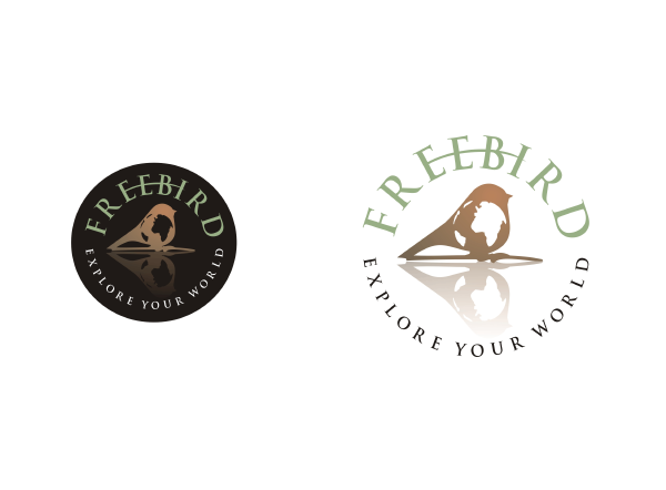
Image Source: ZillionDesigns
This basic combination of two graphic elements (the bird with a globe inside the silhouette) packs more of a punch for being reflected within the logo, as though in a shiny surface.
Reflective logos are often effective for corporate logos, which may rely on a polished effect that isn’t completely flat in order to send a message of professionalism.
Cutesy
Image Source: ZillionDesigns
A cutesy logo definitely isn’t for everyone. But depending on the nature of your business, such as an Etsy shop, it could be the perfect choice.
Cute logos are also easy to adapt, lending themselves to the addition of extra design elements like spirals, dots, curlicues, and different textures.
“Audubon”style
Image Source: ZillionDesigns
A deceptively simple graphic with a realistic style, this bird looks almost like a photorealistic logo until you look a little closer. The look is very reminiscent of James Audubon’s drawings.
It’s easy to go overboard with stylization when it comes to an easily recognized shape like a bird, so going back to the basics is always an interesting choice.
Watercolor Effects
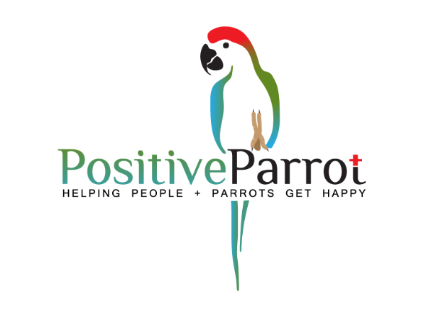
Image Source: ZillionDesigns
The psychology of color is a big part of choosing an effective logo, and opting for a watercolor effect can be overwhelming if it isn’t used carefully. Many top logos are created with only one or two colors.
But this parrot logo using a rainbow of colors is doing it right. It’s entirely appropriate for the theme and message of the logo, and the colorfulness of the overall presentation reflects the free spirit of the bird graphic.
Patterned
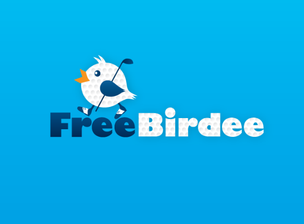
Image Source: ZillionDesigns
This logo for a golf course chooses to reflect both the name (with the bird graphic) and the theme, using a “golf ball” pattern fill for both the bird and part of the typeface.
Though this is a pretty specific logo design idea, it isn’t difficult to imagine the range of options that could work as pattern fills, depending on your market.
Character Or Mascot
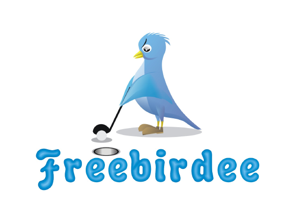
Image Source: ZillionDesigns
It isn’t unusual for a company to have an animal mascot, and this creation is kind of a fun take on the whole idea. The look of concentration on this bird’s face is fairly reflective of how all of us look when we go golfing.
Ultra-simple
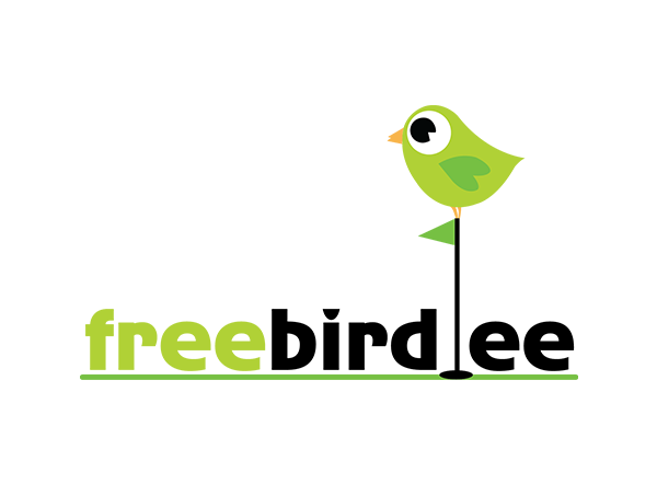
Image Source: ZillionDesigns
The bird in this logo has a grand total of six elements from beak to feet, and it uses only four colors in total. As a logo design idea, it’s a smart decision, as these super simple logo types can easily be made larger and smaller or rendered in grayscale or black and white without losing their definition.
In-line With The Text
Image Source: ZillionDesigns
Logos often use the name of the company as an integral part of the logo, and this one features the silhouette of the bird in the same line with the typeface, tying the two together.
This wouldn’t work very well for a more complex graphic choice, as it could be distracting from the message of the text. But as it is it’s very effective.
Classic Or Vintage
![]()
Image Source: ZillionDesigns
Using a classic style inspired by the sport team logo mascots, this logo definitely takes us back — in a good way.
Classic and vintage styles apparently know no season, seeing resurgences in popularity over and over. They’re basically always a good choice, if they fit well with the personality of your startup.
Super Stylized
Image Source: ZillionDesigns
A very different take on a traditional bird silhouette, this twisted two-shape may not say “bird” at first glance.
But on the whole this stylized bird logo still evokes the same emotions as many of the others on this list.
Silhouette
Image Source: ZillionDesigns
Silhouettes are another very traditional direction for a logo to take. This white-space silhouette makes itself part of the typeface.
The white space or negative space in a logo is just as vital as the “active” elements. A poor use of negative space can make the whole thing seem crowded. But making that negative space work for you as an integral part of the design gives your logo plenty of room to breathe.
A few other ideas on this list have also included silhouettes, as they are an easy choice for an effective logo. But it’s always best to try to mix it up a little, rather than opting for a silhouette that could easily be mistaken for a generic shape. Combining a silhouette with another element is a good way to skip that possibility.
Black And White
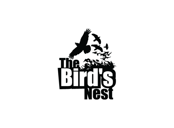
Image Source: ZillionDesigns
Black and white logos are popular choices for a lot of types of startup companies. They have an inherent chic sleekness, evoking a classiness and dignity that pairs well with the bird graphic style.
Bird Logos Of A Feather Flock Together
Birds are a very popular choice for logo designers, given the positive associations and the variety of markets in which they can be used.
As perennial favorites, at times the logo market looks overstocked with bird-inspired design.
But, as the twenty examples above prove, there are plenty of styles to work with in designing a bird logo. So think outside the birdcage, and let your design instincts fly free!

