10 Best Examples of Successful Logo Redesigns in the Face of Digital Darwinism
Featured Image: iStock/Rudzhan Nagiev
A company’s logo design and brand identity play a critical role in its growth and success — and these two concepts are closely related. The logo assists in building brand identity, which builds consumer trust and awareness, resulting in increased sales.
Your logo must create an impact on the consumers. If you notice that your current logo is not having much impact on your consumers, then try something new to match current trends. You are not the only one who is going to do this, many reputable brands have done this in the past, and it has proven to be quite successful too.
Today, we will take a look at 10 examples of successful logo redesigns that have helped companies stay competitive in the market. These redesigns modernized the brands and helped them stand out in a crowded marketplace. So without further ado let’s take a look at these logo redesigns.
10 Successful Logo Redesigns For Inspiration
These ten big companies have successfully rebranded themselves to stay ahead of the curve.
1. Google

Image Source: underconsideration.com
Let’s start with some of the successful logo redesigns of major companies. There are several to mention, but we will talk about Google here, which changed its logo design coloring in 2015.
Since Google has a wordmark logo and such logos, have no additional design elements, adding fonts is the easiest and safest way to redesign them.
Google’s design team was aware of this, which is why they converted the Catull typeface to the flat sans-serif typeface. Doing so gave the logo a lighter, more modern appearance.
Comparing the new logo with the previous one, you will notice that Google removed the shading on its primary colors and made them brighter. This has helped in enhancing the overall aesthetics of the design.
Using minimalist aesthetics is a great way to catch consumers’ attention, such as this example demonstrating that subtle changes can have a significant impact. Following Google’s approach, it is evident that subtlety is crucial.
The new logo also made the branding simpler for Google. The letter ‘G’ you might notice in the new design is easily recognizable for marketing and branding purposes.
2. Instagram
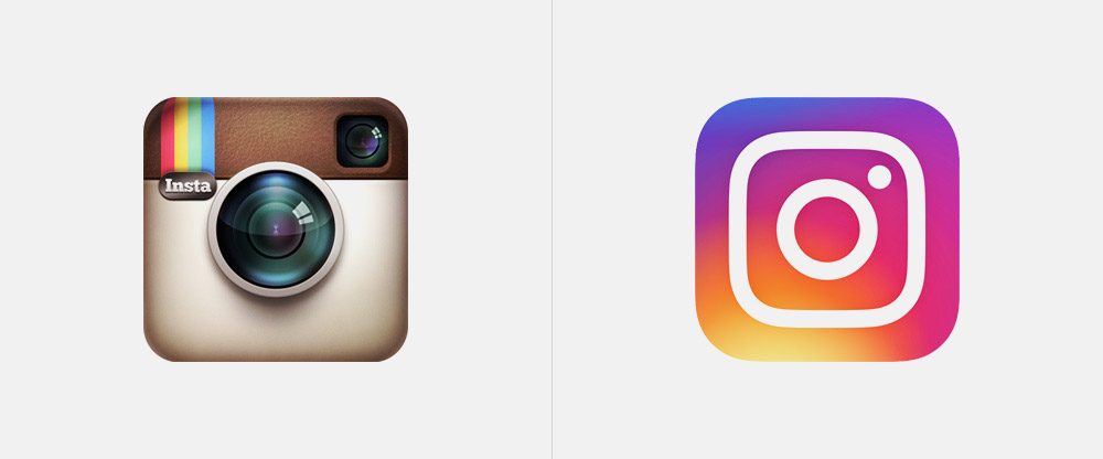
Image Source: underconsideration.com

Image Source: underconsideration.com
Instagram is one of the most popular and largest social media platforms today. Users can share, view, and interact with all types of images and videos using this application.
However, since Instagram was launched in 2010, it has evolved into a much more sophisticated medium than merely a photo and video-sharing service.
Today, it is a key tool for selling, networking, and creating serious content for individuals and businesses. Many small and big companies market their products and services and engage their audience on this platform.
In light of these changes, Instagram decided on a changeover. Their Polaroid camera logo wasn’t enough to represent their community. The redesigning occurred in 2016.
Instagram redesigned its logo to be flat and minimalist, moving away from its previous 3D appearance. The previous design had separate colors for pink, purple, and yellow, but now it has a vibrant three-color gradient.
Throughout, the overall appearance was youthful, fresh, and vibrant, which suits their largest audience of 25 to 34-year-olds perfectly.
While people have now become accustomed to the new design, it was not always a smooth ride. Initially, the logo redesign was criticized for its tacky appearance. The app received great negative publicity from individuals, news channels, and celebrities, but they were least bothered by the criticism, and the old design is easily forgotten today.
In 2022, the platform announced another minor change in the logo and graphics. The gradients have become brighter and a new font, Instagram Sans, is used for the wordmark.
3. Baskin-Robbins

Image Source: underconsideration.com
Baskin-Robbins recently decided to give its logo a new color scheme in 2022. The new logo gives a retro look and allows the company to connect to its roots.
The new logo features the number “31” in bold pink font, which is a nod to the company’s famous “31 flavors” slogan. Baskin-Robbins has been rebranded using a smoother and crisper style of typeface in place of its quirky previous logo.
Brand logos play a significant role in influencing an audience’s perception of a brand. As a part of Baskin-Robbins’ revitalization effort, the brand is reviving the pink and brown colors used in its first advertising campaign in 1953 in hope of attracting more audience, particularly the older audience who no longer have interest in ice creams.
4. Pfizer

Image Source: underconsideration.com
Pharmaceutical giant Pfizer has unveiled its most significant rebranding in about 70 years in 2021. The change happened amidst the pandemic when the company received huge attention for developing the first vaccine to combat the covid virus.
With their new logo, they have ditched the blue pill shape in favor of a double-helix-inspired design.
Pfizer asserts that the new logo reflects the company’s desire to maintain its legacy while anticipating the future. The word “Pfizer” is written in a familiar font present on the old logo, while the phrase “ribbon helix” represents the future.
The redesign has included everything fundamental to the company, while the new addition of ribbon conveys the company’s future goals and technological advances.
5. eBay
Image Source: 1000logos.net
For years, eBay was the place to go when you wanted to buy second-hand items for a low price, however today it’s not the same case.
The modern version of eBay has evolved into an all-encompassing e-commerce platform that facilitates sales between consumers and businesses. Now, it operates more in the manner of an online shopping platform similar to Amazon.
eBay redesigned its logo in 2012 to remove the jumbled, playful typography and make it organized. The change corresponded with the platform’s more professional approach to its business model and the purpose it now serves to the customers.
Now, it’s not a place where people sell ‘used stuff’ for incredibly low prices but a platform where companies and resellers offer their items directly to customers.
Even though the letters no longer overlap, they still touch, demonstrating eBay’s diverse and connected community. Although eBay has changed its typography, it has kept the same recognizable color palette, which is one of the brand’s most recognized elements.
As a result, keeping this symbol throughout reflects eBay’s rich history while pointing to its dynamic future. This shift toward digital-first platforms mirrors how students today rely on services online — from marketplaces to academic support tools like an online essay writing service such as DoMyEssay when managing heavy workloads.
6. Netflix

Image Source: underconsideration.com
Netflix started as a mail-based renting of DVDs in 1997, but that’s no longer the case today. As time went on people no longer seemed to be interested in buying or renting DVDs. Netflix also decided to adapt to the change and redesign its logo and branding to reflect a change in its business model.
In 2014, Netflix redesigned its logo to feature a more minimalist design. The new logo featured the word “Netflix” in a custom typeface with a small icon. This redesign is intended to show the company’s growing presence in global media and its focus on online streaming rather than selling DVDs.
They also eliminated the colors and background shadows that gave the feeling of an old-style movie house. With the iconic red color that Netflix is known for, they incorporated this into the brand in an easily recognizable and distinctive way.
The new logo was used across all of Netflix’s platforms, including its website, mobile apps, and social media accounts.
7. Zapier

Image Source: underconsideration.com
Recently in July 2022, Zapier, a platform that facilitates application integration, updated its logo and brand for the first time in its ten-year history.
Rather than using the old dull logo of an IT company, Zapier revamped its brand identity and logo to capture the ‘magic and motion’ of its customer base.
In the new logo the typography is done in ‘Regular’ font in black color and the ‘orange’ color is changed to ‘international orange‘ in the form of a small dash.
The international orange color is used in the space suits of astronauts. This change reflects Zapier’s growth over the ten years and its global outreach to millions of users and the endless services it provides. Like space is endless.
Zapier redesign is an excellent example of a tech brand attempting to contribute a greater sense of personality to its brand.
8. Standard Chartered

Image Source: underconsideration.com
A new logo design for Standard Chartered was unveiled in October 2020. The new logo retains, the colors and inspiration of the old logo. The blue and green colors emphasize the bank’s professionalism and reliability around the globe.
The logo has been modified to remove the depth and shading, and text. Even though the design appears modest, it has a significant impact.
The new logo replaces the previous design, which featured a stylized eagle shield and a traditional serif font spelling out the bank’s name. There is a distinct difference in font and all lowercase letters are used for the words ‘Standard Chartered’. The small changes have resulted in an improved and more recognizable logo.
With the new logo, the bank aims to demonstrate its commitment to digital transformation and innovation, as well as its global reach. Additionally, the new design was a part of a broader rebranding effort including a new marketing campaign and visual identity.
9. Airbnb

Image Source: underconsideration.com
Since its launch in 2008, Airbnb has grown into a popular online marketplace where individuals can list their residences for short-term or long-term rent. It has become one of the most popular websites where individuals book an overnight stay.
A core component of the Airbnb brand is ‘belong anywhere’; this new logo exactly illustrates this. The new logo encapsulates people, places, love, and air b ‘n’ b in an attempt to communicate its message.
Even though the old Airbnb logo featured comfortable, padded letters, they could not convey the brand’s message and the level of comfort they provide in their services.
‘Linetos circular’ font is used in the new typography, which is much easier to read and recognize. With the company’s growth, they aim to increase brand awareness to a wider audience, as illustrated by the new logo.
When the logo was launched, it was criticized because some compared it to the paperclip-ish logo of software company ‘Automation Everywhere’. Nevertheless, now people have gotten used to it.
10. Olive Garden

Image Source: underconsideration.com
The Olive Garden, a popular Italian restaurant, recently changed its logo, resulting in a complete redesign of its identity.
Olive Garden initially represented its brand with a wordmark logo incorporated into a Tuscan-inspired environment. The redesign retained elements from the original design while adding a modern touch to it.
Although the original logo had its charms, it gradually became outdated. Olive Garden’s name appears in the thick green font, with a grapevine with grapes in the top corner, representing Italian cuisine. A new logo, however, completely transformed the restaurant’s image and gave it a new identity.
New designs retained the same elements. Rather than a grapevine, the corner now displays olive branches. In the new logo, the letters remain dark olive green to maintain their prominence as they were in the old logo, a striking green.
Despite the change in typography, the concept is unchanged, and a handwritten font is incorporated into both logos.
Redesigns like Olive Garden show that a brand can change its look entirely while retaining the original elements. Tupperware recently announced a complete rebrand, after more than 2 decades. According to research from AtomRadar, it proved to be a hit with more than 70 percent of consumers.
Conclusion
The world of branding and design is constantly evolving. Technological advancements are playing a significant role in shaping the way logos are perceived and received by consumers.
The ten successful logo redesigns discussed in this article demonstrate the importance of adapting to changes in technology and consumer behavior while staying true to a brand’s core values and identity.
These companies have shown that a well-executed redesign can refresh a brand’s image and help it stay relevant and competitive in the digital age.

