8 Simple Tricks to Design Luxury Hotel Logos
Featured Image: Freepik.com/freepik
Logos are a critical part of a hotel’s marketing and branding strategies. Such strategies, if executed after a lot of planning and brainstorming, can significantly impact the business.
Logo creation can be difficult for two reasons: it must grab a viewer’s attention and evoke an emotional and positive reaction. Also, they must be cheerful and eye-catching yet familiar and recognizable simultaneously.
A logo should reflect a brand’s values by using color, font, and design. Having an attractive logo will encourage guests to return to the hotel in the future.
Considering all these factors, how should one design a memorable and eye-catching logo for their business? Well, fret not; we are providing you with seven tips that can assist you in creating a logo that will help your brand stick in the minds of your target audience. So let’s get started.
8 Tricks to Design Your Hotel Logo
The following eight helpful tips will be very beneficial for designing hotel logos depending on the type of hotel to be established.
1. Your Hotel Logo Must Be Versatile
Hotel logos are used in a wide variety of ways. When you check into a hotel, you see their logo on the room service menu, and the Do Not Disturb sign. You may even find it on the soap and the towels.
In a Luxury hotel a logo is used on multiple occasions:
- They are embroidered on employee uniforms and promotional items like hats and umbrellas.
- They are printed on items like towels, soap, shampoo, and room service items (dinnerware, cutlery, etc.)
- They may also appear on local event banners as sponsors.
Whenever you plan to design a logo for a hotel, you must ensure that you can easily be printed on all of these surfaces of all these sizes. All these items are used in luxury hotels to facilitate the guests.
It is essential to run this logo through various tests before finalizing it. Think outside the box: Does the logo look good from both a close-up and from a distance? What does it look like on a cell phone screen if you view it in that way?
It will be advantageous for your hotel to create a logo that is both clear and expressive in many different forms on different items.
Image Source: zilliondesigns.com
2. Get to Know Your Hotel’s Brand.
Creating options that capture the latest trends in the industry is an excellent way for designers to gain an edge over the competition.
The primary purpose of a hotel logo, however, is to convey the hotel’s core values.
Ask yourself a few important questions about your brand.
- What makes your brand unique? How does it differ from others?
- How does your brand cater to its target audience?
- In what way would you like your guests to perceive your brand?
- Are there any particular characteristics or values that you wish to convey?
Logos can be key in attracting the right audience and answering these questions.
When guests interact with your hotel, the logo can convey the overall impression you wish to create. Whatever the feeling, whether built on trust, tradition, innovation, adventure, or enjoyment, it does not matter.
Color, typography, and symbolism all play an important role in conveying the overall message of your logo. (We will talk about color later in the article).
To match your brand messaging, you should determine what style you intend to use. Are you planning to go with a vintage or traditional style? How about something whimsical? Are you looking to add humor or wit to your message? Is a logotype representing the name of your hotel crafted from a suitable font?

Image Source: zilliondesigns.com
3. Use Competitor Logos For Inspiration.
After identifying your brand’s identity and feeling, you need to look at your competitors. Being aware of your direct competition and respected brands will give you an important advantage when designing the logo.
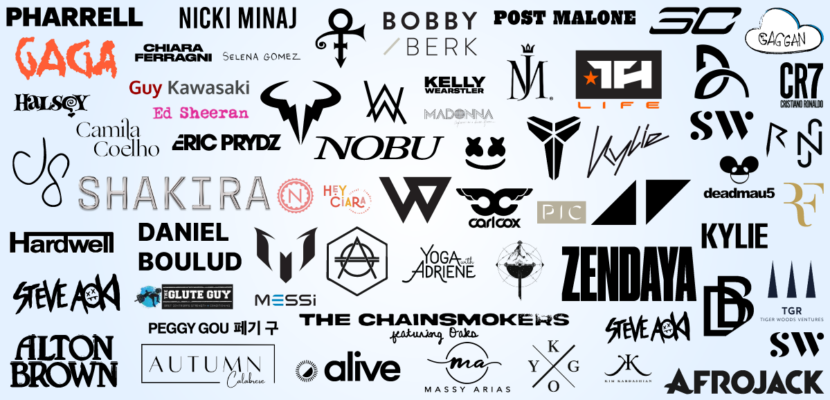
To begin with, you can refer to the competitor’s logos as a source of inspiration and check how versatile their logo is.
You can choose to follow or reject design trends prevalent in your region, industry, and niche. Lastly, ensure your logo exhibits the differences between you and your competition, and avoid using identical images, colours, or design elements.
Image Source: commons.wikimedia
4. Use the Right Font.
You do not need a symbol for logotypes to convey the right message through your logo. Logotypes consist of a single line of text with your brand’s name written in a particular font. In a word, the font conveys all the information it needs to without relying on additional imagery.
A growing number of luxury hotels are adopting this strategy. With their ease of use and versatility, logotypes are an excellent choice in the hospitality industry and an appealing approach in general. It is important to consider your typography carefully if you intend to design a logotype.
Coldiac – Luxury Serif Font is mostly used by luxury brands and hotels businesses. They give a keen feeling of trust, classic styling, and elegance, but they can also appear childish or silly if used incorrectly.
For boutique luxury hotels, handwritten and script fonts may work well, but you should focus on the message’s readability if the customer clearly understands it.
Image Source: zilliondesigns.com
5. Make a Careful Choice of Colors.
The maximum number of colors design experts recommend for an effective logo is three. Any more than that will cause your customer to feel overwhelmed.
Various human emotions are associated with each color on the spectrum, so choose a color scheme that reflects your hotel’s brand. You may promote your hotel as a spa by using green and blue colors, representing health, serenity, and calmness.
Green and blue colors in logos are also suitable for resorts and hotels located near beaches or in forest locations.
Take a look at the following Luxury hotel logos for ideas. The blue logo by Baymont Inn and Suites looks very good for a location on the beach, and the Basecamp Resorts logo looks very appropriate for a location on Hilltop and in mountainous areas where adventure enthusiasts and travellers like to stay.
Choose your color according to the type of audience you intend to reach. In general, black and gray are considered to be a color of class and luxury. In your logo, you might use it as a primary color if you’re targeting fashion industry members.
The Orange color is mostly associated with enjoyment and energy. If your hotel brand is to attract families and children’s then use it in your logo. Take a look at the following examples.
Image Source: zilliondesigns.com
6. Ensure That Your Hotel Logo is Clear and Legible in White and Black.
Occasionally, your logo will not appear exactly as you designed it. Your design must be clear and simple to look professional in both black and white and color.
You can still convey your brand message effectively by using limited media, such as publications, press releases, and magazines.
Several luxury hotels maintain a black-and-white aesthetic at all times. These brands usually intend to express a sense of tradition, elegance, or classic design.
Most of the time, they do not have any symbols associated with them or only have one symbol. With a simpler design, the logo has a sense of elegance that is difficult to achieve when working with complex logos.
For example see the logo of Nunan hotels that looks equally pleasing on black and white backgrounds.
Image Source: zilliondesigns.com
7. Avoid Using Acronyms For New Business
Some of the world’s most well-known Luxury hotel brands use logos that abbreviate their names, such as Cliff house (CF) and Hotel Famulus (HF). Some companies enjoy such widespread recognition that they can further shorten their names by using an acronym of their names.
You can consider a shortened label or an acronym for a logo if the business has an established identity in its marketplace.
Even though simplicity and conciseness are essential characteristics of a successful hotel logo, the audience needs to know the product’s name and what it entails. A logo that is not successful will not be able to convey that to the viewer just by using an acronym.
Image Source: zilliondesigns.com
8. Don’t Use Generic Hotel Logos
Unfortunately, Luxury Hotel Logos designs are characterized by the overuse of several styles, phrases, and designs. Similar images often appear repeatedly in hospitality, where the same images represent travel, tourism, and hotels. It is recommended that you avoid common phrases as much as possible to avoid boring your guests.
It is not always necessary to depict a bed in your hotel logo merely because your guests sleep there. There is no need to depict a large building in your logo, even though the hotel is a large structure.
Stop displaying a plane, globe, or map to depict traveling. Instead of thinking about what these concepts mean to you, consider what they represent to your audience.

Image Source: Freepik.com
Conclusion
Despite how overwhelming it may seem, hiring or being a professional graphic designer is not necessary to create a memorable hotel logo.
Hotel owners or marketing managers on a budget can still achieve professional results without spending much money. These guidelines will help you build a hotel brand attractive to your target audience.
