8 Women-Owned Businesses in San Francisco That Need Rebranding

Featured Image: Flickr/Thomas Hawk
Women entrepreneurs are thriving in the world today as never before. They brave deadly challenges of the corporate world like any other male business owner who wants to succeed in his industry. Their drive, passion, and charisma as a leader are no less than any of their male adversaries. Often a woman’s ability to cope with stressful situations, critical thinking and timely decision-making is underestimated by a lot of people; even by those who are near and dear to them. It is beyond most people’s grasp how a single person can work on and manage multiple roles such as entrepreneur, wife, home-maker, carer as well as keeping up to date with other relations. It is all considered to be a woman’s job – things men have little stamina to do. But women just don’t stop at playing the role of the home-maker. They are now doing amazing things in the outside world, especially, in the world of business.
In the United States, there has been a boom of small businesses since the late 90’s. There are a bunch of small business ideas women can focus their attention on such as fashion, beauty, real-estate or tech. People are learning more and more about the perks of owning a business and excelling in different specialties. Those who think women are left behind are thoroughly mistaken. If anything, they are taking the challenge of breaking into the industry head on, and a careful observation would show us just how accomplished they are. Women are flexible, hard-working, and dynamic leaders, taking care of the world around them with compassion and good will. They cannot be restrained to any particular industry either. From owning designer boutiques to heading architecture firms, playing significant roles in the media as well the tech industry, they are anything but skilled performers.
Now that we understand how much our world is being transformed by women, let us tell you that our article aims at helping a few talented business ladies from San Francisco, whose professional websites and blogs need a revamp in our opinion. It will do them a tremendous amount of good if they considered a make-over for their digital portfolios. Like we elaborated, women are amazing entrepreneurs; things like an outdated web design and weird logo design should not hold them back. It’s in their best interest, that we sincerely write these analyses.
1. Carla Ginsberg Illustration & Design
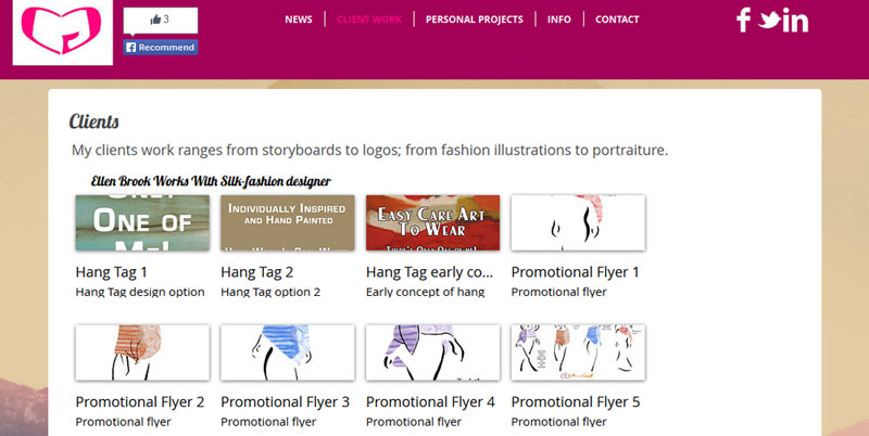
Image of Website: carlaginsberg.com
Nobody in their right mind would expect an illustrator and a designer to own a logo design that looks like as if it was created by a 2 year old. It’s so decidedly pink and implies a heart by putting two letters ‘C’ and ‘G’ facing each other on a blank white background. Our suggestion: let people take you seriously by taking yourself seriously my dear. The logo gotta go! Besides, it would be a great idea if the website didn’t look like a blog.
2. Association & Society Insurance Corporation (ASI)
Image of website: asicorporation.com
It is pretty sad that the largest of the Bay Area firm with a high revenue of $1.3 billion has a website that does not tell a visitor what the company is about. The ‘About’ section is located far below with Privacy Policy in a microscopic font. The logo again is way too simple and straight forward. Actually the ‘Selman Co’ and ‘ASI,’ which are juxtaposed together, look like two different logos side by side with emphasis on neither. A more prominent logo ASI would have looked a lot better for customers who are familiar with this firm.
3. Olga Rocklin Psycho Therapy
Image of website: olgarocklin.com
That Background!!! The Olga Rocklin Psychotherapy website makes me wonder if the site is for treating patients of creating patients! I may sound a little harsh, but seriously, the plain white font over an orange background can drive any graphic designer crazy if looked at for 5 minutes. It’s stressful – a feeling contradicting with the service they are offering. And yes, there is no logo that people can immediately associate with.
4. Simone da Rosa
Image of website: simonedarosa.com
At first, I was confused what might be putting me off on this website, but then, after careful consideration, I realized that it was more than one thing. For starters, the banner they have used employ content that is written in different font sizes within each banner. It not only makes them look ugly and uninspiring but also confusing for the reader. Secondly, the font style they have used on the rest of the site and the use of space is just not right. For a woman who teaches clients to use the laws of attraction for their personal, relationship, professional and financial benefit, to have a website that is not only energizing but also aesthetically accurate is too essential. Oh, and that pale pink section looks like a piece from another website pasted over the sky blue background. Do something about it, please!
5. Be a Fit Mama
Image of website: beafitmama.com
Be a Fit Mama, Inc. earned the position of no. 2 personal training company in the whole San Francisco A-List. Obviously, when a company is doing so well, people reach out to it with high expectations of a positive and vibrant website. The website fails to capture attention and it’s really hard to stay there for more than a few seconds, let alone use their resources or read success stories. It would also be nice if the main page held the founder’s picture with her name, as otherwise, the first impression a stranger gets, is of a website not from the San Francisco Bay Area, but of the African country Kenya.
6. Kim Selby
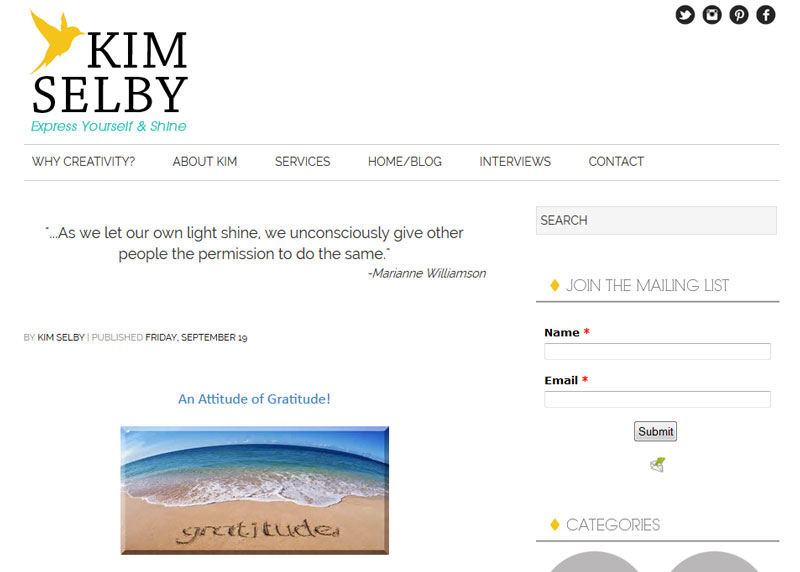
Image of website: kim-selby.com
Okay, there are three kinds of website background: 1) those which are so dull that you can start yawning within a few seconds, 2) so bright that they scare the readers away, and 3) aesthetically sensible, that complement the website and its purpose and as a result, inspire the visitor to stay and even do business with the owner. Now, I like the overall design of Kim Selby’s website, but the really small font alongside that pastel blue and white background loses my skimming ability. As you scroll down, the design on both sides of the text strikes the eyes more than the text or anything else on that website. It diverts the attention of the reader in an annoying way. Either make it more transparent or change the design.
7. Builtline
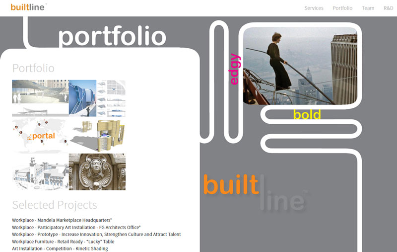
Image of website: builtline.com
The absence of content on the upper part of the main page, and the abundance of content as below, makes the whole space look less organized. Also, there is too much white even on the colored parts of the website. The font colors for adjectives such as, dynamic, bold, and stylish, also fail to make a good impression. They do not properly communicate what they mean. Still, the most immediate change they can bring is to some color to the introductory part of the website.
8. Evrystep
Image of website: evrystep.com
The website curates portfolios artists, dancers, and athletes. The first words that capture your eyes are “showcase your passion” in block letters. The only problem here is that the outlook of this website severely lacks any artistic passion in itself. There is no mention of what kind of professional portfolios are welcome there. The main page is way too simple and without any reference or visual clues to art or dancing, etc. To me the site is in desperate need of some energy.
They call San Francisco “The Paris of the West.” It is known as a financial hub, and a metropolis of a variety of cultures. So ultimately, for anyone striving to be the best in their industry in the bay area, it is of utmost importance to get the branding and marketing right. That is the key to earning high rewards for their professional efforts. Businesses all over the world are paying special attention to their web designs, logos, and other marketing collateral, we’d recommend strategic branding to achieve their mission and vision.
Do you agree rebranding help transform businesses for the better?






I don’t understand why you would highlight these wonderful women just criticize. I really don’t see the helpfulness of this piece at all. Perhaps providing criticism and also some suggestions, or perhaps hook the ladies up with some web designers, etc. I think it would have been great to hear that despite the logos and the websites, these ladies offer phenomenal services.
Candice you are right – they offer phenomenal services, and if they had better web presence, then their branding would reflect their awesome services. The purpose of this piece is not to criticize per se but to give constructive feedback so that they can achieve even more with their business.
Angela, actually the purpose is not “slamming others” but to raise them up. Wouldn’t you say, if they had better logos and websites to boost their brands, their business would increase manifolds? I think it would.
Moreover, they were worth the search because they offer awesome services; too bad they are buried under bad designs. Considering they are dedicated to their profession and business, I am assuming, logos and websites are the least bit of their concern. They need to give a bit of time on their branding tactics, and that’s all this post is about.