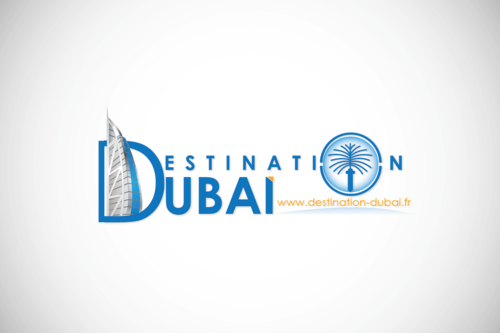
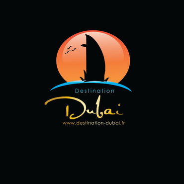
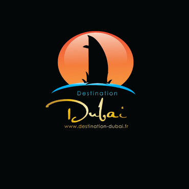
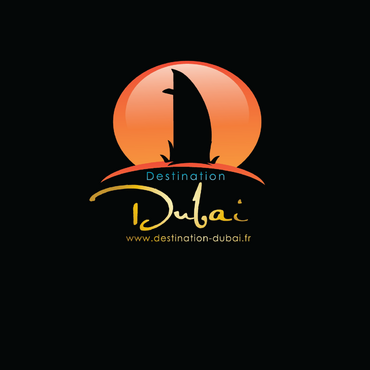
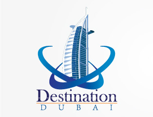
Destination Dubai needs a logo...
Destination Dubai
|
Contest Holder
14410
?
Last Logged in : 4419days4hrs ago |
Concepts Submitted
75 |
Guaranteed Prize
200 |
Winner(s) | A Logo, Monogram, or Icon |
|
Live Project
Deciding
Project Finalized


Creative Brief
Destination Dubai needs a logo...
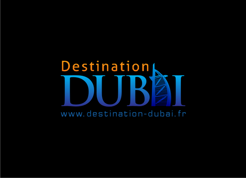
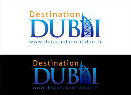
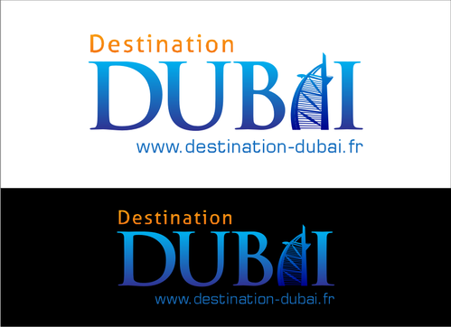
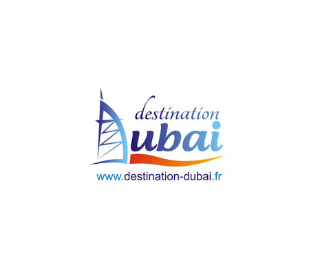
Destination Dubai
www.destination-dubai.fr
Yes
Destination Dubai is a destination management company targeting the French and French speaking customer base market.
The logo should convey the Dubai lifestyle and heritage: between modernism and tradition.
Only through the logo, the customer must be travelling to Dubai already...
Travel
Logo Type
![]()
Symbolic
![]()
Modern
Traditional
Good colors associated to Dubai would be: the blue of the sky/sea, the yellow of the sun and the sand color of the desert. Texture effects can be used instead of colors themselves
2
The website is not active yet but if you want to learn more about Dubai and get inspiration you can visit: http://www.definitelydubai.com/
There are several globally known landmarks in Dubai. Feel free to get inspiration from them in the logo creation.
Final version should include one design with the website adress below and one without
Related Contests