SALES / SUPPORT : +1-877-525-5646   |  


Rogue Vapor Graphic #1

Instant Inhalable Energy

Contest Holder RogueVapor ?

Last Logged in : 4299days19hrs ago

Concepts Submitted

62

Guaranteed Prize
250
Winner(s)

1

Other veildAll design entries can be viewed by other designers. Featured Featured Contest
tick_gray

Live Project

tick_gray

Deciding

tick_blue

Project Finalized


Project: Rogue Vapor Graphic #1
Industry: Retailers Logo
Contest Launched: Apr 28, 2011
Selected: 1 winning design from 62 concepts
Winning Design by: EleVen711
Close Date: May 05, 2011


Rogue Vapor Graphic #1 - Retailers


Awarded as a winner
Project Report    

Sort by:


#61

#53

#47

#45

#38


Creative Brief


Rogue Vapor Graphic #1

Instant Inhalable Energy

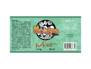
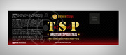
I need static banner ad graphics, but I need one uncommon size that I can't choose in that category so I have to use this category. The sizes I need are (560x300, 728x90, 160x600). Please read the attached document the graphic will link to this text and a video about this offering. Phrases or quote from the document can be included on the graphic. Product Taglines can also read "Inhalable Energy", "High Energy Caffeine Blend", or other... Company Tagline is : "An Obsessive Devotion to Flavor" Caffeine levels range are: none, low, medium, high, super, hyper. Creatives: Please remember it isn't only our coffee flavors that has the option for caffeine, it is any of our great flavors. You can use any free font, or Alexon Light, Alexon Light Exprt, or Alexon Medium. Please include or incorporate the Rogue Vapor logo attached. The words "Rogue Vapor" can either be beside the logo or underneath the logo.

Retailers

Target audience is an even split from 50/%50 with male/females and group age range is from 20-50, slightly more in the 30-40 range.

Read the attached document for not only content, but to also see the more light hearted side of our marketing. The Background color of the image should be in a seperate layer or easy to change as the color scheme for the website is not nailed down yet. (I don't need the colors to match, I just need them not to clash)

Related Contests


Brand & Label for E-Liquid Bottle
$250
Prize Money
89
Concepts
Product Label for Bullets
$150
Prize Money
41
Concepts
Expedite WCP Pet Shop Ad
$150
Prize Money
13
Concepts
Redesign of Newspaper Marketing piece for a discount dental plan.
$250
Prize Money
69
Concepts

Discussion


Comments

  • May 01, 2011 7:07 PM
    thanhsugar thanhsugar
     
    Hi Project Holder! Please view the design at full size, it make text better! Thanks!

    Like Icon 0   DislikeIcon 0
  • May 01, 2011 3:41 PM
    RogueVapor RogueVapor
      Project Holder
    Notes for #24, #25, #26, and #27 Out of these four I like 26 and 27. I feel there is a little too much use of the yellow vapor trail in 24 and 25. On 26 and 27 I like it but I would want to see the vapor trail more organic coming out of the “Y” in energy.

    Like Icon 0   DislikeIcon 0
  • April 30, 2011 12:08 PM
    RogueVapor RogueVapor
      Project Holder
    Sorry the note to #4 was meant to be for #8, I like this color scheme. I feel a little refinement and energy at the same time.

    Like Icon 0   DislikeIcon 0
  • April 30, 2011 12:04 PM
    RogueVapor RogueVapor
      Project Holder
    Smartinfo, I like your series #11, #12, #20, #21, #22, #23 The ones I like the most out of those are #12, #21, and #23

    Like Icon 0   DislikeIcon 0
  • April 30, 2011 12:00 PM
    RogueVapor RogueVapor
      Project Holder
    #4 I like this color theme, it makes me feel a little refinement and a little energy at the same time.

    Like Icon 0   DislikeIcon 0
  • April 30, 2011 11:57 AM
    RogueVapor RogueVapor
      Project Holder
    Notes on #6, a little to clean, doesn't draw my attention as much of the others do. #18, I like this one it seems to be picking up some of the energy theme.

    Like Icon 0   DislikeIcon 0
  • April 30, 2011 11:54 AM
    RogueVapor RogueVapor
      Project Holder
    Thanhsugar, I like the lightning effects is items #5, #7, #9, #10, #13, #14, #15, and #19… But some of the white letters on top of white lightning seems to get lost. #5 and #7 seem to be better in this aspect because of the blue lightning. I do like the effect and over all look, just in its current incarnation it seems to be harder to read.

    Like Icon 0   DislikeIcon 0
  • April 30, 2011 10:51 AM
    DJJOHN DJJOHN
     
    Notes on #3, ""Nice, clean I like it. I would just need the bottom row of text to be easily editable."" Dear PH, yes it is easily editable. every thing is in layers and editable. Thx.

    Like Icon 0   DislikeIcon 0
  • April 30, 2011 9:45 AM
    RogueVapor RogueVapor
      Project Holder
    Notes on #3, Nice, clean I like it. I would just need the bottom row of text to be easily editable. Notes on #4 The color break from black is nice. But the banner feels wordy. I think a little more background detail or graphic would help. Just FYI: The most import formfactor of this banner for me is the 560x300. If you are only going to focus on one size for mark up I would suggest that one.

    Like Icon 0   DislikeIcon 0
  • April 29, 2011 10:49 PM
    RogueVapor RogueVapor
      Project Holder
    I like both of these (#1, #2 ), but I am looking maybe for something to reflect the "Instant Energy" aspect.

    Like Icon 0   DislikeIcon 0