SALES / SUPPORT : +1-877-525-5646 |
Login
Spartan
|
Contest Holder
Spartan
?
Last Logged in : 4802days21hrs ago |
Concepts Submitted
224 |
Guaranteed Prize
350
|
Winner(s) | A Logo, Monogram, or Icon |
|
Live Project
Deciding
Project Finalized

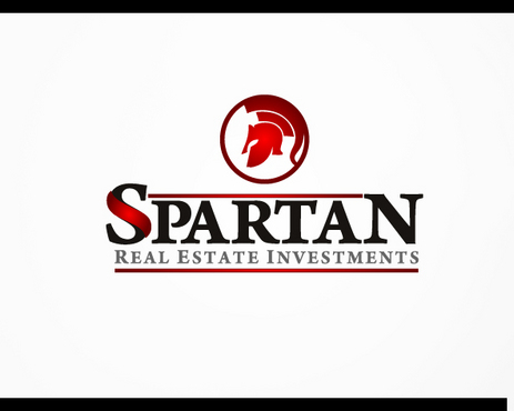
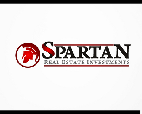
Sparan Real Estate Investments
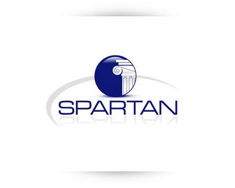
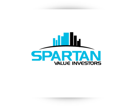
Spartan
Value Investors
Yes
We invest, assist, and sell foreclosed properties. Our parameters are small in scope right now, but our long term goals are to diversify outside real estate only investments. At heart, we are an investment fund that keeps a strong balance sheet to maximize on only the best opportunities.
Real Estate
Logo Type
![]()
Symbolic
![]()
Web 2.0
![]()
Unique/Creative
Clean/Simple
Corporate
Modern
Blue, white, maybe black, maybe green. We think 2 colors would probably be best, but we don't want to limit the design by any strict parameters.
not sure
Along with the companies mentioned above, we like the following logos from the logodesignguru.com gallery: Blackstone Auction Group, ParkSide Realty Group, Green Hills Real Estate, zinyc.
Again we are not set on whether we like the "Value Investors" part to be in the logo. Also, we're not really sure whether we want to incorporate some type of symbol into the lettering. We're pretty much open to any ideas.
We like the big "S" associated with Michigan State Spartan football, but we don't want this logo to make people think of this institution at all.
Our main goal is to have a font (or some combination of font + design, logo, mark, symbol, etc) that will be easily recognizable and will become an icon of an institution who does honest business and makes smart investments.


Comments
Project Holder
Project Holder
Project Holder
Project Holder
Project Holder