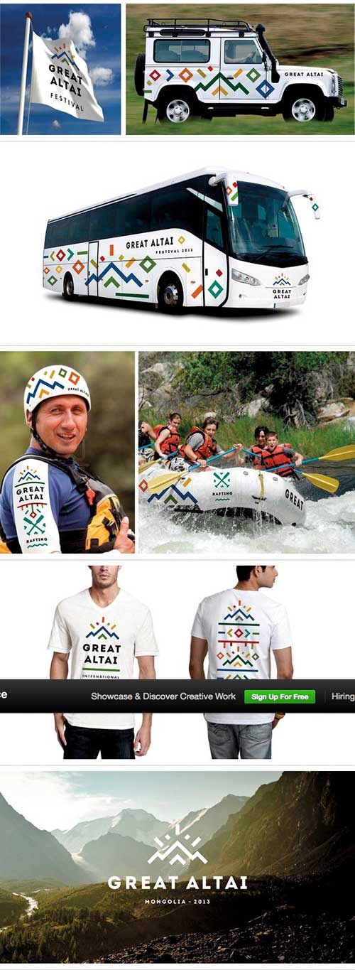
How To Create A Business Logo System for Your Brand
In today’s modern world, ever changing as it is, companies are under a lot more pressure to be just as adaptive as the markets therein. A lot of companies are using more modern logo designs and colors to attract customers, so it’s only natural that they’ll be hedging their bets, too.
Why Would You Need A Logo System?
A business logo system allows a company to be adaptive, without losing their core appeal. Different styles of logos and different color schemes will appeal to different demographics, and different audiences.
But, it's not just the target markets, either. New products that are launching need to have labels and branding on them too, and if the products are changing, sometimes the labels need to change too. Think about Mountain Dew, or any sports drink, for that matter. The bright colors represent the flavors, and if the colors of the logo were set in stone, then how would customers know which flavor they were picking up? A logo that's dynamic and adaptable can be an asset to a company, but one that’s stagnant and unable to change? That sounds like a recipe for disaster these days.
Creating Your Own Logo System
1. A Good Basis
If you’re just about to start a business, then you’ll want to go simple. Letter type logos tend to be a popular choice because they’re intrinsically recognizable by their shape, which is how we can read. If you combine that with a simple quirk, those two static features will be enough to carry it.
2. Core Design & Variation
Usually, the first letter of the company’s name is a clear choice for your core design, and is an effective way of doing it, if the current trends are anything to go by. If you’re called ‘Bob’s Bread’, consider using two ‘B’s in some interesting way. If it’s ‘Wally’s Burgers’, then you’re going to want to do something with the ‘W’. Beyond that, it’s up to you to decide what sort of quirks are going to be your static elements, and from there, you’re into the experimentation phase.

If you’ve got a graphic designer you’re paying anyway, you’re in luck. If you’re having to pay one hourly to put things together for you then it may be costly. If this is the case, try sketching some designs yourself to save them spending your money on ‘thinking time’. It happens more than you’d think.
3. Design Styles
Design style can vary a good bit when it comes to logos, and the beauty of a logo system is that the design style can change. Some of the popular ones include Art Nouveau, characterized by the flat, outlined illustrations that look hand drawn. This isn’t to be confused with Art Deco, which has the same vintage look, packed with flatter, one dimensional color schemes, and yet presents with sharp edges and shapes. Contemporary styles embody simplicity, and often feature jagged shapes, large panels of flat color, and sans-serif/modern fonts. Early and Late Modern styles utilize flat colors with high contrast, sharp lines, and geometric shapes. From Contemporary and Modern styles, there’s emerged a trend of ‘Clean Minimal’, embodied by a lot of companies these days. These often simple minimal logos show off a simple shape or vector graphic to get their message across. But, like all things, there are variations like ‘Flat’, ‘Geometric’, ‘Feminine’, ‘Masculine’, and ‘Abstract’. A more modern look is likely the best choice for a logo system as the simplicity will allow you to focus on the permutations without thinking about keeping your graphics intact
4. Font Variation
With a billion fonts at your disposal, you’ll never be short of one that suits the occasion. Fonts, believe it or not, can change - especially if they’re part of the logo itself. These days, thanks to great features on editing programs, fonts can be converted to shapes, and messed with manually. That in itself has opened up a whole new world of design possibilities. Now, fonts don’t have to be stagnant, boring, or stale. Check out the font variation across these LVC logos for proof.
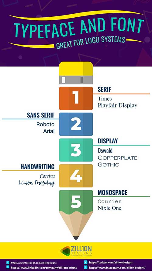
They utilize a series of changing color palettes, as well as that core shape of the three letters, to carry the design and recognition potential through the variations. And they look great doing it too. If you want to do the same, then you need only consider the typeface. Either stick with a serif, sans serif, display, handwriting, or monospaced typeface, and then, go nuts with the font. Design is as much about getting it wrong as it is right, and experimentation is key for both.
5. Color Schemes
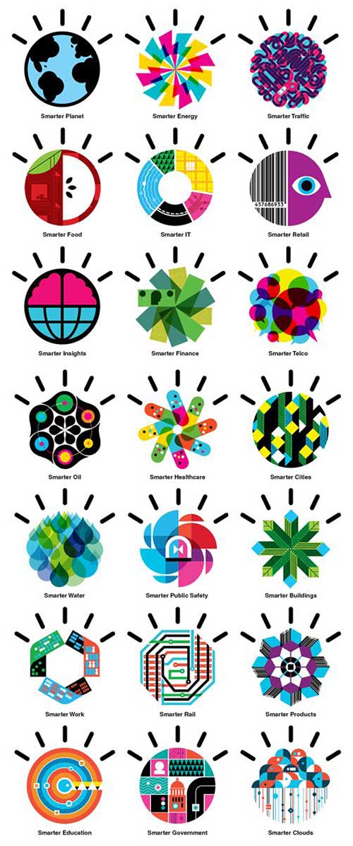
Color is now a fluid element. Whereas before companies used to live and die on their company colors, now that’s obsolete. You only need to take a look at these ‘Smarter’ logos to figure out that colors don’t mean anything anymore:
But, what they do have are self-contained color schemes. All the colors in each individual logo blend perfectly. So, while changing colors is the new in-thing, changing them frivolously can be just as dangerous as ever.
6. Theme Variation
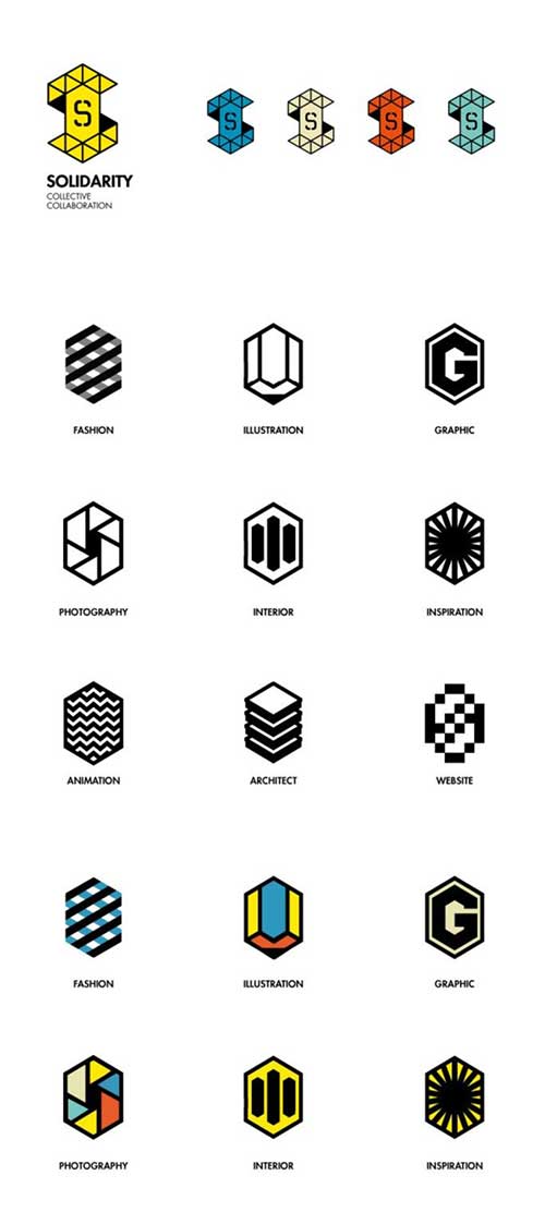
Theme variation is an interesting one. What we mean by theme variation is the general tone or purpose of the logo, and what it aims to convey. A great example of this is the ‘Solidarity Collective Collaboration’. They have this brilliant [color changing] logo that we showed off above, but for their subsidiary factions, they utilize a logo system to represent different things, while retaining the hexagonal shape. They exhibit just how variable logos can be without losing the recognizability.
7. Static & Fluid Elements
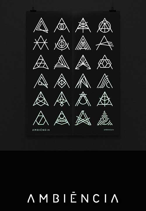
If you’re wondering just how changeable a logo can be, you only need to take one look at what ‘Ambiencia’ are doing. With the simple triangular ‘A’ shape, set off by the constant cross-bar, they’ve gone nuts and designed a whole array of designs that come with all different connotations, with everything from a fingerprint (bottom right), to a navigational compass (second from the left on the second row), to a prismatic light refraction (second row, far right). These are just some of the most recognizable ones, but it just goes to show how much you can do without losing that brand recognition. There’s certainly no mistaking their logo for anyone else’s, no matter how it looks.
8. But I already have a logo
Well, that’s a start. You’ll have a pretty big head start on the competition, because all you’ll need to do is work backwards. Look at your logo, and ask yourself what the core elements are. What has to be there for the message to come across? If it’s your name in a certain font, a picture of a turtle, a simple outline shape like the American landmarks designs (below), or anything else, then you make that your static element, and commit to changing the rest. Again, it’s down to experimentation.
How to Recognize Logo Systems
- A logo system has both static and fluid elements
- Core image is preserved, while satellite features changes
- Mostly based on alphabet letters, or simple vector images
- Static elements can be modified but retains recognizability
- Fluid elements work to reflect the tone and message of the logo,
- Different colors, shapes, and fonts convey contextual meaning
9. How do I know what to use and when?
Sometimes, it’s going to be easy. Think about Google Doodles. Depending on the time of year, the logo changes. This is one of the most prevalent examples of a logo system at work. On Saint Patrick’s Day, the logo is green and adorned with clovers. On World Book Day, it uses book imagery. Whenever they want to show their support for something, they create a new doodle, and you should follow the same trend. Think about what you want your logo to represent, support, or tell your customers when they see it, and you’ll already have some direction for what sort of variations you want to create.
10. How complicated should it be?
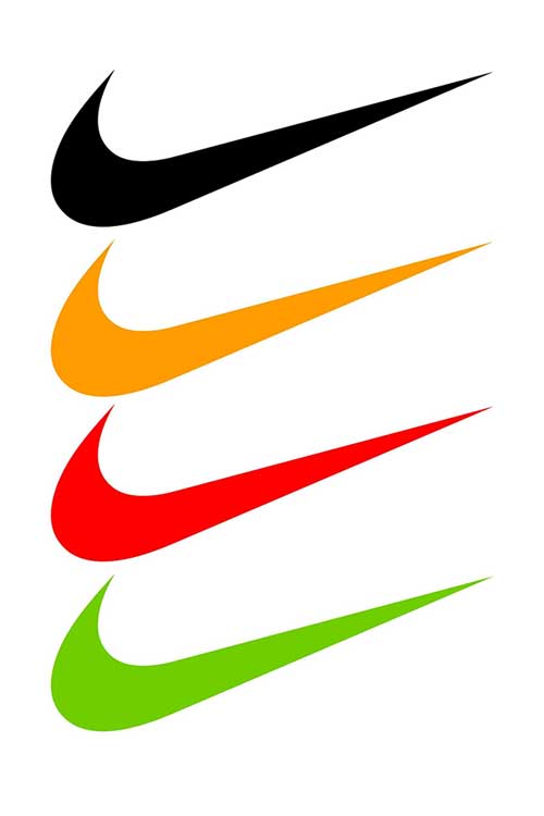
Not very - at all. Make it as simple as possible. What you’re looking to retain is brand recognition. Apple’s apple utilizes shape, but appears in different colors. This is a logo system because it’s not bound entirely by static elements. Nike the same. That tick is Nike whether it’s in black, white, blue, orange, or pink. People instantly recognize it, no matter what, and that’s something you should be striving for. People should recognize your brand whether it’s just the static element, or whether it’s clouded and obscured. The core elements carry that recognition of brand, and will let you meddle with your logo as much as you want.
11. Using it to your advantage
The next question you’ll be asking is, if this whole logo system thing is going to cost so much, can it actually make money? The answer is yes, sort of. It’s going to be difficult to quantify, but in the long term, you can definitely use a logo-system to your advantage. Having the ability to change the colors, shapes, and everything else of your logo will certainly allow you to appeal to different markets. A prime example of this was Hillary Clinton’s Pride Logo. She had it designed to show that she was in favor of same-sex marriage and other rights for the LGBT+ community. If you want, in your business, to appeal to a demographic, nationality, target market, or otherwise, you can use a logo system to your advantage.
Or you could, you know, just put a leprechaun hat on it for Saint Patrick’s Day, because that’s always fun too.
Logo systems are continually evolving and gaining popularity. Companies were once limited by software, awareness, and access to experts. But now, with the internet opening up freelance marketplaces, and with blogs and articles on everything from graphic design to ladybugs, there really is no need to stick with a convention that was put in place only by the limits of its technological age. Everything else has moved on, and for the forward thinking entrepreneur and business owner, logos have too.


