How to Use Letterforms in Logotype Design
Before we dive deep into the subject, we must first define some key terms:
- - Letterforms
- - Typography
- - Font
What is a Letterform?
Letterform is a term used in typography to describe the shape of letters or in the modern language known as a font. Wikipedia explains it as follows:
"In typography, a typeface (also known as font family) is a set of one or more fonts each composed of glyphs that share common design features. Each font of a typeface has a specific weight, style, condensation, width, slant, italicization, ornamentation, and designer or foundry.
Therefore fonts can be divided into many groups but few of them are fundamental, such as serif, sans-serif, script, blackletter, decorative, handwritten, and mono-spaced.
What is a logotype?
A logotype is a type of logo design focused on the brand’s name. This means that unlike a combination mark or brand mark, this logo style does not contain any pictorial reference unless a symbol is created in a negative space logo design such as in the FedEx logo.
Logotypes have become a popular choice in recent years, and it is being used by an array of brands, for their famous logos, as well as startups and small businesses. IBM, NASA, Ray Ban, Coca-Cola and Google are just a few examples of companies that have attractive and memorable logotypes.
So when you’re designing a logotype, your biggest concern should be the kind of typeface you pick and the color you choose. Once you’re done deciding the font and the color palette, you only need to combine it all into one great logotype perfect for you.
A logotype can be a wordmark or a lettermark depending on the name of the company, product, or brand.
Serif vs. Sans Serif
First choice you have to make is between serif and san-serif font. It mainly depends on line of work or industry for which a logo is created. For example, if you are designing a logo for a contest for a wedding planning agency it's natural you wont's use Serif or heavy fonts characteristic for printing company; or if you are designing a logo for construction business or building company which needs to be represented as firm, stable, strong, reliable etc. you surely won't use script font or decorative font. So let's get back to the serif - sans difference.
Serif fonts are typically used in printing industry and they are invented for the purpose of easier reading because their serifs form line on top and bottom of letters and row of text looks straight so the human eye finds it easier to jump from word to word. In logo design, they are often used in lawyer office, construction or building firms or any industry that needs to be represented as stable, reliable, trustworthy, and honest. For many years Serif logo designs dominated the design industry but in the past few years many companies have decided to redesign their logo from serif to sans. It's partially because serif are difficult to read when minimized on small screens (mobile phone or tablet).
There are lot of brands which have found success with serif logo designs although today it's rare to bump into such a logotype.
Sans are much more popular today and the world's famous brands are in sans serifs.
Thickness
The second thing is thickness of your letters. Some designers would say that the mother of all fonts is Helvetica - you may agree or disagree but it is an excellent example of how various font thickness can affect a logo design. Eventually, the choice of font is always dictated by industry branch or type of business the logo is for.
If logo is for a beauty salon, then a heavy font is definitely a wrong choice. A light or thin font stands for sophistication, gentleness, precision qualities which are associated with the beauty and fashion industry.
Helvetica is used in many, many famous logo designs, and in various thickness depending on the industry type.
Italic
Italic or oblique or cursive is the right choice for a logotype if you need to convey messages that refer to movement. Unlike regular typefaces which remind me of stationary, standing still, and stagnancy, italic is related to playfulness, speed, energy, going forward etc. and always remind us of constant movement and even futuristic in some way. It also implies elegant, sophistication and unordinary. An iconic logotype in italic is Nike.
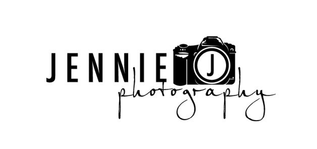
Script
Script or handwritten logotypes are not particularly popular, but a few of them have achieved exceptional success.
There are no specific rules for handwritten logotype. One good characteristic of handwritten logo is uniqueness. With a handwritten font logo you convey a message that you are unique and determined to succeed. Handwritten logos were popular in the past century but they are coming back in big style today. Some of handwritten logos which are iconic are Coca Cola, Ford or Disney.
Condensation
Condensed fonts are sometime used when the name of the company in a logo are too long and with condensed typeface you can save space. Condensed fonts also represent luxury, precision, lightness, tightness. Condensed fonts in logo also speaks of maximum usage of limited space with high precision. Condensed fonts can also be thin, semi bold, bold, heavy and other subclass, and also can be straight or italic. Again, choosing the right style always depends on the demand of the client and industry type.
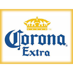
Blackletter
Blackletter typefaces also known as Gothic scripts are rare in logo design but nevertheless are used from time to time. Gothic is one of the earliest forms of nonstandard, designed fonts dated even to medieval time. Calligraphy style of fonts have been born in Europe and was one of first typefaces used in branding. Today it's rare in modern usage except when you want to emphasize characteristics like tradition, ages, old, aristocracy etc. It is common in brewing industry and many beer labels from Europe are in blackletter typeface.
Kerning
Kerning is important for several reasons, among all is readability. If you don't have proper kerning letters can merge and form unwanted shape or word. Kerning is important when you downsize a logo to few millimeters or pixels so it maintains readability. Large kerning can also be problematic because when you move letters too far from each other, the word can break apart and lose it's meaning.
There is excellent online game which can help you to understand meaning of kerning.
What not to do
If you wish to honor the author of the font and to honor the basic design rules you should never deform a font in any way. By deforming I mean squeezing, transforming, distorting or any other action which will ruin the original shape of letters. Always remember that someone has put a lot of effort and hours of work to design that font and it's not fair to massacre it in any way. If you use freehand drawing method and you draw your letters by yourself then everything is allowed but destroying somebody else's work isn't morally right.
In designing of a logo always try to keep it as simple as possible and by that I mean not to use more than 2 different fonts or more than 2 variation of the same font. Today it's common to combine 2 different fonts in logo design but more than that would be crowded and too much.
Examples of fonts to use for logotypes
The internet is full of websites offering free fonts for logo design and trends are changing from year to year. When choosing a font for logo design it's important to pay attention to license. Not all fonts are free and some of them, even paid one, have several levels of usage rights, that's why always need to check user agreement. Sometime it's best to use simple fonts like:
There are no rule pointing to one specific font type from a mentioned font families. It's the designer's choice. Anyway if you have an idea of how your logo will look and you already have a suitable typeface then the choice between a few top rated (or not) fonts from that typeface is purely technicality and solely designer's choice. But from a designer's point of view all top notch brands of the world and their logotypes are created from simple and basic fonts.
In the end there is only one conclusion to draw regarding using letterforms in logotype design. Choice of letterform is greatly influenced by industry or type of business logo is for. Naturally all of this is applicable on Latin or Cyrillic characters and languages. Similar theses can be applied onto other languages like Chinese or Arabic but few of these rules must be applied on all of them. Right kerning and specific styles of letters, no matter in which script or language must always be honored if you wish your design fulfill its purpose and to represent brand in best possible way.
*This post was originally published on Logo Design Guru.
**All logos source: commons.wikimedia.org
Written by Raquel Addams