SALES / SUPPORT : +1-877-525-5646 |
Login
Are you trying to establish a builder brand?
Well, do you know the first step to creating a solid brand identity?
It might seem obvious, but the most critical aspect of your brand is your builder logo design. Doesn’t matter if you are a small construction company, or a large building contractor. If you don’t have a snappy and effective logo, you pretty much don’t have an identity.
But with so many design options available, it can be overwhelming to decide what type of builder logo to create. Don't worry, though, we've got you covered!
In this article, we'll explore the world of builder logos and provide you with some useful tips to help you create a logo that truly represents your business.
Simply put, your logo is the visual representation of your brand.
It helps establish an association, convey expertise, and set you apart from the competition.
Your logo is more than just a pretty picture—it is the face of your brand. A well-designed builder logo can make a lasting impression on potential clients and help you stand out from the competition
But, what exactly makes a logo effective for builders?
First, it's important to consider the industry you are in. As a builder, you want your logo to communicate your expertise and professionalism. This means using clean, simple designs that convey strength and stability. Bold, sans-serif fonts and strong, geometric shapes are often popular choices for builder logos .
To create an effective builder logo, you need to consider the key elements.
These would be the things that make your logo truly stand out from other builder logo designs.

Choosing the right colors is so important, but is often understudied.
You want to pick colors that represent your brand and make you stand out from the competition. For example, blue is often associated with trust and professionalism, while green can convey a sense of environmental responsibility.
Moreover, blues and greens are common choices for builder logos, as they are associated with reliability, trust, and growth.
Red can also be a powerful color, conveying strength and passion.
Perhaps read up a little bit on brand color theory to see what you resonate with the most.

Who thought that choosing a font would be such a commitment?
But that’s the truth of it… you’ll have to pick a typography that represents you.
When choosing typography for your builder logo, it's important to consider legibility and readability. The typography should be easy to read from a distance, especially on signage and other platforms.
Additionally, the typography should reflect the style and tone of your business. For example, if you specialize in luxury home construction, a script font may convey elegance and sophistication. However, if you’d like an engineering service logo, a bold and sans-serif font may be more appropriate.
It's also important to avoid using too many fonts in your logo. Using too many fonts can create a cluttered and confusing design. Stick to a maximum of two or three fonts to keep your logo clean and cohesive.
Let's take a look at some examples..
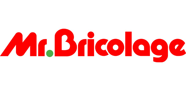
The logo for Bricolage Construction uses a bold and modern sans-serif font, reflecting the company's contemporary and innovative approach to building. On the other hand, the logo for Rustic Roots uses a combination of sans serif and serif font, giving a traditional and classic feel that matches the company's focus on rustic and natural building materials while staying modern in their approach. Basically, you’re not just maintaining legibility and readability. You’re giving yourself an identity.
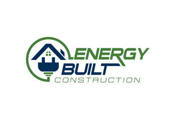
Including a symbol or icon can help convey the type of building work you do. For example, a hammer or saw can be used for a carpentry logo design, while a crane can represent a contractor company logo.
Using a symbol or icon in a builder industry logo design can help visually convey the type of building work the company does, make the logo more memorable and distinct, and communicate the company's values and personality, all of which contribute to building a strong brand identity for the company.

When creating your builder logo, it's important to keep in mind the different ways it will be used.
Some contests may require you to upload a digital file of your logo design, while others may ask to present it in a mockup. Be sure to provide all the required information along with your submission. Such as your name, contact details, and a title for your design.
Your logo should be versatile enough to work across a variety of mediums, from business cards to billboards. It should also be scalable, meaning it can be resized without losing its quality or legibility.
This is your brand identity—and you want it to be represented everywhere!

Now that you’re all set to start ‘building’ your logo, you’ll also want to explore the different types of design choices you have.
There are several types of builder logos you can choose from. Some popular options include:
A wordmark is a logo that only contains text. This type of logo is perfect if you have a short and memorable business name.

A lettermark is a logo that uses initials instead of the full business name. This type of logo is ideal if your business name is long or difficult to remember.

An emblem logo contains both text and a symbol or icon. This type of logo is perfect if you want to include a visual representation of your business.

Now that you know the key elements and types of builder logos, here are some top tips to help you create a builder logo:
Looking for some inspiration?
Observe the logo designs for more building companies to get your wheels turning:
This logo uses a bold, sans-serif font with a stylized "H" that doubles as a building structure. The grey and white colors convey professionalism.
Kiewit's logo features a simple, bold typography in black with a distinctive orange accent color. The "K" symbol also resembles a construction crane, representing the company's focus on heavy construction and engineering.
The PulteGroup logo features a clean, modern font in blue with a stylized "P" symbol that resembles a roofline. The simplicity of the design conveys professionalism and reliability.
Bechtel's logo features a stylized "B" that resembles a building structure, with a bold and modern typography in black. The blue and orange accent colors convey trust, professionalism, and innovation.
These are just a few examples, but as you can see, there is a range of different styles and design elements that can be used in builder logos to convey the personality and values of the company.
So there you have it, folks!
Your builder logo is the first step in establishing your brand identity and making a lasting impression on potential clients. Remember, it's more than just a pretty picture - it's the visual representation of your business. By considering key elements such as color, typography, symbolism, and versatility, you can create a logo that truly reflects your expertise and professionalism.
And with the different types of builder logos available, you have plenty of design options to choose from. So go ahead and create a logo that stands out from the crowd and represents your business in the best possible light!


