20 Logo Designs That Give You the Creeps
Featured Image: iStock/losw
Paranormal activities happen, you have to admit, at so many levels. But if you are a graphic designer, the only terrifying moments are those experienced during peak seasons like Halloween, when you are buried underneath a pile of projects and pressure to come up with creative yet unique designs.
Designing a logo has never been so terrifying. But work has to be done, and we don’t want you to panic your pants out. That’s why we are offering you some insights on why some logo designs give you the creeps (figuratively and literally), while others give new meanings to the word “horror”.
To begin with, mood specific logos are common in a variety of industries. However, designers are often dumbfounded at the perspectives that they should take to instill fear or horror in the target audience on these occasions for their clients. We recommend that you sit down and brainstorm for your Halloween or any ghoulish logo design by watching and reading horror or suspense movies or books.
As the story unfolds, you will recognize the scenes where you feel your heartbeat increase. These are amazing in revealing human reactions and psychological triggers that you could use to instill in your design. Moreover, if you are a gaming buff, PlayStation or Xbox fan, you can even find games which are developed on scary themes to get your creative juices going for ideas.
Mind you coming up with a scary logo design doesn’t mean you go for the clichéd horror theme. Though there are many effects and techniques to give a logo that goose-bump look, some are more common than others. Here’s a rundown:
1. An image of skull, scary creature, devil or doll
2. An abandoned asylum, house or building
3. A woman or little girl at the end of the hallway
4. A foggy scene
5. A dark room with flickering lights and blowing curtains
6. A shadow or figure standing by the window
When you are designing a really creepy and scary logo, it’s important that you look into the concept, target audience and industry in depth. Even if you are not sure about the different elements which you could put into your logo, you can always get inspired by the thousands that are already present. Remember that copying another logo or design isn’t a good idea, so if you don’t have an original idea, you brainstorm some more.
So without adieu, here’s a list of 20 logos which will help you find out the difference between a good scary, bone chilling logo and a bad horrific design.
Ugly Designs
This logo is the definition of a bad logo which is trying a little too hard to be scary.
Image Source: clarksvillezombiehunters.com
Professional graphic designers will probably be scared of the bucket load of effects which have been used here.
Zombies are supposedly the favorite scary object of designers who know nothing about creating a scary logo.
Inspirational Designs
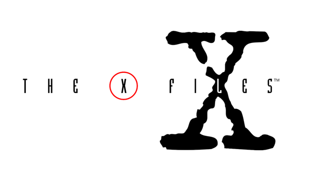
Image Source: commons.wikimedia.org
This simple yet intriguing X-files logo makes use of a good and sophisticated typeface and adds mystery by circling the ‘X’.
The prominent cross inside this very famous movie’s logo tells the viewer what the movie is all about and prepares you for a demonic tale.
Image Source: garbledtransmission.com
The pointed ‘F’ and ‘T’ letters in this particular movie title make it obvious that the viewers are about to get to treated to a horrific vampire film.
Can you detect the dropping blood in this Buffy the Vampire Slayer logo? This logo is the perfect example of a design which uses simple elements to achieve its purpose.
Image Source: vhsrevival.com
Anyone who has watched one or all parts of the movie ‘Scream’ know that the weapon of choice for the killer was a knife and this is what has been shown in the pointed ‘M’ of the logo.
Horrific Logos
Image Source: logofaves.com
Though this may look like a film roll, the three circles inside instantly tell the viewer what this production is all about.
Blum House Productions are known for their horror films and the single light bulb in a dark room makes their perspective obvious.
This logo is a good representation because it not only signifies the apple through the tree but also indicates poison by the skull inside.
The simple image of a dead bird is enough to give the chills to viewers and show what the record company represents.
A skeleton, crow and creepy typography, dare you ask for more in a Halloween based logo?
We have already shown you bad zombie horror logos, but this is one which has made proper use of the flesh-eating beings.
One look at this clever logo and you feel like you are being spied on.
Image Source: logopond.com
Notice how the ‘I’ in this particularly scary, killed logo is laid down and not upright?
You can learn something new from both these good and bad kinds of designs. The fact is that Halloween and scary themes are often challenging to make if you are not aware of all the elements that you could make work for you. So don’t wait for someone else to tell you what you should be creating because now is the time to get inspired.
Have you ever designed any design for Halloween? Share it with us.