5 Grocery Labels That Created Successful Bargain Brands with Bland Design

Featured Image: ThinkStock/Noel Hendrickson
You think bargain brands have poor design, however I will argue that they are brilliant because you know exactly what it is when you see it – an inexpensive product!
When you are shopping, you can quickly find the difference between the generic bargain brand and the name brand at a glance because one appears “cheap”. You can easily point them out because they have intentionally used ugly-looking or simplified design to stand out!
As Dolly Parton once said, “It takes a lot of work to look this cheap.”
The mindset of the bargain hunting shopper
Most bargain brand packages have one small graphic to show the type of product, a very simple logo, and the copy written in a clean sans font. It looks clean and nice, and communicates “cheap” because it doesn’t use a full color graphic label with colors and various branding. Some others will include blocky shapes, bright and flashy primary colors, and big red prices that make a graphic designer cringe!
If your store’s target market is the shopper that wants a deal, know that they are specifically looking for cheap design as a clue about its price range. Stores that have a store brand or a discount brand intentionally cultivate that belief about bland design attract the price-conscious market.
A bargain shopper searches for those label clues to find a deal, and that means the design works.
In my opinion, there are 5 generic labels that are the most successful, and it all comes down to their logo and their package design – it speaks directly to their desired audience! Follow their lead and your store’s brand will skyrocket your sales.
First Price (from Norway)
Color theory is all over this label design, but most people wouldn’t notice. With a simple text on the logo and red as a primary color, First Price attracts attention to their brand, and hint about the passion they have for their products. The logo design stands out against the intentionally selective black and white photos of their products.
The red, yellow, and orange colors have a purpose, as these are the colors that make you want to eat more when you are hungry, and that’s perfect for First Price. First Price has a huge line with all the types of foods you will tend to eat more of; crackers, cookies, pastas, and more cheaply.
Migros Budget (from Switzerland)
On the Migros Budget logo, your attention focuses on the word “budget” with the black, slanted text placed over a bright orange “m”. Simple design, and eye-catching, it does the job to make you think “cheap”. The marketing team picked their typeface well to communicate that message!
However green is the dominant color of this brand’s design and it implies that the brand is a money-saver. It can also make a customer think this brand is “healthier” than other cheaper brands, so keep this in mind if your store plans on running a healthy or organic line of products.
Migros Budget follows the theme of bland design with a simple picture and simple text describing the product. There are no fancy names anywhere on the label.
No Name (from Canada)
The No Name brand is unique because the logo isn’t a real logo. The company name is tiny, out-of-the-way, and unimportant. You know this bargain brand by color.The bright yellow is eye catching! The packaging is what sells this brand more than being able to name the company with their logo design.
The product is the most promiment element on the label, and that’s just what No Name wants you to see. You don’t need to grab the fancy brand with the fancy product name, stay simple and the cost stays low.
Are you beginning to see a pattern in the color palette among cheap store brands? Red, orange, and yellow.
Euroshopper (from Europe)
Euroshoppe’s logo is similar to a stamp. Unlike many other bargain brands, they want to draw attention to the fact that it’s a Euroshopper product. The logo is black and sharp against the typical red packaging of their brand, and is usually placed in a spot that will catch your eye. The sizing will change depending on the product, but it will always be noticeable.
What is unique about this brand is the fact that all the products have illustrations on their packaging and not of real food images. It draws even more attention to the logo and further creates the belief that it’s an inexpensive product.
Kirkland Signature (from USA)
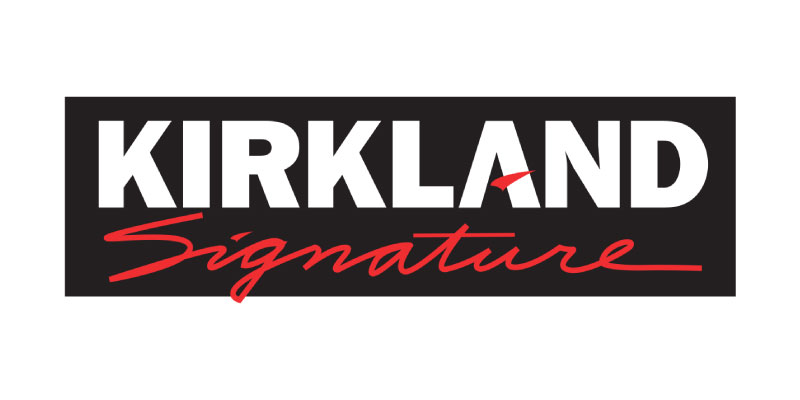
Kirkland Signature is commonly found in Costco Wholesalers which is known for bargain deals. The fact the brand is at Costco helps portray the cheapness of the brand, however the logo is simple enough to draw attention to it. The big black box around the logo’s typeface makes your eye focus on the Kirkland part of the logo.
What is unique about this logo is that it looks like they made a sticker to go on top of the existing product’s logo, and that you know Kirkland is going to give you a deal. The brand doesn’t have any unique idea for packaging, but the existing sure get your attention that the product will be deal worthy for you.
These brands are fantastic examples of design because they consider the context of the design – a person looking for an inexpensive brand wants a simple product with a simple look. This shopper doesn’t want to pay extra for the better packaging or the name brand!
When creating a bargain brand, it’s important to have packaging and a logo that is minimalist and easily scalable. Not only do you have to understand the principles of graphic design, but you need to consider your client’s target audience and what will catch their eye.
Do you agree cheap and bland design sells?


