The Science Of Symbols For Construction Logos
Feature Image Source: iStock.com/Enis Aksoy
The construction industry is booming fast and it witnesses more competition than ever before. This calls for the exceptional marketing campaigns to create a difference. But let me remind you, in a competitive environment, it is far more challenging to get noticed and create a long-lasting impression. A construction company with web presence is there but nobody knows about it. You need a custom logo design to make your brand image memorable.
With this realization, most construction contractors, and firms focus on establishing a professional appearance with best construction logos. However the brand logo needs for a construction company are unique, unlike any other industry. A good use of symbols in professional logos can create differentiation in the minds of the customer.
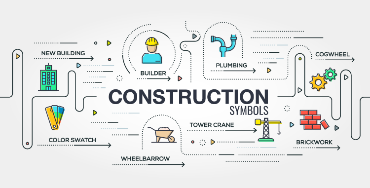
Integrate construction symbols
Now the most common identifiers for this industry include elements that show tensile strength and ruggedness. Those elements could be drill machines, operating or mechanical gears (engineering gear can also be used as the two industries are often superimposed). While doing so, you easily create a marked differentiation in the minds of the user. With an understanding of the science of symbolism in graphic design, you will be one step closer to finalizing the symbol vector to represent your brand. Just be careful to select one of these construction logo symbols to communicate your brand message.
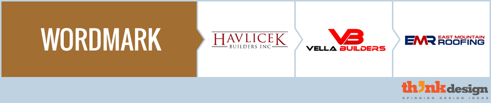
Wordmark logos create exposure
This might be considered as an old school method to create a brand identity. While wordmark logos establish an identity, they are not easily memorable when so many other construction contractors are using wordmark logos.
Anyhow, it’s a good idea to start off with wordmark logos and leave room for improvisation later.
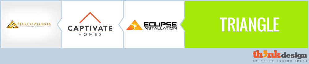
Triangle symbolize energy and power
Perhaps the most popular geometric shape used in construction logos and general contractor logos. Triangles give the impression of rooftops for homes. So if your business somehow caters to domestic housing construction or sales, the use of triangles in some subtle way would give away the meaning you intend to convey with or without using wordmark.
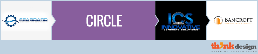
Circle for compactness
In construction logo design, complete circles are becoming a fad that has lost its charm. The latest logos are created with open-ended circles that are somehow part of the wordmark. Besides that, the circles can represent patterns, gear or a stand-alone icon that is mobile-friendly.
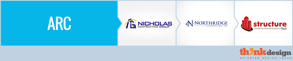
Arc for connectivity and progression
Arc is often touted as nothing more than an extension of circle but according to designers that is not true. While a circle suggests community, integrity, and perfection, an arc represents connectivity, progression, trust and reliance. Check out these construction company logo designs and let us know if you feel it too.
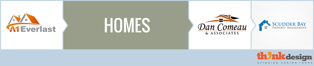
Homes tell about business niche
Housing contractors might as well put a tagline to explain the nature of their business but what really matters is the element of instant recognition that the audience gets just by looking at the logo for a millisecond.
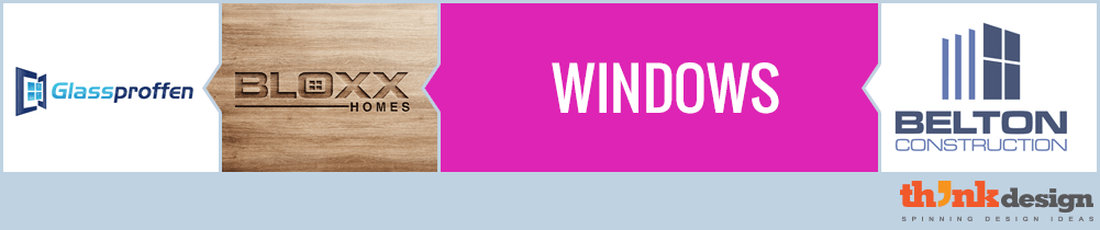
Windows add aesthetic elegance
The best part about rooftops and windows as symbols for construction logo is that they never appear redundant if used smartly. Some people like them free from the wordmark whereas other clients would like to see it subtly associated with the words. They have been used for logos of more than just this industry. Interior décor and lifestyle businesses use windows to add aesthetic elegance to their logos. Check out some examples here.
Excavator for builders
Foundation is the crux of any building and to lay a foundation, excavator is needed. This explains why most recent companies ask for and prefer the use of excavator in their logo. Note the smart use of excavator in this logo design gallery. Would you like to incorporate this element in your corporate logo design?
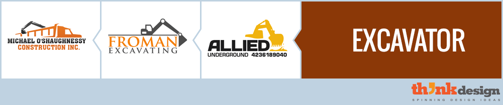
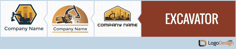
Image Source: Excavator Logo by LogoDesign.net
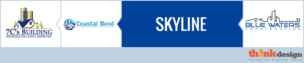
Skyline for multiple businesses
The use of skyline as a symbol is most appropriate when the business caters to all aspects of construction and serves both domestic and commercial consumers. To narrow it down, when a company serves all aspects of the business under one umbrella, then a skyline in the logo will communicate the professional message.
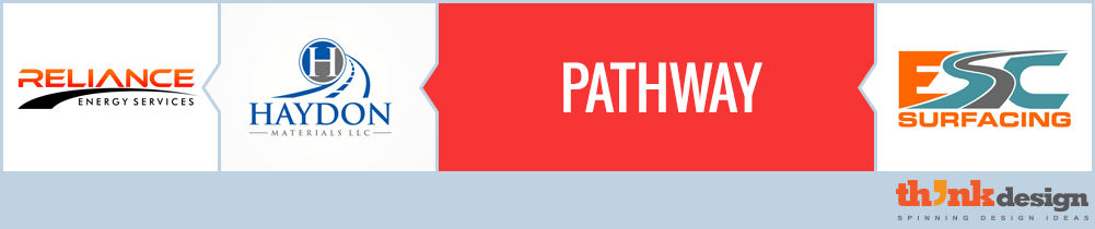
Pathway represents structural integrity
Besides homes, buildings, windows and doorways, there is another symbol that gives away an impression of a construction industry from a distance. Usually pathways are ideal for a business –to-business provider in the construction supply chain. Pathway is a symbol of structural integrity, and denotes a long-term relationship of trust and reliance. For instance if you are a provider of construction materials, the smart use of pathway in your logo will clearly present the brand message.
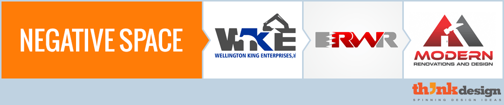
Negative space – experimental but differentiated
Logos hiding some construction symbol or icon in negative space can become a hit only if they are careful to choose one element.
Too many symbols in negative space makes a logo cluttered and hence its design compromises viewer’s recall.
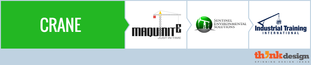
Crane for heavy construction
Where do you spot cranes? Perhaps at all construction site! But the most noticeable ones are found around a place with heavy constructions. Sometimes you see them around high rise constructions site where plazas, shopping complexes, office towers
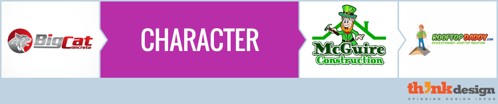
Character makes brand recall easy
Now this is something that very few builders or construction firms will use in their logos. A character lightens the mood of a logo but if designed professional, it can serve as an excellent identity symbol. Some organizations even select the name based on the character like the BigCat concrete which offers a B-B service in construction or Rooftop daddy that serves domestic consumers.
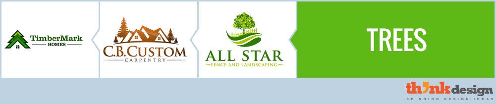
Trees symbolize nature
Since everyone is using homes and elements to depict construction business, new comers need to create more differentiation by going niche. If you specialize in wooden housing construction, or maintenance, the use of trees in your logo can convey the message.
While there are thousands of construction logo templates available, the way to get a unique identity is to customize and personalize your corporate logo.

