#DesignerSpotlight Jessica Hische: Lettering And Illustration Mashup In Graphic Design
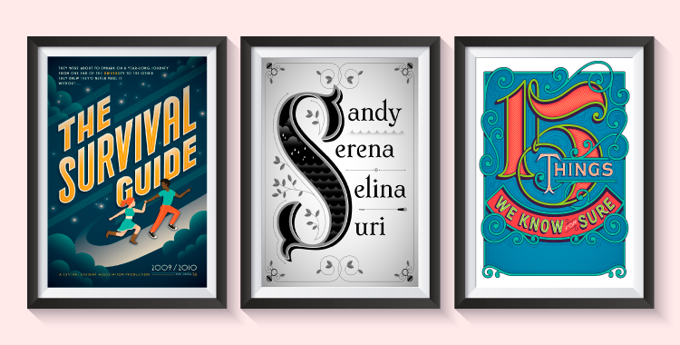
Feature Image Source: Freepik, Jessica Hische
There are somethings (like some people) that fit into each other like a jigsaw puzzle. Designers with typography skills know how to successfully make these connections in the most satisfying and beautiful ways. One such illustrator and type designer is Jessica Hische who uses graphic elements in a way they were “made for each other”.
Let’s plunge into her design career to learn how a young woman made a winning freelance business by marrying letters with illustrations.
Jessica Hische Biography
Born in 1984, Jessica Nicole Hische is a renowned letterer and illustrator originally from South Carolina. After attaining a degree in graphic design and interactive design from Tyler School of Art, she worked with design firms like Headcase Design and Louise Fili.
Starting A Business
Eventually she felt that she could run a business of her own because she figured her freelancing projects were earning her more than a full-time job, so there was no-brainer there. Well, she thought like a smart businesswoman to-be by first collecting at least six-month worth finance to pay her bills before she left her job to start her venture.
Of course when you’re hired you don’t need to worry much about how to get the projects, they’re assigned to you; but when you’re on your own you have to gain exposure for your personal brand and business. Hische’s first gig came from an acquaintance, and then onwards from regional and national magazines up towards brands like Wes Anderson and American Express. “I think it took three or four years of consistent end-of-year numbers to realize that I’d actually created a successful business”, said Hische in an interview.
During this time, she has worked with major brands like Tiffany & Co., Victoria’s Secret, Samsung, Nike, OXFAM, Penguin Books, Starbucks and Target. The list will keep expanding as she progresses.
Design Side-Projects
In addition to her primary business, she works at a collaborative studios Title Case, The Pencil Factory and Studiomates. This talented young woman is also running a side-project with her husband whereby they share tutorials for newbie web designers and web developers.
Moreover, she writes and designs picture books and conducts masterclasses on platforms like Skillshare. She also speaks about design at conferences and finds that interaction with people the most inspiring time of the day.
Also Explore: Alan Peckolick – When Typography Takes Center Stage In Graphic Design
Inspirational Sources For Typography Design
To maintain a successful career in type design, typography and illustration you need a constant dose of creativity. It’s important to find resources that inspire you to do original and imaginative work every single time without fail.
For Hische, her mentor Louise gave her the essential skills and methods to begin a startup. If you find individuals you think you can learn from then you must make notes of all the necessary things so you remember them for life. Her heroes also include Marian Bantjes, Doyald Young, Alex Trochut, Chris Ware and Matthew Carter among others.
The designer also advices noobs to be aware of all the type that is around you in print or digital form. The “back catalogue of influences will help you the most” and to be honest, this is something we all do. Whenever we see something worth-it, we memorize the design or just save it for later.
She says, “You don’t need to have formal education in type, to learn type and understand type.” It all comes down to your observations. Although it takes time to educate yourself about type designing and typography, but by doing so you gradually begin to develop your visual vocabulary.
Mashup Lettering And Illustration
So how do letters and illustrations come together? Here are some techniques I found in Jessica Hische’s work that’ll help you with your projects.
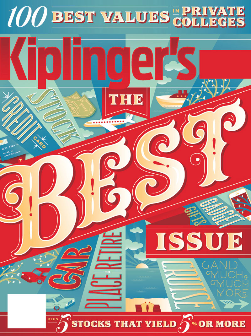
1) Use lines to give a sense of direction. Line is a visual design element that comes right after a point. It helps the creator to lead the viewers’ eyes from one point to another.
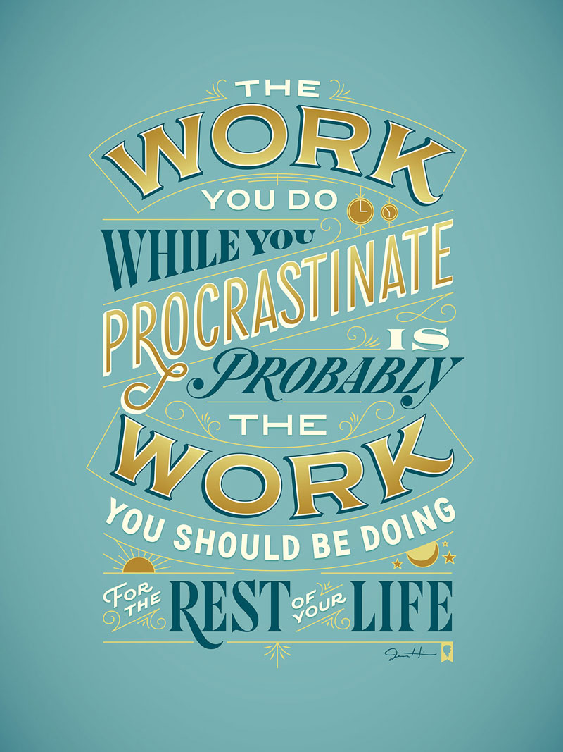
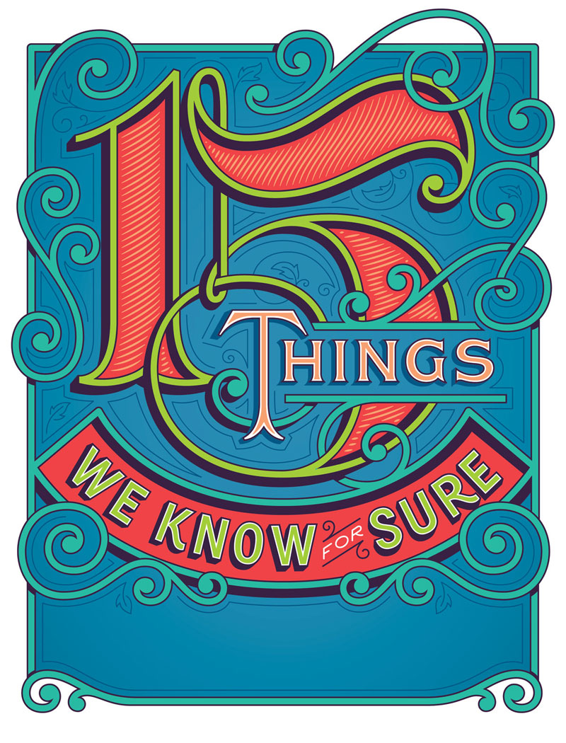
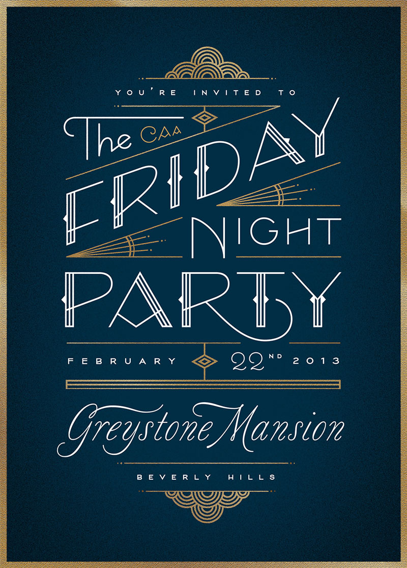
2) Use organic forms to create a landscape or scene. Organic shapes are asymmetric and irregular. They’re found in our surroundings whether man-made or natural. These forms are relaxing and relatable.
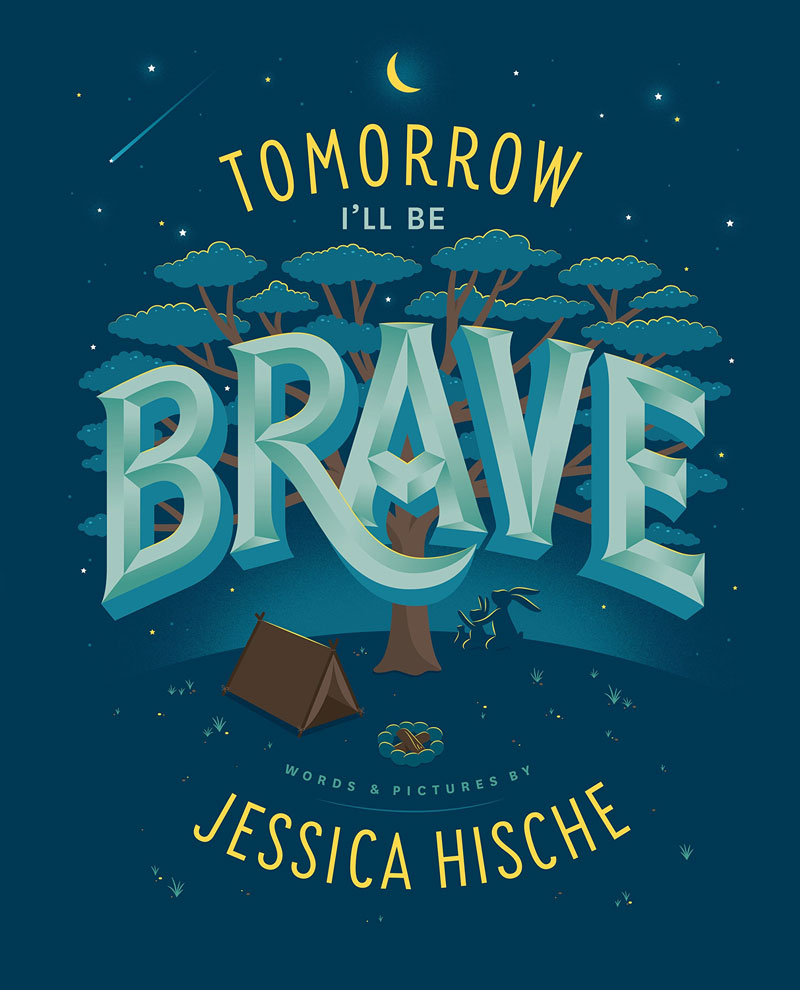
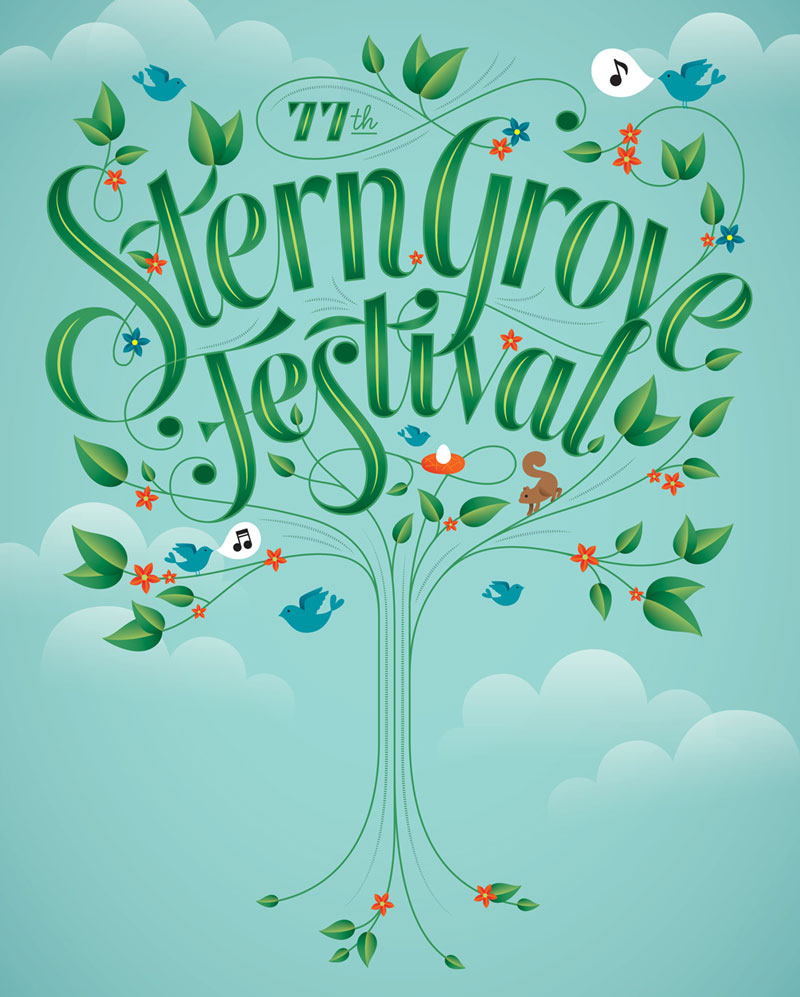
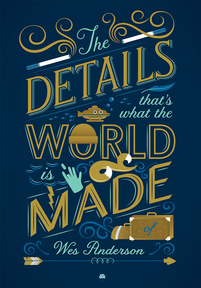
3) Add a pattern over type design to give it a personality. Overlaying repetitive shapes on the letters gives a character to your typography and visually uplifts it. It also helps to create a directional flow.
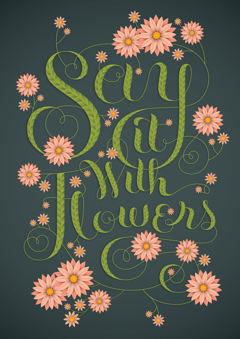
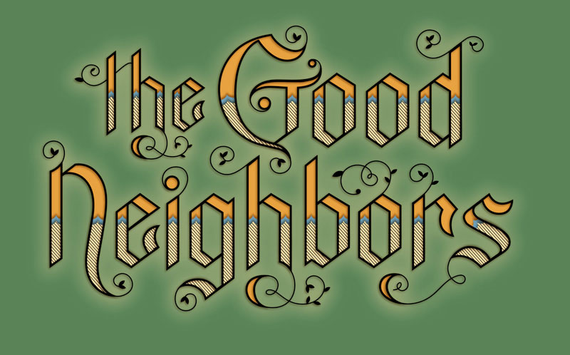
4) Use geometric shapes for spotlight and highlight. The simplest types of shapes like rectangles and circles can accentuate a typography design.
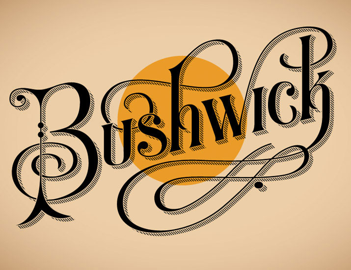
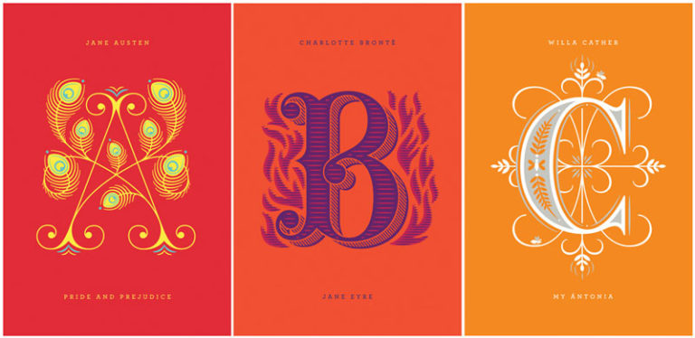
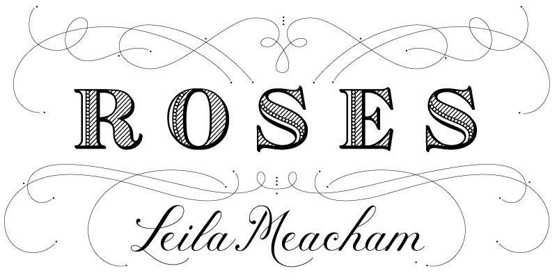
5) Embellish your custom font with filigree. A delicate artwork that gives a vintage look to anything it is added to. Originally a type of jewelry design, but it’s used to beautify graphic designs.
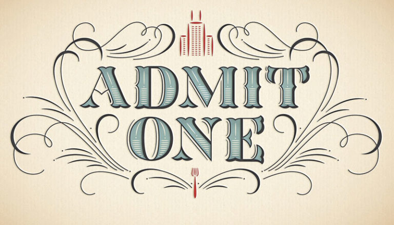
Do you have any tactics to pair type and illustrations? Share one with us.
Images Credit: Jessica Hische
