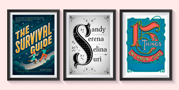
#DesignerSpotlight Malika Favre – How To Make Bold And Beautiful Minimal Illustrations
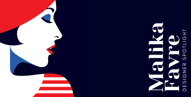
MalikaFavre.com
Having a style and being stylish are two different things but Malika Favre has got both!
Favre is a French illustrator based in London. She began her career as a graphic designer and later focused her profession on illustration. Her work has been used by top magazines such as Vanity Fair, The New Yorker, and Vogue.
She has a distinguished flair in her illustration artworks that are contemporary and modish. Her pop art illustrative pieces are chic and perfect for editorial designs. You can say, she is an advocate for minimalism because all of her works are sans elaborate detailing – and tell you what, that’s the beauty of it.
This #designerspotlight is not based on translating her life into words instead, I observed Favre’s work to grab inspiration from her design style so that newbie designers can learn how to make striking graphics.
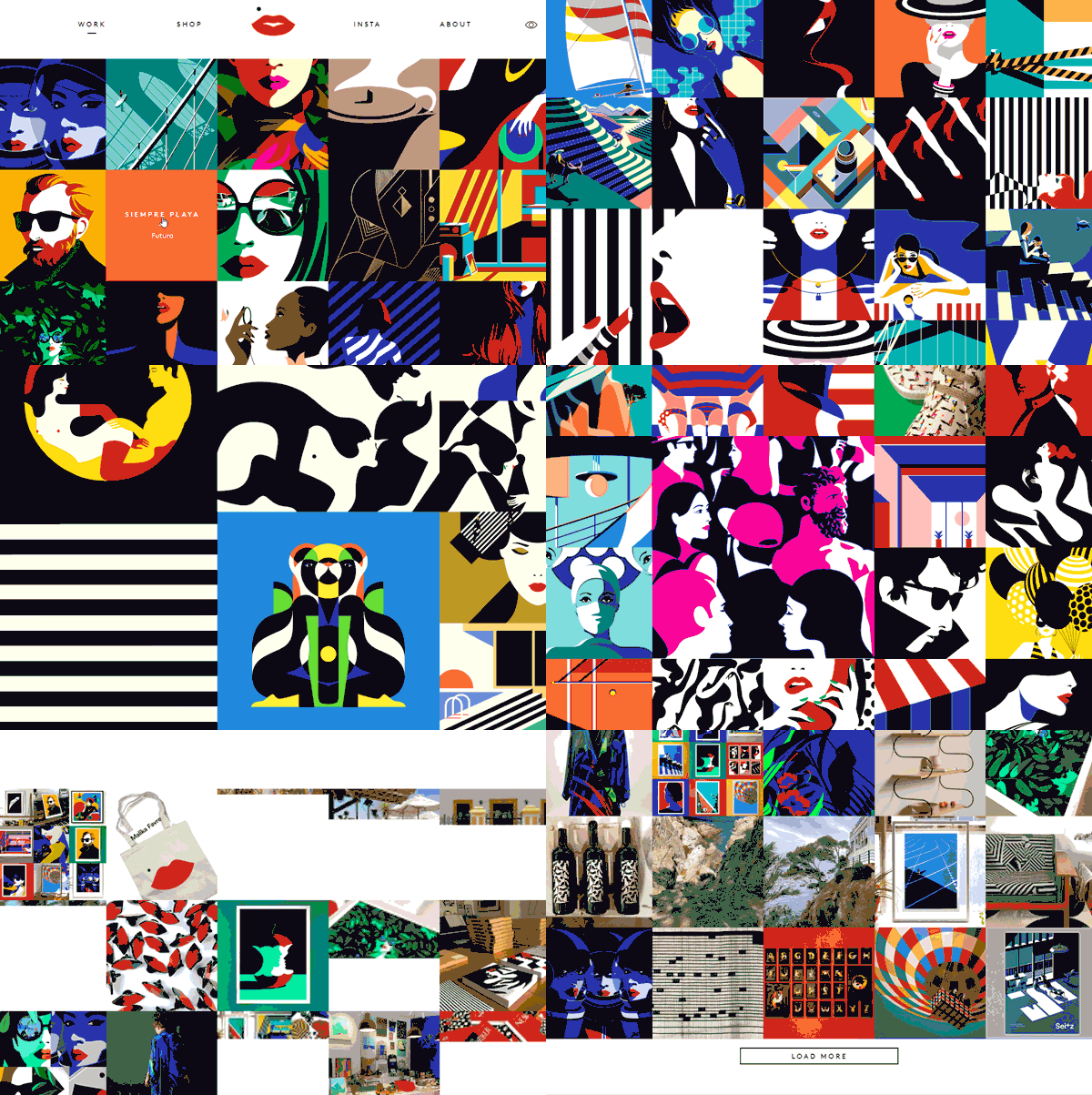
Image Source: malikafavre
Color Choices Matters
1) Flaunt A Simple Color Palette
Well, some designers think the more colors they add better detailing in a drawing. If you want to create elaborate illustrations then you can expand your color palette. But for minimalist designs you need to limit the color scheme to less than five hues.
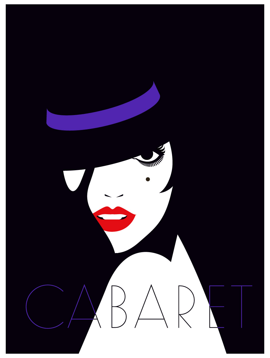
Image Source: malikafavre
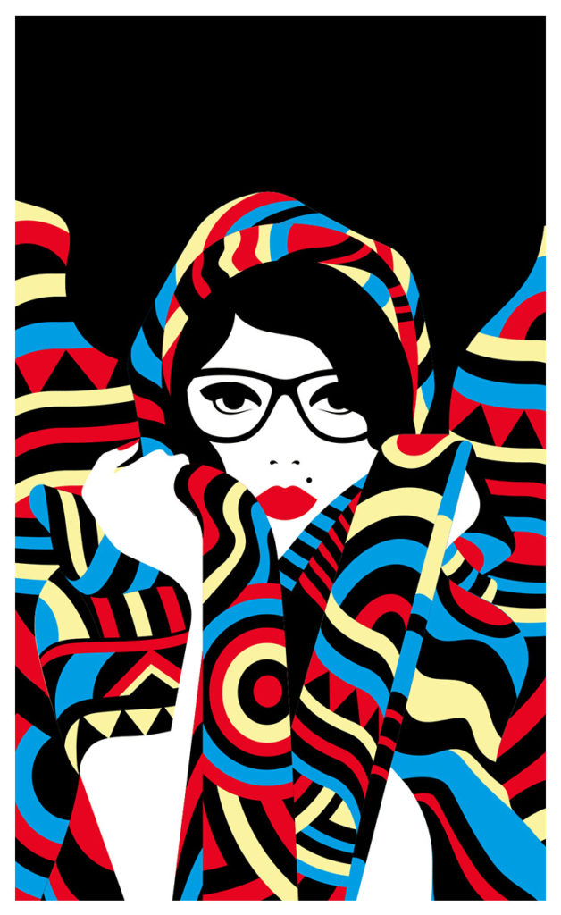
Image Source: malikafavre
2) Select Bright And Contrasting Hues
No doubt pastels have their sweet charm but Favre’s bold and beautiful minimal illustrations are far from that zone. Her designs are focused on daring and distinct colors that instantly catch the viewer’s attention.

Image Source: malikafavre
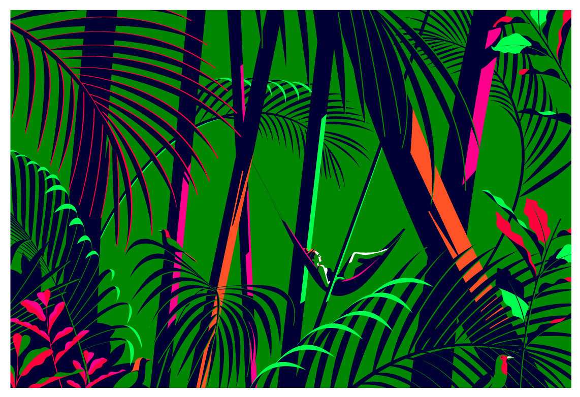
Image Source: malikafavre
3) Use Color Shades For Shadows
Creating scheme of colors isn’t a piece of cake, to be honest. You need to work out the color wheel to create a color palette that has colors you can use for highlights and shadows in illustrations. Observe Malika Favre’s graphical art, they’re pasted with brightness and dimness.
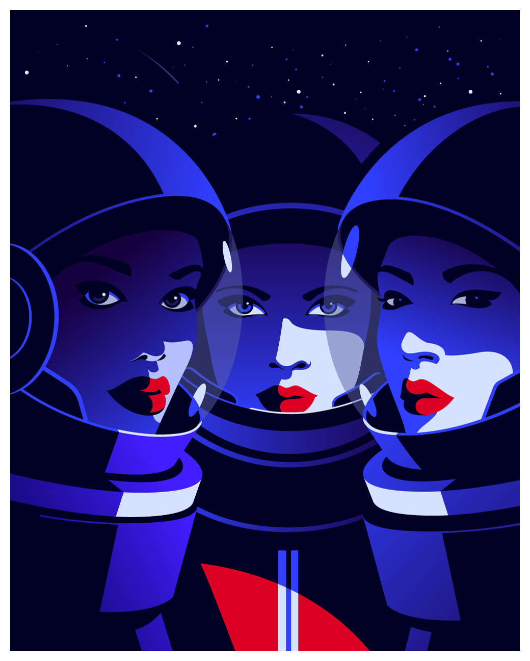
Image Source: malikafavre
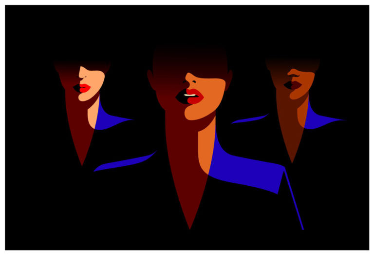
Image Source: malikafavre
4) Know Where To Use Which Color
When symbolizing a confident woman in your illustration, never forget to paint her lips red. With this one step, you can turn your simple girl into a fashion icon. Choose shades and tints of red for different looks. Pink and red are the top picks.
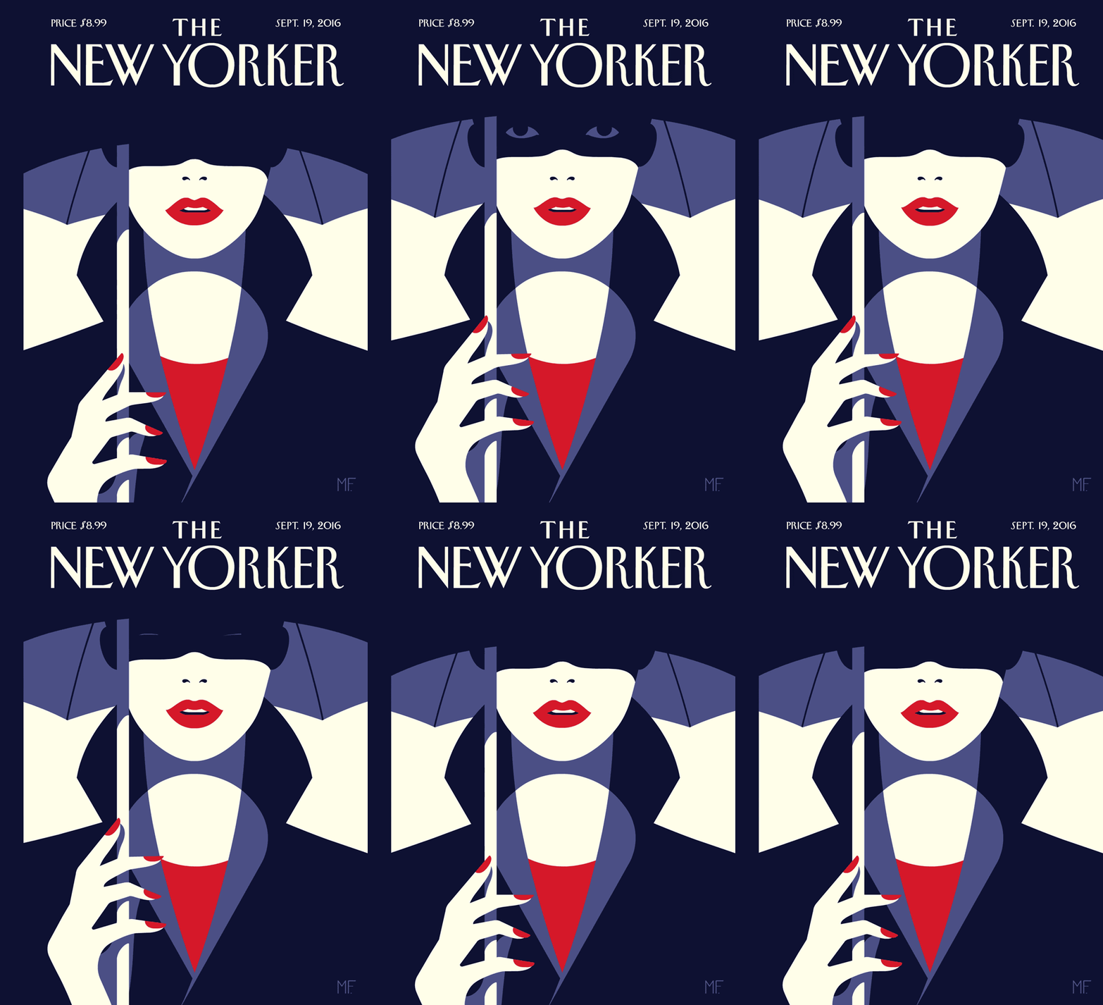
Image Source: malikafavre
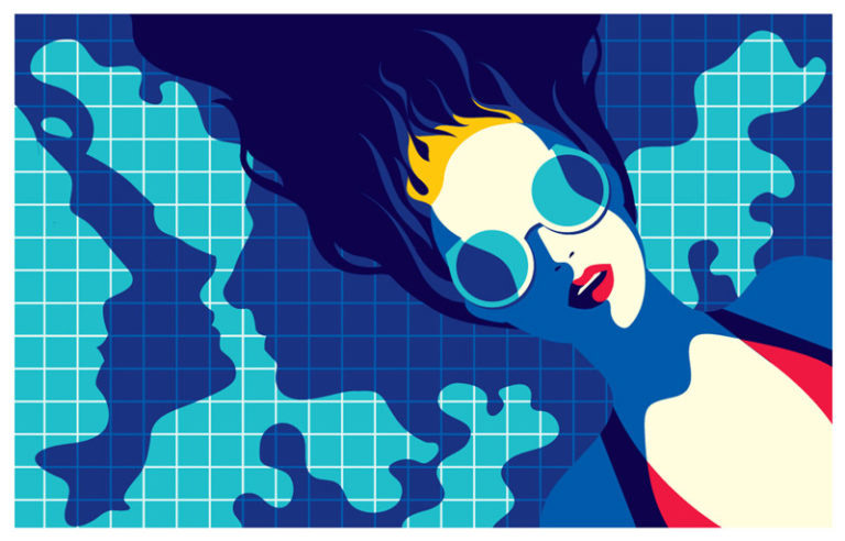
Image Source: malikafavre
Shape Psychology In Design
5) Work With Geometric Patterns
To create flawless patterns for background or foreground, you can conveniently choose geometric shapes such as triangle, square, circle and rectangle. These are basic two-dimensional forms that can be creatively placed into a repetitive composition.
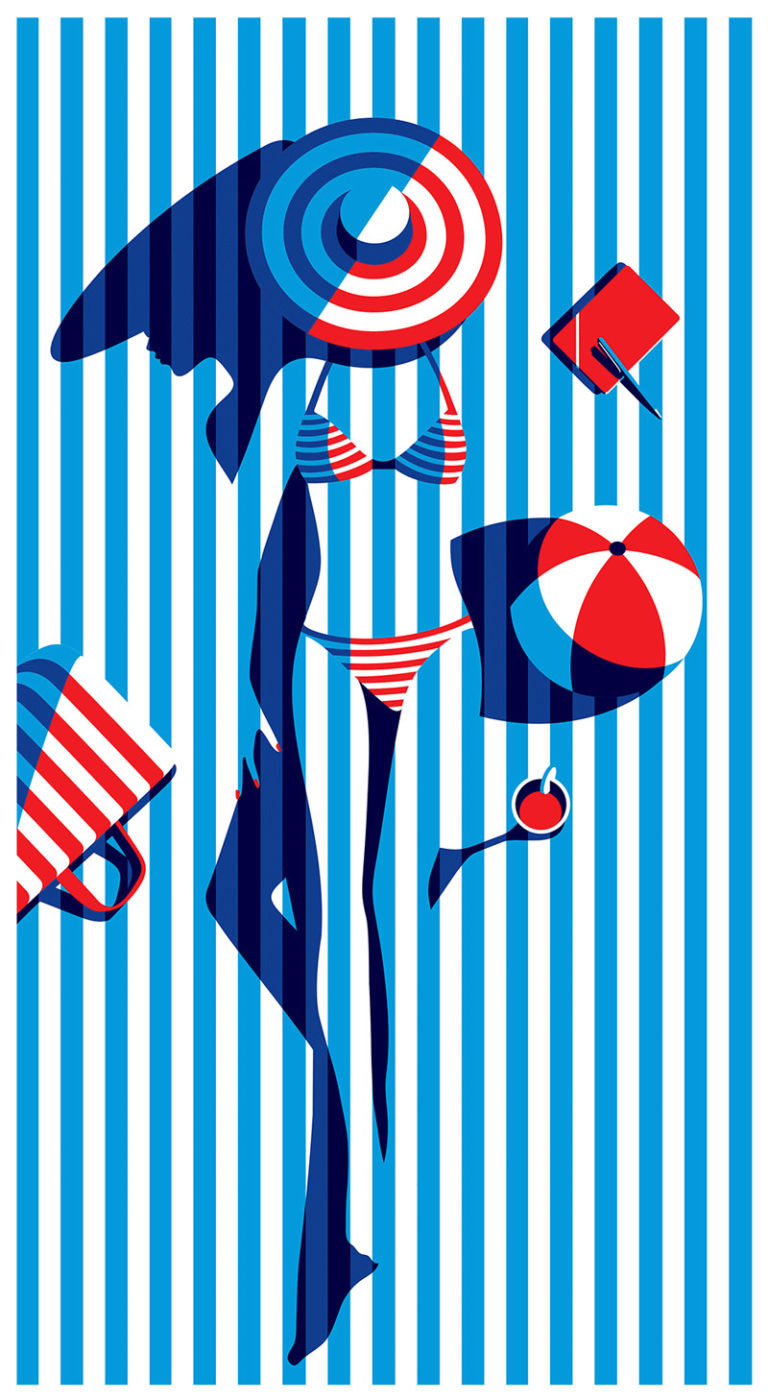
Image Source: malikafavre
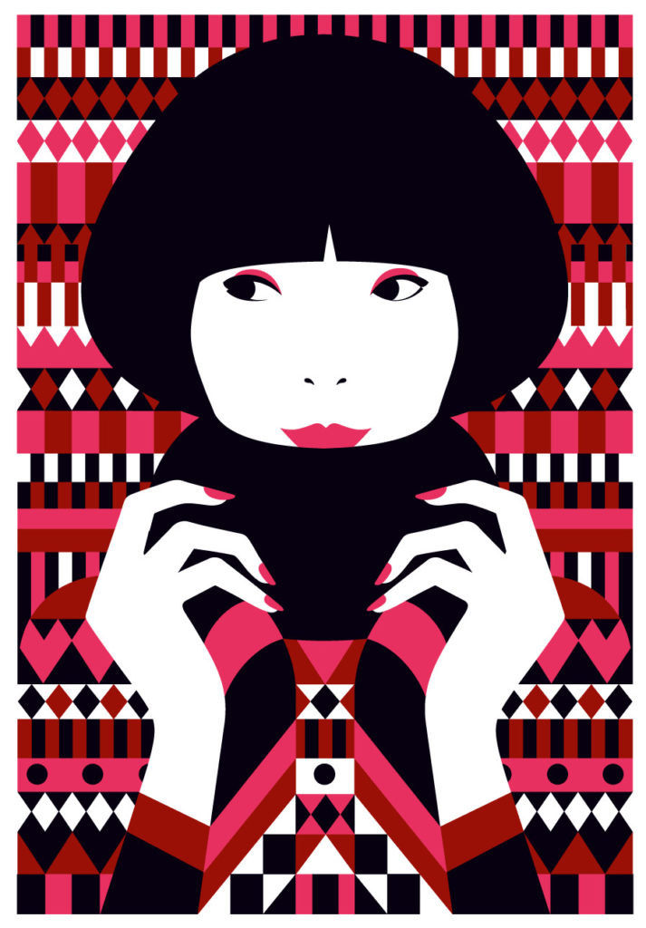
Image Source: malikafavre
6) Include Curves In Shape Edges
Geometric designs are cool but curves add splendor to forms. A curving contour implies fluidity and is seen as a decorative style. You can add a curve to any shape, it doesn’t have to be a circle. A curve with a straight-edged shape creates an interesting contradiction.
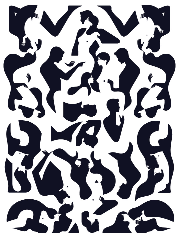
Image Source: malikafavre
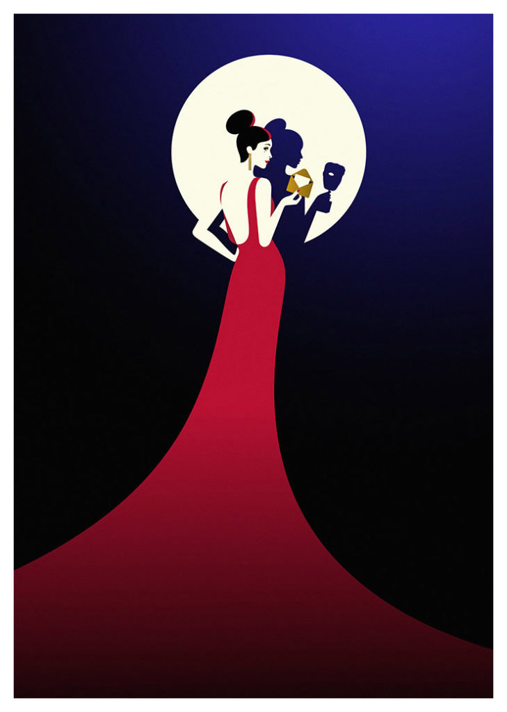
Image Source: malikafavre
Sensory Experiences Give Oomph
7) Play With Optical Illusions
Some of the best optical illusions like the Muller-Lyer Illusion or the Zollner Illusion have twisted our senses enough. Favre uses the illusion method to show continuity and also to merge the two grounds of an illustration. It gives her graphic art designs an unusual look.
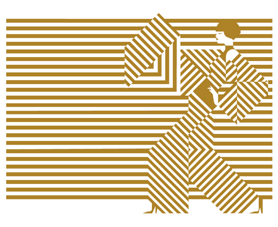
Image Source: malikafavre
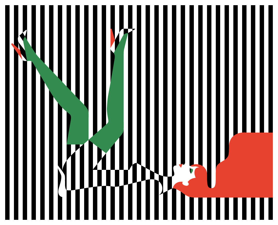
Image Source: malikafavre
8) Use The Collage Technique
The one thing on top of the other plays tricks with your visual sense because you are continuously trying to figure out the start and the end, or the background from the foreground. Making a collage is a stimulating visual art method to combine different forms.
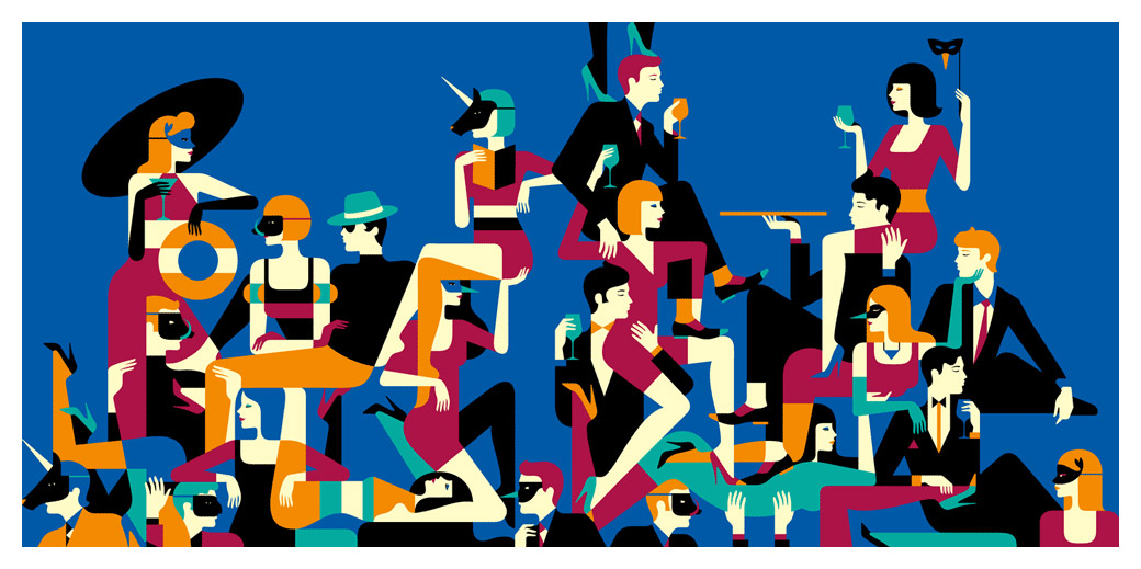
Image Source: malikafavre
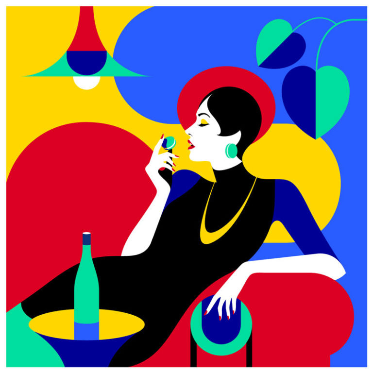
Image Source: malikafavre
Plan The Composition
9) Add Proximity Between Figures
For that sultry appearance always cleverly use space and make sure to decrease the one between organic forms resembling human and animal body parts. Favre has jam-packed graphic elements in some of her bold illustrations to present and evoke sexual feelings.
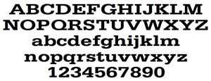
Image Source: malikafavre
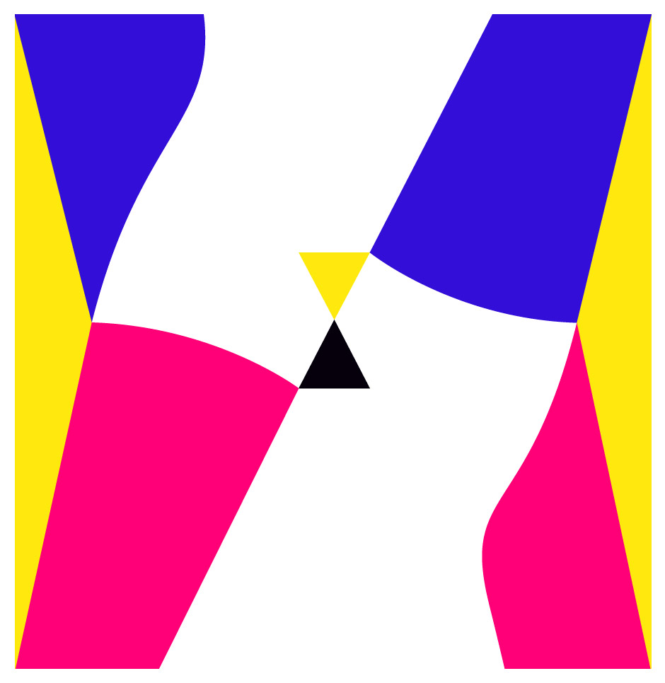
Image Source: malikafavre
10) Never Miss Out On White Space
White space is not the same as negative space just to make that clear, but they both are concerned with space. White helps to add charm to a design and aids to break the monotony of colors and patterns.
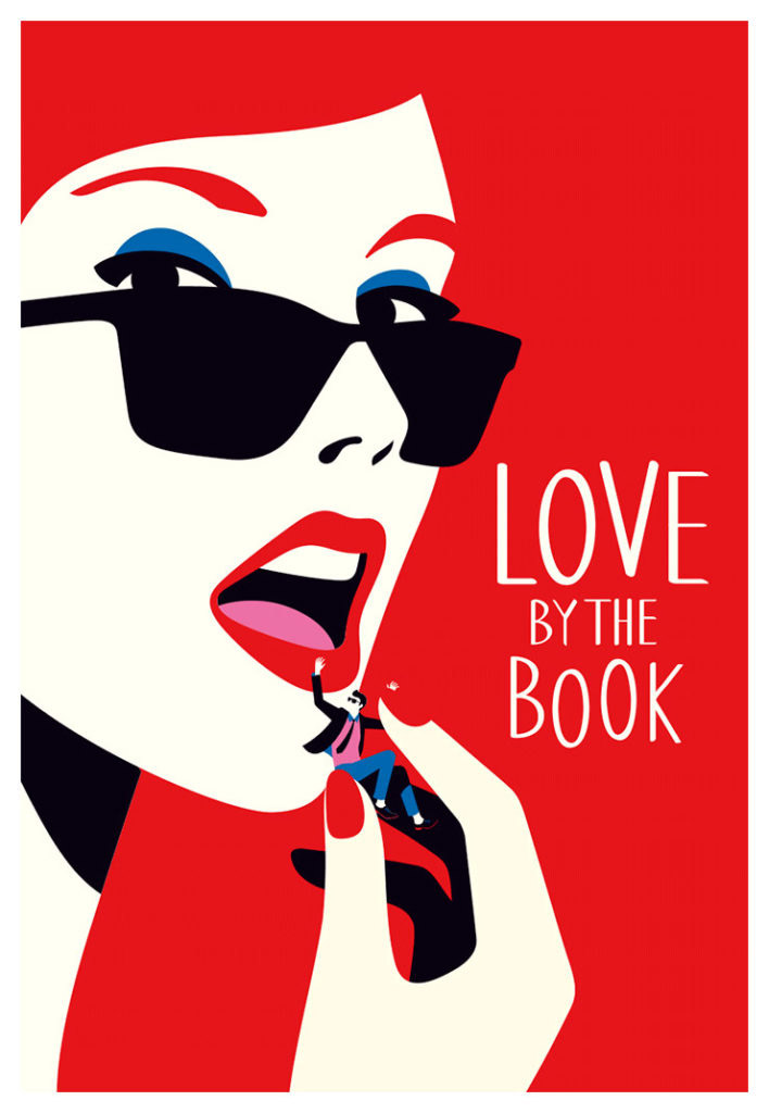
Image Source: malikafavre
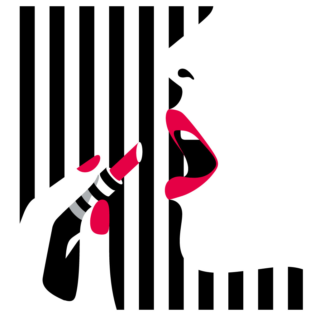
Image Source: malikafavre
I first came across Malike Favre’s work last year. Instantly, I fell in love with the way she incorporates colors and shapes to make remarkable minimal illustrations. This is the kind of work you can take inspiration from to uplift your branding and marketing visuals. Hope you enjoyed this short journey into exploring her work.
Which of these bold and beautiful techniques will you use?
