7 Ways To Add The Latest Disruptive Technologies In Website Designs
Featured Image: freepik.com/pch.vector
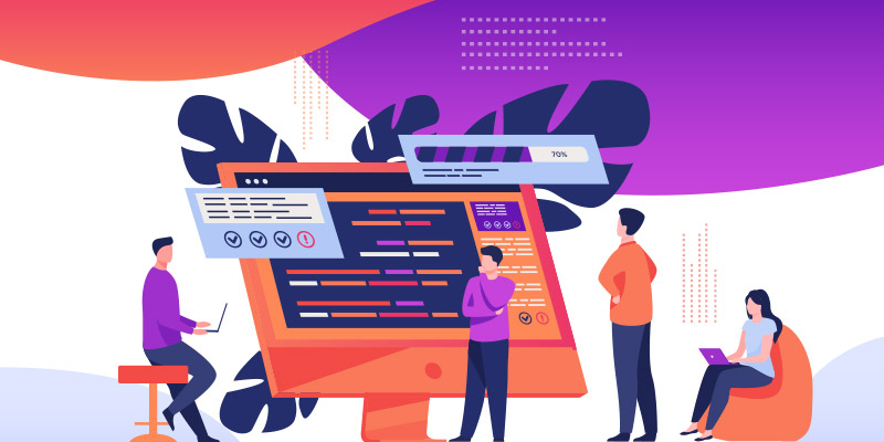
As the digital landscape continues to evolve, it also affects a vast number of technologies along its way that includes website design and development as well.
The latest disruptive technologies are constantly emerging, promising to transform web design innovatively to provide a unique experience to visitors. Like AI chatbots that answer user queries quickly or AR/VR in showcasing products and services to users in real-time. Such technologies give businesses and organizations a very big competitive advantage.
To use such technologies, website designers must constantly explore to see which technology best showcases their services and provides great value to users.
Today we will explore 7 innovative ways to incorporate the latest disruptive technologies in website designs.
You will learn the benefits of each technology and how each of these technologies helps your business or organization in the long run. So let’s get started.
1. Mobile First Design
Creating a mobile-friendly website is an integral part of designing a website and one of the main factors in SEO ranking as per Google guidelines. Websites must be optimized and perform the same for all devices, regardless of their screen size or specifications.
The benefits of mobile-first design are manifold. It improves user experience, reduces website bounce rates, and improves website traffic.
2. AI Chatbots
AI chatbots are becoming increasingly popular as a way of answering user queries on the website. Recently, the integration of AI voice cloning into these chatbots has made their responses sound even more human-like, enhancing the user experience.
These chatbots are programmed to provide real-time customer assistance in the same way a human would speak. Such assistance helps the user navigate the website and address their concerns.
The benefits of AI chatbots are many. They can improve customer satisfaction, reduce wait times, and increase website engagement. They can help businesses save time and money by automating customer support.
Businesses don’t have to hire actual employees and pay them monthly salaries just for customer support when AI chatbots can do all this for free.
Many famous businesses and corporations have incorporated AI chatbots in their websites and other applications to assist customers. Some examples include:
- Mastercard: Mastercard has an AI chatbot called “KAI” that helps customers with their financial needs, including providing information on their account balance, transaction history, and spending patterns.
- Domino’s: Domino’s has an AI chatbot called “Dom” that allows customers to place pizza orders, track deliveries, and receive updates on their order status.
- Starbucks: Starbucks has an AI chatbot called “My Starbucks Barista” that allows customers to place orders through voice commands, text, or messaging. The chatbot also provides recommendations and answers questions about the menu.
- Spotify: The popular music streaming service uses an AI chatbot to help users discover new music and make personalized playlists.
- H&M: The fashion retailer uses an AI chatbot to help customers find the right clothing size and style and answer general questions about products and store locations.

Image Source: dribbble.com/Octet Design Studio
3. Voice User Interface (VUI)
Voice user interface (VUI) technology helps visitors to interact with websites through voice commands. VUI technology has become increasingly popular since the introduction of voice assistants like Alexa and Google Home.
Websites can incorporate VUI to allow users to interact with their website through voice commands. The VUI technology provides an accessible way for users to interact with a website.
VUI technology helps to improve user experience and keeps a visitor engaged on a website thereby increasing dwell time. Having a high Dwell time matters a lot in SEO of a website.
Here are some examples of famous websites that have used Voice User Interface (VUI) in their web designs:
- Google: Google has integrated voice search functionality into its search engine, known as ‘Google Assistant,’ that allows users to search the web by speaking their queries. Google Assistant is also an AI-powered virtual assistant that can be accessed via voice commands.
- Apple: Apple’s VUI called ‘Siri’, can be accessed via voice commands on Apple devices. It helps to answer different user queries without having to actually type anything.
- SoundHound: SoundHound is a music discovery app that allows users to identify songs by singing or humming the tune.
- Amazon: Amazon’s Alexa, an AI-powered virtual assistant, can be accessed via voice commands on its Echo and other devices.

Image Source: dribbble.com/Chanhwi Park
4. Virtual Reality (VR)
Virtual reality (VR) technology is another trending technology being used for various purposes.
Such technology helps to create an immersive experience for users.
Websites can use VR to showcase products or services, allowing users to experience them in a simulated environment. Such technology can also give a massive edge to businesses over their competitors if done properly.
The VR technology provides an engaging and immersive brand experience for users. In addition to increasing engagement on a website, it allows a business entity to showcase its products or services uniquely.
A few websites that have integrated Virtual Reality (VR) into their web design are:
- Lexus: Lexus has created a VR experience on its website that allows users to explore its newest vehicle, the LC 500. It allows a 360-degree detail view of its exterior and interior features.
- Toyota: Toyota, similar to Lexus, has also created a 360-degree video experience allows users to explore the Toyota Mirai and learn more about its technology. You can access this feature on Toyota official website.
- Red Bull: Red Bull also has created a VR video experience in augmented reality to allow its users to experience a Red Bull Air Race from a pilot’s perspective.
- IKEA: IKEA has created a virtual reality app that shows users the designs of different rooms and allows them to test out different furniture configurations and see how items would look in their homes.

Image Source: dribbble.com/Arya Wijaya Kusuma
5. Augmented Reality (AR)
Augmented reality (AR) technology, quite similar to Virtual reality (VR) that helps the user get digital information on the physical world. Putting it simply, AR enhances the real-world environment with virtual information while VR creates a completely fictional world.
Websites can use AR to showcase products, allowing users to see them in different settings.
This allows users to visualize and interact with products and services more tangibly.
Listed below are examples of popular brands that have used Augmented Reality (AR) on their websites:
- Sephora: Sephora’s AR app allows users to try virtual makeup using the camera on their smartphone or tablet. While using this app, users can see what different colors and products would look like on their faces.
- Lego: Lego AR app that allows users to see how virtual sets would look in real-world environments. Users can place and manipulate virtual Lego structures in their own space using the camera on their smartphone or tablet.
- Converse: Converse has an AR experience on its website that allows users to try virtual shoes and see what different styles, sizes and colors would look like on their feet.

Image Source: dribbble.com/Musemind Mobile
6. Blockchain
Blockchain technology is a decentralized, distributed ledger used to record transactions securely. It can improve website security and increase transparency in online transactions. Websites can incorporate blockchain to create a secure platform for transactions.
Blockchain technology helps to improve user trust, reduce transaction costs, and provide many long-term benefits that help to build brand reputation.
The following brands have implemented blockchain technology in their websites and services:
- Walmart: Walmart has been using blockchain technology to track the origin and journey of its products once they are purchased on a website.
- IBM: IBM is one of the leaders in blockchain technology, offering a wide range of products and services based on this technology. Its website features information on how the technology can improve supply chain management, digital identity verification, and more.
- Maersk: Maersk, one of the world’s largest shipping companies, has implemented blockchain technology to streamline the shipping process and reduce fraud incidents. Its blockchain platform, called ‘TradeLens,’ allows shipping companies, ports, and customs authorities to share data and reduce the time and cost of transporting goods.
- Coca-Cola: Coca-Cola has started using blockchain technology to manage its supply chain, to ensure its raw materials are ethically sourced.

Image Source: dribbble.com/Outcrowd
7. Use Progressive Web Apps
Progressive web apps are web applications that provide a native app-like experience to users. They can be installed on a user’s home screen and accessed without an internet connection.
You can create a more engaging and seamless user experience by using progressive web apps in your website design.
For example, a news website could use a progressive web app to provide users with a more interactive reading experience, with features like push notifications and offline reading. Many websites do have such progressive apps too; here are some examples:
- Twitter: Twitter Lite is a PWA that allows users to access Twitter on slow internet connections and low-end devices. The PWA provides a native app-like experience, including push notifications, offline access, and fast loading speeds.
- Forbes: Forbes has a PWA that provides users with a fast and engaging mobile experience. The PWA features offline access, push notifications, and a smooth user interface.
- Pinterest: Pinterest has a PWA that allows users to access the platform without downloading the app. The PWA provides a fast and engaging experience, with features such as push notifications and offline access.

Image Source: dribbble.com/Onilab LLC.
Advantages of Adding Disruptive Technologies in Website Designs
Now that you understand which disruptive technologies you can add to your website, let’s read on to see what advantages such technologies give to businesses.
1. Enhanced User experience:
Disruptive technologies such as, VR and AR can enhance the user experience while providing an immersive and interactive experience.
Using Virtual Reality (VR) for example, users experience scenes and objects that appear real, immersing them in the world around them. These objects can be products and services a user and can see and feel how they would look in reality.
2. Increased Engagement:
Disruptive technologies can help increase user engagement by providing new and unique ways to interact with a website. For example, chatbots can provide instant customer service and support, and answer user queries in a similar manner as a human operator would do.
3. Improved Personalization:
Disruptive technologies can also help websites provide a more personalized experience for users.
Machine learning algorithms can analyze user behavior and preferences to provide personalized recommendations, while targeted advertising can show users ads more relevant to their interests and needs.
4. Competitive Advantage:
Websites that incorporate disruptive technologies can gain a competitive advantage over those that do not.
By providing a more engaging and personalized experience, these websites can attract and retain more users, leading to increased customer loyalty and higher conversion rates.
5. Increased Security:
Disruptive technologies can also improve the security of a website and help to protect private client data. Such as by, using blockchain technology we can automate payment tasks and provide a safe and secure way for online transactions.
6. Improved accessibility:
Disruptive technologies can also help make websites more accessible to users with disabilities. For example, voice-activated interfaces (VUI) can make it easier for users with mobility or vision impairments to navigate a website and find their desired products or services especially on an E-commerce website.
Conclusion
By incorporating the latest disruptive technologies in responsive web design, as explained in the article, businesses can stay competitive, and enhance the user experience.
Using such technologies, websites can create unique, personalized, and immersive experiences for visitors. While each technology has unique benefits and challenges, businesses can experiment with these technologies to see which best suits their website needs.
So if you are looking to provide a fresh experience to your website users and increase brand reputation, be sure to implement the technologies discussed in this article.
