Why Google Needed a New Logo Design

If the innocuous transformation (below) of the four colorful dots from circles to a complete Google logo isn’t a reflection of the fact that Google rules our world, then what does, I don’t know. Since its inception as “Backrub” to “Google”, the brand has been transforming lives with some of the most fantastic products and services, namely, a no-nonsense search engine; a dynamic social network that brings professionals together; an email domain system that is utterly reliable; and an always available Google drive, to name a few. That’s what make Google such a beloved brand.
Google Announces New Logo
What do you think of #Googles new logo? pic.twitter.com/DhVCGo2csX
— Reuters Tech News (@ReutersTech) September 1, 2015
So it was quite a shock when Google announced a conglomerate company Alphabet which would rule all the brands Google had acquired and given its users pleasure over the years. While co-founder Larry Page at the time had made it clear that Alphabet will not be branded, the question that boggled us all had been, “What’s the future like for Google?” (Read that “what’s going to happen to us!”). And then yesterday, Google popped up with a new logo. Obviously, an uproar was imminent.
Explore: Google’s New Android Icons Redesign
Reactions to New Logo
In an age of social media, the online community can really be good if they want to, and not to mention creative:
Who shot the serif? #googlelogo
— Tasmo (@_Tasmo) September 1, 2015
Can you design a better #GoogleLogo asked @guardiantech (http://t.co/sjdxSohlEy). Yes, yes I can. pic.twitter.com/MHltSfRACB
— Keir (@keiross) September 2, 2015
Hey @google, we can do that too… @VideoScribeApp #GoogleLogo pic.twitter.com/Dzft73z9UP
— Sparkol (@SparkolHQ) September 2, 2015
Hey @Google you have inspired us as well! #GoogleLogo #Bitcoin pic.twitter.com/1Zhc8aBxTF
— Blocktrail (@blocktrail) September 2, 2015
Hi @Google, you’ve inspired us too… #Googlelogo #SmilingE pic.twitter.com/RIuysTkdsk
— Heineken NL (@Heineken_NL) September 1, 2015
And then there were others (including companies) who were not so kind, downright mean is an understatement. They didn’t hesitate a minute to show their disapproval.
And with that, the elusive serif’s conservation status was reclassified to Critically Endangered http://t.co/FUceCcfHdG #Google #googlelogo
— Colin Matthews (@SVNDER) September 1, 2015
I wonder how many people were involved and how much money was spent to change the font? pic.twitter.com/Yf5kcT2OwH
— Tony Michael (@TonyMichael) September 2, 2015
People say don’t change. But #Google changed http://t.co/5tdPGz7aiy
— SHAANDAAR Alia (@aliaa08) September 1, 2015
hey @RachelintheOC I think an evil human-killing computer super-cluster would have much better design sense. pic.twitter.com/KkDxCzDTPv
— AboveTopSecret (@AboveTopSecret) September 1, 2015
Why Google Redesigned its Logo
Nevertheless, Google did change. If you’ve been reading the signs you’d have known why Google has redesigned its brand identity. While the online community is busy oohing and aahing about the new logo, here’s a thought to go forward with. Brand redesigns don’t happen overnight; they happen for several reasons. There have been sure signs of a logo redesign in the case of Google.
a. Change of Mission & Vision
Google had started out with a search engine that was simple and easy to use. It did that for many years, and grew into a giant of a brand. It stuck with its logo variations but the time has come that it redefined its mission and vision. Alphabet became the announcement of this change, and the logo announced yesterday was a visual reflection of this.
b. Diversification of Product Range
Google no longer represents the mixed bag of highly diversified product offering from Nest to Android OS etc. Google is no longer associated with search engine alone. It needed an identity change that would separate it from the core service it provides. So while Alphabet will hold the other brands, Google the brand will be exclusive to all things search whether its searching for people, location, things on the internet, offline monuments or whatever strikes the user.
c. Appeal to Acceptance
Google has always been a youthful brand that spearhead all things innovative. The old logo needed to jumpstart fans and followers to come on board with its new brand direction, and tell the story of an interactive brand that will eventually dominate all type of devices. A new logo was needed to represent this, and appeal to the masses to accept the change.
d. Design for a New Age
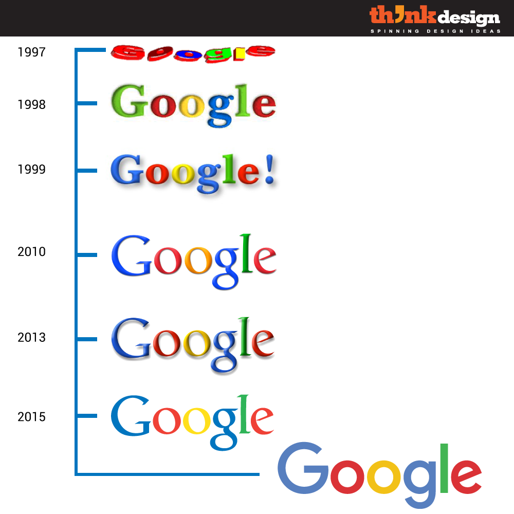
While the above tweets seemed to indicate people hated the design, the evolution of the Google logo to this stage was expected. All through the ages Google has maintained its brand color, and that has been critical too in this new logo to sustain branding. With the change of each logo, we witness Google has adapted well to the font of the time (see below). From chunky letters to serif and now sans-serif fonts, Google knows the need of the design hour. By going flat, “shooting the serif” with Product Sans (its own creation) and adding elements of different Google products, it actually has outdone itself in the redesign arena.
To say that Google has redesigned unintentionally and without a thought is unjust. When a brand as big, and as knowledgeable as Google makes a decision, trust me, it means a big change.


