Bad To Bad Logo Designs Based On Popular Opinion: UBER, Animal Planet, What Else?
Feature Image Source: Freepik
Is it just me or some brands have completely lost it? Lost creativity, originality and a good sense of aesthetics I mean. Everyone was just figuring out the new UBER logo when Animal Planet shook us with their brand identity redesign.
So when you’re redesigning your logo, the aim is to look better not bad. However, seeing these companies it seems that they’re steering against the notion. Let’s scrutinize some bad to bad logo designs that’re constantly failing to impress.
Dubious Brand Design: Uber
A good brand design is clear on what it wants to deliver and how it wants to look, but sometimes some businesses fail to accomplish this clarity. Such is the case with Uber. It never found satisfaction in its brand image, and this is why the company’s logo kept changing from one logotype to another.
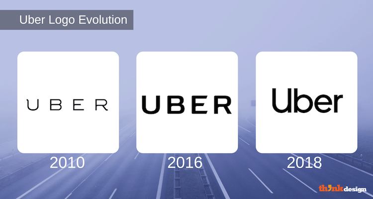
When the company launched in 2009, the logo seemed brittle with awkwardly curved serifs in the letters “U” and “R”. From UberCab, the company shortened its name to Uber and ousted CEO Travis Kalanick ruined it with an in-house design that received countless criticisms in 2016. The typeface was peculiar yet better than before, but what put the company in deep water was its app icon design.
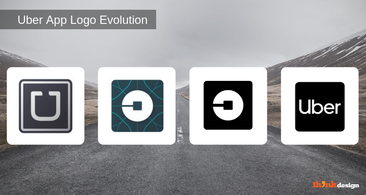
Due to the uproar, the company had to get rid of the strange app icons. And just recently, it introduced a new brand design with a custom typeface called Uber Move. The new CEO, Dara Khosrowshahi says “it’s time to move in a new direction. And I want you to know just how excited I am to write Uber’s next chapter.”
The new @Uber logo is so fucking boring. #design pic.twitter.com/4XaRPa3L20
— ᴺᴼᵀ Jony Ive (@JonyIveParody) September 17, 2018
We often hear “less is more” but I don’t completely agree with it because many brands are taking this phrase too far. They’re literally ripping away every element from their respective logo design – making it look naked or incomplete.
“A designer knows he has achieved perfection not when there is nothing left to add, but when there is nothing left to take away.” – Antoine de Saint-Exupery
Born To Be Too Wild: Animal Planet
When the typographic logo design of Animal Planet came out, we were in awe as to “what the heck they just made!” Not that the old visual identity was appealing, but at least when you aim to evolve you tend to get better not worse. Anyway, we accustomed our eyes to bearing the sight of that mess, or at least what we did was pretend to ignore it.
Surely many designers thought it can’t get worse than this right? Ah, hold that thought. Animal Planet created a new visual this year to represent their fresh brand identity. They went with a ‘kind of’ abstract elephant and an overall minimal look with an arbitrary typeface choice. The elephant symbol comes from the 1996 logo design, which had the same animal in negative space along with a globe.
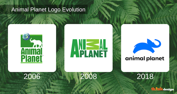
People have commented on blue being the rarest occurring color in nature, the elephant is leaping like a dog, or that it’s one miss after another.
Animal Planet changed their logo and I’m not sure how I feel about it yet. pic.twitter.com/aCxBziTnUL
— ( not so ) รקà¹à¹Ðº×¥ á´…á´œsᴛɪɴ 🎃 (@dustinjax) October 18, 2018
I’d leave it to you to decide if the logo design is thumbs up or thumbs down. However, I feel if they improve the icon shape a little more in the coming years then we might finally get a hit design from Animal Planet.
Confused Mood: Tribune Publishing
So there are people who’re undecided, but with something as big as your brand identity you can’t always be in a dilemma. You need to make the right decisions about design.
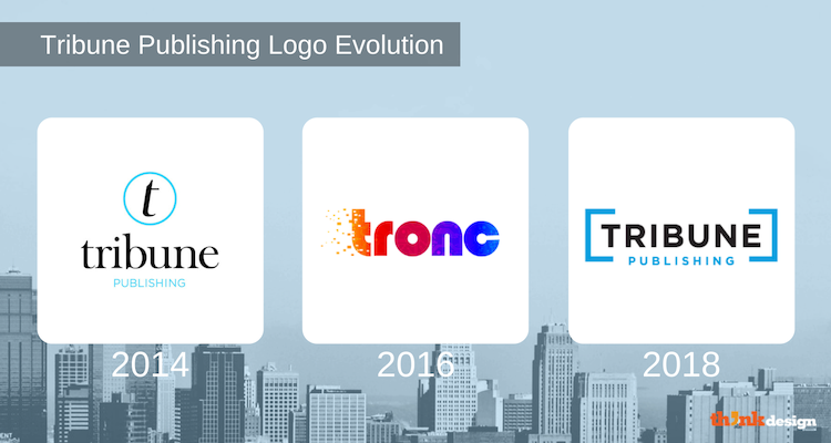
When Tribune Publishing changed its name to “tronc” and the design of the logo, I was shell-shocked. A multicolored gradient logo with a techie pattern overlay and the first letter had a disintegrated effect. The design received several bad comments such as “RIP brand credibility”, “Must be June Fools’ Day!” and “My eyeballs just threw up.”
Now they changed their look again – this time it’s back to boring. So much for redesigning the logo yet again.
What’s This: Fine Arts Museums Of San Francisco
I thought an image is worth a thousand words. That’s what is popularized, but looking at the before and after logos of this museum just spoils the idea. Does a “paragraph” qualify as a logo design?

The new logo design is a bad replica of the old design, which was also a mediocre design. Wait a minute. Is this even design? Looks like art is laughing at design. Seriously, this is the kind of stuff that makes you say WTF.
Why Do Some Logo Designs Keep Failing?
There has to be a reason for a brand to keep failing in creating a winning design. The following can be the cause for failure:
- Ignorance is a bliss, or is it?Being aware of anything that’ll help you design a better brand identity is crucial. You must conduct a research in order to evaluate how your brand can successfully connect with the target market.
- Easy does it! Don’t rush your brand identity redesign simply because you feel everyone is changing and so should you. Spend time on the design and the concept behind it, especially in this digital world where you can be easily trolled.
- When redesigning your logo, make sure it isn’t a dime a dozen. A logo design builds an image for your brand, so if you want it to be great then don’t settle for the ordinary.
- Don’t cut corners with your visual identity design. While a cheaper and quicker solution seems like a treat in the beginning, it becomes a nuisance later. So aim to get a professional logo design from a credible designer, rather than waste your time on bog-standard services.
Why do you think brands fail to design a successful identity?
Blog Logos
Ecommerce Logos
IT Firm Logos
Computer Company Logos
Communication Company Logos
Business Logos
Arts and Crafts Logos
