Top Logo Redesigns That Lit Fireworks In 2019

Feature Image Source: Canva
Oh wow, 2019 sure went by fast! We have witnessed winners and losers, plus those who broke conventions to those who remained in the cliché zone. All of us swung between the modern/simple style and the out-of-the-box aesthetics.
Brands are designing logos that either explain too much or nothing at all. You can literally do just about anything provided you have a solid reason to back yourself up with, otherwise you’ll be trolled to your grave.
It’s easier to design a new logo from scratch than to redesign an existing one because people tend to compare the before and after versions. What in the world were some of them thinking? Yes, here are the top logo redesigns that lit a fire this year!
Note: Know that there will never be a time when logo designs are not always under the pendulum of a hit or miss situation.
Okay so, let us now sniff out the logos that were open to heavy judgment. Why do you think these logos became controversial? Share your views.
IKEA

Image Source: underconsideration
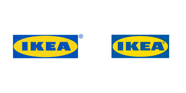
Alright so this brand is pretty cool with the technologies it uses to market its products, but what in the world happened to its logo design sense. I guess people are good with some things and not all things.
IKEA’s logo redesign looks like it needs to change once more. Even if you want to tweak yourself, you would want to seriously transform your look right? What is the point of making invisible-to-lay-man-eyes logo and then replacing your entire brand identity with it?
Well, if you are hiring a design agency and they’re spending time and effort over your logo, then the edit should at least be substantial enough.
Landscaping Company Logos
Home Maintenance Logos
Antique Shop Logos
Painter Logo Designs
SEARS

Image Source: underconsideration
Looks like Airbnb just found its long lost sister. The two have scarily similar icons. Don’t you think so? There are a number of questions that come to mind immediately when you stare at this new logo for as long as you can.
- Was there a need for a symbol?
- What does the symbols truly represent?
- Why are the colors different than the brand name?
- What exactly is linking the name and the symbol together?
Well, as a casual looker, one may not search the logo and try to read everything the brand has to say about the redesign. Technically, the new logo design should be self-explanatory.
Fine we will give it some time to see how this visual identity works for the brand.
STAPLES

Image Source: underconsideration
What is it exactly? A staple pin or an awkward table or a bench or an incomplete laptop screen. You decide what you see.
At least the old logo was cohesive but this one is a tough child. Saying this because the symbol doesn’t say much on its own and the lowercase brand name isn’t the bold type anymore.
Graphic designer Will Patterson says, “Staples made me laugh because they unveiled this huge rebrand and it was like a revolutionary thing when it came out and … I actually really need to look at this whether it works or not.” He too agrees that while the font is still nice and functional, the icon is ambiguous. He points that the icon on its own looks like an “unfinished logo” and this is probably something we all can agree with.
KROGER

Image Source: underconsideration
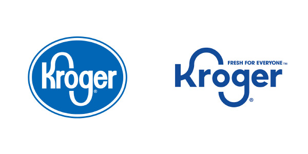
Okay so here we have another logo design that begs for another redesign! The “K” looks like it got drunk one night and the evil witch just froze the poor thing in that embarrassing position.
The hand of that letter needs a surgery ASAP. To be honest, the new logo would have worked out fine if the “K” knew its limits. Like, where exactly are you trying to reach man?
The tweak in the corporate logo should have improved on the elements that are not appealing. It is a waste of time to invest labor into a logo design that is uncomfortable to look at.
MICROSOFT EDGE

Image Source: underconsideration
There are some logos you look at and it seems they’ve been ripped off from a stock vectors website. This is one of them. The new “e” icon is nothing like the iconic design. Okay, so they wanted to change the logo completely but it would’ve been better to keep the sanctity of the letter.
The thought behind the logo (incorporate a wave into “e”) is not bad but the execution could be better and more relatable. Armin Vit, Cofounder of UnderConsideration says, “Overall, I guess this has a bland Microsoftness to it that’s to be expected.” Right now the new design is generic. It lacks uniqueness.
Do you know of more logo designs the fired up people? Let us know in the comments below.


