Blue Vs Pantone Color Of The Year 2019: What Best Fits Digital Technology?
Feature Image Source: Pantone
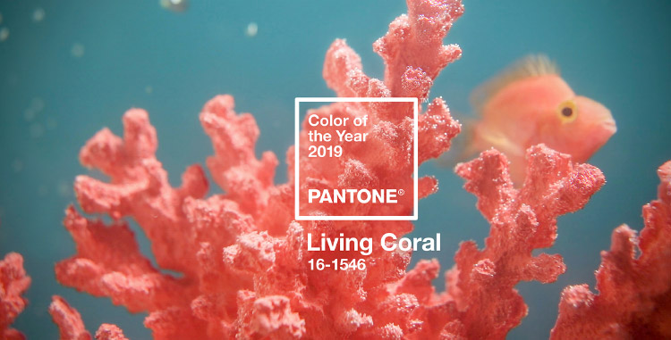
Pantone’s color of the year for 2019 is out! It’s a beautiful Living Coral (PANTONE 16-1546), but even more exciting is their inspiration for this reveal. The company says it came from a “reaction to the onslaught of digital technology and social media”, which makes me wonder how the social and tech industry will come to accept a color with pink undertones. For long designers have stressed that the shades of blue best describe technology as it radiates a sense of security and reliability, but Pantone has certainly changed that.

Image Source: Pantone
Color Psychology Of Blue
Let me elaborate on what is the meaning of the color blue for technology businesses. According to a theoretical rule book, it became established that the shade and tints of blue have successfully emulated other colors when it comes to tech-based branding or marketing.
Blue is considered to be a symbol of communication, intelligence, efficiency, logic, dutifulness, calmness and trust. This is the reason why social media websites like Facebook has used it in their brand identity design. However, lately these brands are suffering from all types of allegations and Pantone perhaps thought that another colors might represent the “need for optimism and joyful pursuits” in the world today.
It’s important to note that while blue has positive connotations, it has some negative meanings. The color blue also denotes feelings like aloofness, unemotional, coldness and unfriendliness. What was once considered a male dominated color, actually became a universal color but sometimes it’s best to explore other options instead of boringly sticking to one.
Color Psychology Of Living Coral
The vice president of the Pantone Color Institute, Laurie Pressman told the The Associated Press that “With everything that’s going on today, we’re looking for those humanizing qualities because we’re seeing online life dehumanizing a lot of things.” She further said, “We’re looking toward those colors that bring nourishment and the comfort and familiarity that make us feel good.” The question is, will Pantone 2019 be able to break the monotony of tech life and business with its charming and jubilant self?
Pressman describes the Pantone color of the year 2019 as having a retro feel akin to “simpler times” without having any socio-political baggage of redundant colors like blue and red often paired with white, black or grey.
Living Coral For Social Media Logos
While I am at it, I thought what will happen if famous digital technology businesses celebrated the Pantone color of the year 2019 by coloring their logo designs Living Coral. It will be interesting to see how blue colored logos will look in a pink-orange. Let’s see how famous social media logos will look is they celebrate pantone 2019 color of the year.

Some social networking platforms like Foursquare and Flickr incorporated pink in their logos and to be honest they look much better than the all-blue team. Somehow blue is taking away the joy out from being online and just making everything look too masculine and serious. May be it’s time for a feminine touch. Here are some social media logo designs that are not in blue, let’s see how they look when turned completely blue.

If you’ve got a technology business, what color would you prefer: Blue or Living Coral?