How Responsive Design Can Increase Your Conversion Rate
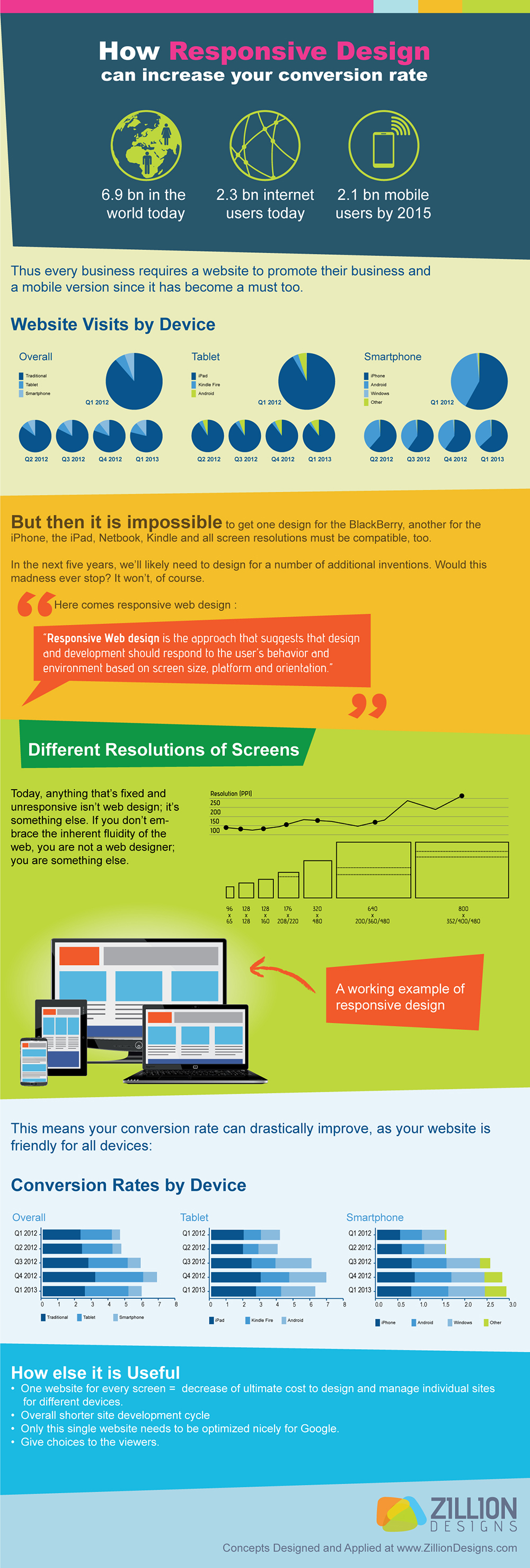
The internet has become a mobile frontier that businesses can’t deny any longer. As more people are beginning to use mobile devices like smartphones and tablets, along with the increasing number of businesspersons who use tablets while traveling, one thing has become clear: mobile is taking over Internet surfing.
Everything from social media updating to sending business reports and reading blogs, the mobile devices have replaced the laptops as the go-to traveling companion. It’s only logical that you want to make the user experience better for mobile and tablet users to stay competitive in today’s market. Businesses are losing hundreds if not thousands of dollars annually when they don’t convert to the new web standard. Increasing your conversion rate by switching your website to responsive design is simple business sense!
What is responsive design?
A responsive design simply means that all the content on the website including images and structure of the site remains the same on any device. For example, when a user accesses a site on their desktop, they are getting the full view of the site. And when that same user goes to visit the site from their smartphone or tablet, the site will retract to fit on the smaller screen.
For businesses this means cashing on mobile device users even when they are not at their desktops in the office or at home. It’ll be business as usual 24/7. However, if you aren’t convinced that you need to take the time to redesign, check out this infographic that talks all about what responsive web design will do for your business!
![[Part 2] Logo Design Trends 2020 – Symbols In Focus](https://www.zilliondesigns.com/blog/wp-content/uploads/Logo-Design.png)
![[Part1] Logo Design Trends 2020: Going Over The Basics of Visual Elements](https://www.zilliondesigns.com/blog/wp-content/uploads/logodesign-trends.png)