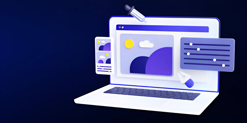
Design
Crowdsource brilliant ideas and discover the perfect design for your brand.
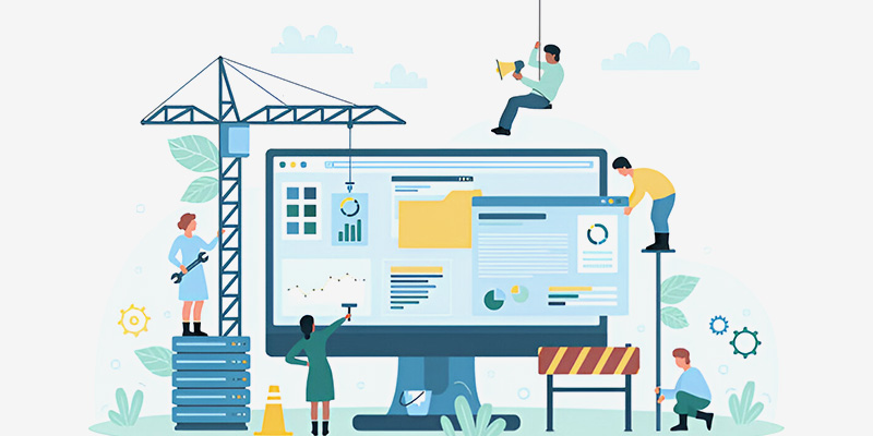
Development
Turn your vision into reality with custom websites, apps, and digital solutions.
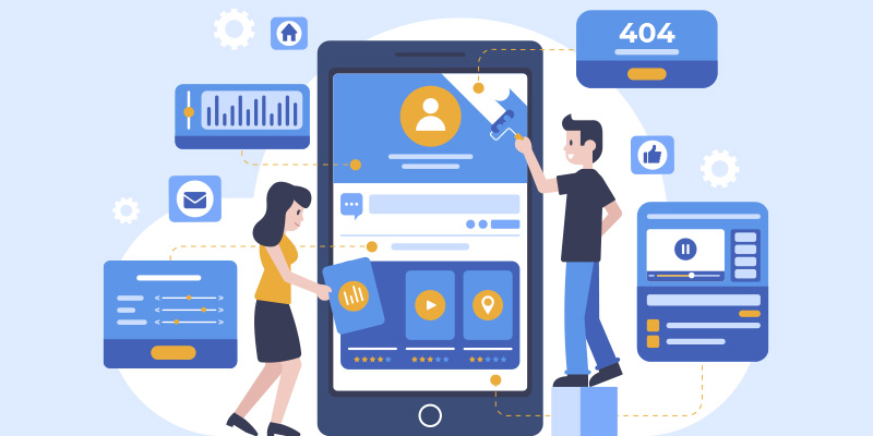
Digital Marketing
Reach the right audience, generate more leads, and accelerate business growth.
Welcome to ZillionDesigns! Need help? Just leave us a message, and we'll get right back.
Interested in custom design? Start a Contest
For other queries,
Click here