The Comprehensive Guide to Designing Business Cards: Tips, Types, Techniques & More

Designing a business card is about creating a visually balanced layout that communicates your brand identity and essential contact information across print and digital mediums. This guide will help you design one that makes an impact.
A visually appealing business card shares all your important business information in a way that people can easily recall later. Business cards bring a human element to networking. Handing someone a well-designed card creates a lasting physical connection. So it’s important to design a business card that looks modern and on-brand. For digital business cards, there is more flexibility. They enable instant sharing via links, QR codes, or NFC, and can include clickable contact details, portfolios, and social profiles. The real advantage lies in combining both formats. When both are designed effectively, they share information in a way that makes an impact.
What Is a Business Card?
A business card is a branding asset designed to communicate your professional identity and relevant contact details in a clear and memorable format. It works for both print and digital formats, each serving a unique role in modern business communication. Each includes key details such as your name, job title, company name, and contact information.

Key Characteristics of a Business Card
- Logo: Placed usually at the top corner or center
- Name: This appears before anything else on the card
- Contact information: Job title or business name, phone number, email, and location or website and socials
- Business Details: Define your position or services offered
- Website or portfolio: A simple domain for credibility
- Physical Address: Accurate details of your location
- Social media presence (optional): Include professional networks like LinkedIn or a Facebook business page
Print vs. Digital Business Cards
Physical business cards are considered one of the most effective print materials for marketing. Beyond the basics, they act as a visual representation of your brand. The design, typography, layout, and even the material all influence audience perception. Digital business cards also have the same purpose and are designed for speed, accessibility, and interactivity.
As one creates a personal connection, the other extends that interaction into a scalable, trackable, and more dynamic experience.

Print Business Cards
Printed business cards are exchanged during in-person interactions such as meetings, events, and networking opportunities.
- Tangible and memorable: Human interaction creates stronger and lasting relationships, making the exchange feel more intentional. This helps your brand stay top of mind, unlike purely digital interactions, which are easier to forget.
- Strong for first impressions: The design, material, and finish of a card immediately communicate professionalism and attention to detail. If you think about the role of a business card in cohesive branding, it can be quite central.
- No technology required: Print cards can be shared anytime without relying on devices, apps, or internet access. This makes them reliable and effective in all environments, from formal meetings to casual encounters.
- Focused information delivery: Limited space means clarity and prioritization, so only essential information is included. This makes the card easier to read and more impactful.
- Perceived value with materials: High-quality paper, textures, and finishes promote a positive brand perception. Premium materials can make your business feel more established and trustworthy.
Digital Business Cards
Digital business cards are built for ongoing engagement. They can be updated quite easily and within seconds, making them highly scalable and efficient.
- Instant sharing and accessibility: Digital cards can be shared instantly across locations and time zones, making them ideal for remote communication. They allow businesses to connect quickly without physical limitations.
- Interactive and dynamic: They support clickable links, social profiles, videos, and portfolios, enabling users to engage more deeply with your brand. This transforms a simple contact exchange into an interactive experience.
- Easy to update: Digital versions can be edited at any time. This helps keep your contact details accurate without the need to reprint or redistribute materials.
- Scalable and trackable: They can be integrated with analytics tools, allowing you to track engagement such as clicks and views. This helps businesses easily measure the success of their marketing campaigns and optimize their networking strategy.
- Environmentally friendly: Since there is no need for printing, digital cards reduce paper usage and waste. This makes them a more sustainable choice for modern, environmentally conscious businesses.
| Feature | Print Business Cards | Digital Business Cards | Hybrid Approach |
| Experience | Tangible and physical, creating a personal and memorable interaction | Virtual and screen-based, focused on speed and convenience | Combines physical interaction with digital extension for a complete experience |
| First Impression | Strong visual and tactile impact through design, paper, and finish | Relies on UI, layout, and interactivity for perception | Uses print for impact and digital for deeper engagement |
| Accessibility | Can be shared anywhere without devices or internet | Requires a device but allows instant global sharing | Physical exchange supported by instant digital access |
| Information Depth | Limited to essential details due to space constraints | Can include extensive information like links, portfolios, and media | Keeps print minimal while expanding information digitally |
| Flexibility | Static once printed; requires reprinting for updates | Easily editable and always up-to-date | Print remains stable while digital stays dynamic |
| Engagement | Passive interaction after exchange | Active engagement through clickable and interactive elements | Encourages users to move from offline to online interaction |
| Scalability | Limited by printing and distribution | Highly scalable and easy to distribute globally | Scales digitally while maintaining a personal touch locally |
| Cost Efficiency | Requires printing and reprinting costs | Low-cost distribution after initial setup | Balanced investment with long-term efficiency |
| Sustainability | Uses physical materials and resources | Paperless and environmentally friendly | Reduces print dependency through digital integration |
| Conversion Potential | Depends on follow-up actions by the recipient | Direct actions possible via links and integrations | Highest potential by guiding users from print to digital actions |
Hybrid Approach – Print + Digital
Combining print and digital business cards makes your branding more effective by connecting physical cards to online content through QR codes or NFC. Simple ones work quite well for networking, and business cards with NFC or QR codes are ideal for modern communication and ongoing engagement. When you combine the two formats, it helps you turn a simple exchange into an ongoing interaction and increases the chances of follow-ups.
Types of Business Cards
Business cards come in different formats across both print and digital mediums. Each type serves a different purpose depending on your brand, audience, and how you plan to use the card. They can be conventional, the ones you see every day, or you may find quite a few business cards with unconventional shapes, too.
Let’s take a look.
1. Standard Business Cards

These follow traditional sizes and layouts, making them the most widely recognized and used format. Their structured design ensures readability and professionalism, making them suitable for almost any industry. They typically include essential details like name, title, company, and contact information in a clear, balanced layout.
2. Minimalist Business Cards

Focused on simplicity, these cards use clean layouts, limited color palettes, and strong typography. By removing unnecessary elements, minimalist business card designs highlight only the most important information. This style is popular among modern brands that want to communicate clarity, sophistication, and confidence.
3. Premium and Luxury Cards

Designed to convey exclusivity and high value, these cards use advanced printing techniques such as embossing, foil stamping, letterpress, or spot UV. Often printed on thicker or textured paper, they create a tactile and visual impact that reinforces a brand’s premium positioning.
4. Die-Cut and Custom-Shaped Cards

These cards move beyond the traditional rectangular format, using custom shapes or cutouts to reflect a brand’s identity. Whether subtle rounded edges or bold, unconventional silhouettes, they are highly memorable and often used by creative professionals or brands looking to stand out.
5. Textured and Specialty Material Cards

Instead of standard paper, these cards use materials like recycled stock, kraft paper, plastic, metal, or even wood. The physical texture adds a sensory dimension, making the card more engaging and distinctive while also reflecting brand values such as sustainability or innovation.
6. Static Digital Cards (PDF/Image)

These are simple digital versions of traditional business cards shared as images or PDFs. They replicate the look of print cards but are easy to distribute via email, messaging apps, or social platforms. While convenient, they do not offer interactivity.
7. Interactive Digital Cards

Built for engagement, these cards include clickable elements such as phone numbers, email links, websites, and social media profiles. Some may also include embedded videos or portfolios, turning a basic contact exchange into a richer brand experience.
8. QR Code-Based Cards

These cards integrate a QR code that users can scan to access additional information, such as a website, portfolio, or digital contact page. They bridge physical and digital experiences, allowing more information to be shared without cluttering the card design.
9. NFC-Enabled Cards

Using Near Field Communication technology, these cards allow users to tap their phone against the card to instantly access digital content. This creates a seamless and modern sharing experience, often used in tech-forward or innovation-driven industries.
10. App-Based Business Cards

Managed through dedicated platforms or apps, these cards store and share contact information digitally. They often include advanced features such as real-time updates, analytics, CRM integrations, and networking tools, making them ideal for scalable and data-driven networking.
11. Folded Business Cards

Designed like a mini brochure, these cards fold to provide extra space for information. They are useful for including additional details such as services, product lists, or brand messaging while maintaining a compact format.
12. Photo Business Cards

These cards include a personal or professional photo, helping recipients quickly associate a face with a name. They are especially useful in industries where personal branding and recognition are important, such as real estate or consulting.
13. Transparent Business Cards

Typically made from plastic or similar materials, these cards use transparency as a design feature. They create a sleek, modern look and stand out visually, often used by brands that want to communicate innovation and creativity.
14. Magnetic Business Cards

Designed to stick to metal surfaces like refrigerators or filing cabinets, these cards extend their lifespan and visibility. They are commonly used by service-based businesses that want to remain easily accessible to customers over time.
15. Eco-Friendly Business Cards

Made from recycled materials or sustainable resources, these cards reflect environmentally conscious values. Some may even use plantable paper embedded with seeds, allowing the card to be repurposed instead of discarded.
Each type serves a different strategic purpose, from creating strong first impressions to enabling ongoing digital engagement. Choosing the right format depends on how you want your brand to be experienced and remembered.
Key Characteristics of Effective Business Card Design
Mostly, print and digital business cards require more than arranging contact details on a small canvas. The brand assets need to communicate your brand clearly and create a strong visual impression. Here are the key elements to keep in mind for good business card design across mediums.
1. Simplicity
Simplicity is one of the most important factors, given the limited space. Overloading the card with too much information or design detail can reduce clarity and impact first impressions.
- Focus on essential information: Include details like name, role, and key contact
- Reduce visual clutter: Avoid excessive graphics, colors, or text
- Improve usability across formats: Simple designs work well across both print and digital This business card design for Jacobs Restoration shows how less clutter and effective use of white space keep the focus on the details.

This business card design for Jacobs Restoration shows how less clutter and effective use of white space keep the focus on the details.
2. Readability
A business card must be easy to read at a glance. Clear typography and proper spacing ensure that users can quickly find and understand the information.
- Use legible fonts: Choose clean, professional typefaces for small sizes
- Maintain proper spacing: Proper spacing between elements improves clarity
- Maintain contrast: High contrast between text and background maintains visibility Keeton Construction’s business card is a good example here. The text against the white background makes it readable and maintains clarity.

Keeton Construction’s business card is a good example here. The text against the white background makes it readable and maintains clarity.
3. Brand Consistency
Your business card should feel like an extension of your overall brand identity. Consistency builds recognition and trust with your audience.
- Match with brand visuals: Use colors, typography, and logo systems consistently
- Maintain tone and personality: Show traits like creativity or professionalism in design
- Create a cohesive experience: Elements across print and digital cards should be unified

A unique business card design for The Center stays on-brand with the yellow accent paired with dark blue.
4. Visual Hierarchy
Visual hierarchy helps guide the viewer’s attention to the most important information first. Without it, the card can feel confusing or difficult to navigate.
- Highlight key details: Make your name, role, or primary contact point stand out
- Structure information: Group related details together so users can quickly scan
- Guide the eye: Use alignment, spacing, and contrast to move from one point to the next

The business card for Eternal Monuments uses contrast and positioning to keep the viewer’s attention. You can track the important details in seconds.
5. Functionality
A business card must not only look good but also serve its purpose, whether it’s sharing contact details, driving traffic, or facilitating a quick interaction.
- Optimize for print usability: Look for correct sizing, margins, and material choices
- Enhance digital usability: Include clickable links, QR codes, or NFC features
- Support conversion goals: Design the card in a way that encourages action

The Pathway Fitness business card contest is a good example here. The cards are easy to scan, have all the information listed, and have a clear CTA to scan the QR code.
6. Color Choices
It is very important to choose colors that are on-brand and relevant to your industry as well. So think of hues of blue or green if you are in finance or healthcare. Try to avoid adding more than two or three, as that could overwhelm the viewer.
- Print Color Schemes: Consider the CMYK system, as colors maintain their appearances
- Digital Color Schemes: The RGB system allows for brighter and more dynamic visuals
- Color Combinations: Pairing a neutral base with one or two accent colors

The business card for Femmewell has a bold purple as its base color with a pop of pink for contrast. It’s relevant to the niche and makes a strong visual impact.
7. Typography
It’s best to use one or two fonts at most, like a clean sans-serif for contact details and, if needed, a contrasting font for the name or logo. Font size should create a clear hierarchy, with the name standing out most, followed by the title and contact information. The typography should match your brand style, be it modern, formal, or creative.
- Visual Hierarchy with Sizing: Your name is the largest; the job title is in a slightly smaller size
- Serif vs. Sans Serif: Clean sans serif fonts for contact details, Serif fonts for names or positions
- Fonts for Digital and Print: Avoiding thin or intricate styles for print, prioritize clarity for digital

This business card design for Trio works well for its clean sans-serif font used to highlight the details. The logo’s handwritten style creates a striking contrast too.
When these elements work together, a business card becomes a strategic brand asset that communicates clearly, looks professional, and drives meaningful engagement.
How to Design a Business Card: Step-by-Step
When designing a business card, you need to follow a structured process that balances branding, clarity, and usability. You can launch a contest or request the brand assets with your logo as well.
Step 1: Define Purpose and Core Content
Identify what your business card is meant to achieve. This decision shapes both the design and the information you include.
Common purposes include:
- Networking at events or meetings
- Personal or corporate branding
- Lead generation or client acquisition
Once that is clear, highlight the core information your card must communicate:
- Your name and professional designation (who you are and what you do)
- Your company name and logo (brand identity)
- Key contact details, such as phone number, email, and website or portfolio
You can also decide to include optional information like a tagline or value proposition, especially if it helps clarify your role or brand message.
Step 2: Choose Format and Supporting Details
Decide how your business card will be designed and any additional details to include.
You can choose between:
- Print cards for physical networking
- Digital cards for online sharing
- Hybrid formats that combine both approaches
Based on your choice, list optional supporting elements such as:
- Physical address or location (important for local businesses)
- Social media handles such as LinkedIn or Instagram
- QR codes linking to websites, portfolios, or digital resumes
- Clickable phone numbers, emails, and links
Step 3: Launch Your Contest and Fill Out the Brief
Now, access the brand identity design page and launch your contest. You’ll have to register to create an account, or you can log in if you already have one. Add details in your brief, such as:
- Project setup: Title, card size (single/double/folded), design style, industry, and font preference
- Personal details: Name and title
- Contact information: Address, phone/cell/toll-free, fax (optional), email, and website
- Branding details: Additional notes (colors, layout, tone, QR code, etc.) and logo upload
- Back side content: Any elements for the other side, such as tagline, logo, services, or social links
This helps the designer maintain a good hierarchy as well, so that viewers can read the most important information in seconds, without confusion or overload. Launch a Contest
Step 4: Focus on Typography and Brand Colors
Typography and color bring personality and consistency to your card.
For typography:
- Choose readable, professional fonts aligned with your industry
- Limit yourself to one or two font families
- Use size contrast for hierarchy
For colors:
- Apply your brand color palette consistently
- Allow for high contrast between text and background
- Keep printing limitations in mind (colors may vary in CMYK printing)
Together, typography and color influence how people think of your brand.
Step 5: Pick Visual Elements and Brand Identity
You need to carefully choose visual elements that support your message. These include:
- A company logo as a central branding element
- Simple icons for phone, email, and social platforms
- Subtle patterns, textures, or graphic accents
- A tagline or brand message
The key is balance; anything you incorporate in your design should not overpower the essential information.
Step 6: Optimize for Output and Final Use
Finally, prepare your business card for the chosen format, like print, digital, or both.
For print cards:
- Include bleed areas to prevent cutting issues
- Maintain safe margins for important text
- Use CMYK color mode for accurate printing
- Maintain high resolution (typically 300 DPI)
For digital cards:
- Design a responsive layout that adapts to screen sizes
- Make contact elements clickable (email, phone, links)
- Make sure that QR codes are clear and scannable
- Optimize file size for fast sharing and accessibility
Specifications and Requirements For Business Card Design
For both print and digital formats, it is important to pay attention to technical details that directly impact quality, usability, and performance. When you meet the right specifications, it becomes a lot easier to be consistent, avoid production issues, and deliver a seamless user experience everywhere.
These business cards rely on precise technical settings so that the final output looks sharp, professional, and matches your design intent.

Using standard dimensions allows for compatibility with printers, holders, and wallets. It also maintains the appearance across professional settings and avoids unnecessary resizing issues during production.

High-resolution files (300 dots per inch) are crucial for sharp and clear printing. Lower resolutions can result in blurry text and pixelated graphics.
Print designs should always be created in CMYK (cyan, magenta, yellow, and black) and digital in RGB (red, green, and blue). Choosing the correct color mode helps ensure your business card looks professional across print and digital formats. Using the wrong one can lead to color mismatches and reduced visual quality.


Safe margins keep important text and elements away from edges, avoiding accidental cuts during trimming. Bleed (typically 0.125 inches) helps ensure that background colors or images extend beyond the trim edge, preventing unwanted white borders. The trim line is the final cut where the card is trimmed to its actual size, and padding maintains spacing between content.
1. Bleed MarginExtra space added outside the card size
|
2. Trim Line (Cut Line)The final size of the business card
|
3. Safe Margin (Safe Zone)Inner margin that protects important content
|
4. Padding / Internal MarginSpace between content elements inside the card
|
Digital cards should be optimized for mobile viewing, as most users will access them on smartphones. This means using readable font sizes, responsive layouts, and properly spaced elements.
|
1. Print-Ready Business Card File Size
|
2. Editable Source File Size
|
3. Digital Sharing File Size
|
Files should be lightweight to integrate fast loading and smooth sharing. Large file sizes can slow down access and reduce user engagement, especially on mobile networks.
Paper stock thickness plays a key role in how your business card feels and is perceived. Thicker cards showcase higher quality and durability, and thinner stocks are considered more cost-effective and flexible.
| Paper Thickness | Why it’s Used |
| Standard (300–350 GSM) | Common choice for everyday business cards; offers a balance between durability and affordability. |
| Premium (400–450 GSM) | Thicker and sturdier, giving a more professional and high-quality feel. Ideal for businesses wanting to elevate brand perception. |
| Ultra-Thick (600+ GSM) | Extremely rigid and luxurious; often used for high-end brands looking to make a strong impression. |
| Lightweight (250–300 GSM) | More flexible and budget-friendly; suitable for large-scale distribution but less durable. |
| Layered / Duplex Stock | Multiple layers combined for extra thickness and unique visual edges; used for distinctive, premium designs. |
The right orientation influences how your business card is viewed, read, and remembered. Both print and digital formats offer flexibility, but the choice should align with your content structure and brand style.
| Orientation Type | Print Business Cards | Digital Business Cards |
| Horizontal (Landscape) | Most common and widely accepted format; fits naturally in wallets and cardholders. Ideal for traditional layouts and easy readability. | Works well for desktop viewing and email sharing; provides a familiar layout for structured information. |
| Vertical (Portrait) | Modern and distinctive; stands out from standard cards. Best for minimal or creative designs. | Optimized for mobile screens; aligns naturally with smartphone viewing and scrolling behavior. |
| Square | Unique and eye-catching; often used for creative industries. May require custom printing and storage considerations. | Visually appealing for social sharing and digital profiles; works well for branding-focused layouts. |
| Custom / Die-Cut Shapes | Highly distinctive and memorable; used to reflect brand personality. Requires specialized printing. | Less common, but can be simulated through creative layouts or interactive formats in digital cards. |
| Folded (Tent Style) | Provides extra space for information; useful for detailed content or mini brochures. | Can be adapted as multi-screen or scroll-based layouts, offering more content without clutter. |
These define the final look and feel of your business card, influencing both visual appeal and user experience. Print focuses on premium finishes, and digital cards rely on visual effects and interface styling to create a similar impact.
| Finish Type | Used for |
| Matte Finish | Smooth, non-reflective surface that offers a clean and professional look. Reduces glare and is easy to read and write on. |
| Glossy Finish | Shiny and reflective coating that enhances colors and makes designs appear more vibrant. Best for bold visuals but can show fingerprints. |
| Soft-Touch / Velvet | Luxurious, smooth texture that feels soft to the touch. Adds a premium and high-end perception to the card. |
| Spot UV | Glossy coating applied to specific areas like logos or text, creating contrast and drawing attention to key elements. |
| Foil Stamping | Metallic finishes, such as gold or silver, add shine and elegance. Commonly used for luxury or premium branding. |
| Embossing / Debossing | Raised (embossed) or recessed (debossed) elements that add depth and a tactile dimension to the design. |
Features that Make Business Cards Stand Out
These cover design styles, materials, and clickables for digital business cards. Any element you choose shapes how your card looks, feels, and performs. Consider the visual style and physical quality of printing materials as well to create impact. The right combination can make a great impression right away.
1. Minimalist design
These cards focus on clean layouts, ample whitespace, and key information. This style creates a modern, elegant look and also improves readability. The overall appearance makes the design feel refined and intentional.
2. Bold and high-contrast design
Using strong colors and high contrast helps draw attention to every detail. This style is effective for grabbing attention and making the card memorable in a stack.
3. Premium finishes and materials
High-end materials like thick cardstock, textured paper, or specialty finishes add another dimension to the look. Techniques such as matte or glossy coatings influence how the card feels and reflects light. All of these can make the business stay with people for a long time. Once finalized, make sure you follow the principles of material design in business cards as well.
4. Foil stamping, embossing, and spot UV
These features add depth and visual interest. Foil stamping introduces metallic accents, embossing creates raised textures, and spot UV highlights specific elements.
5. Interactive layouts
Digital cards can include links, buttons, and icons that people can engage with. This also allows users to take immediate action, transforming the card from a static asset into an interactive experience.
6. Clean UI-based designs
Inspired by app and web interfaces, these designs prioritize clarity, structure, and ease of navigation. Users can quickly access important information without confusion.
7. Animated or dynamic elements
Subtle animations or transitions can encourage people to take action and make the card feel modern. Movement draws attention to key elements without overwhelming the user experience.
8. Shareable Links
With these, you can simplify digital interactions by providing instant access to websites, portfolios, or contact details. They make information sharing seamless and improve accessibility.
9. Click-to-call, email, and portfolio integration
Digital cards enable direct actions such as calling, emailing, or visiting a website with a single tap. Integrating portfolios or service pages also helps convert interest into engagement.
Case Studies
- Calcs-Plus: Leads grow 38%, QR scans increase 52%
- The Happy Camper: Repeat visits improve by 27%, referrals grow 19%
- Terrana Orthodontics: Walk-ins increase by 34%, 41% increase in local awareness
- Demerara Bakery: Client inquiries grow 46%, conversions increase by 22%
- Image Designs: Store visits increase 63%, response rate grows 29%
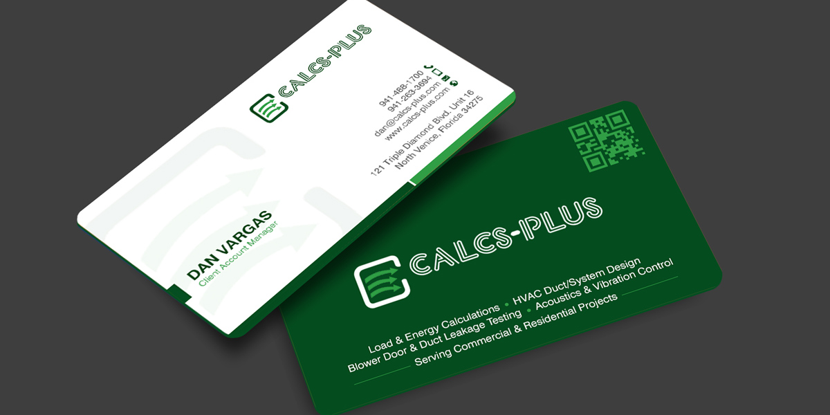
Calcs-Plus Grows Leads with New Business Card Designs
Problem: The company relied on traditional cards that shared only basic contact details, resulting in low follow-up engagement and missed opportunities
Process: A contest was launched, and a hybrid business card was the winning design. Clean print layout and a prominently placed QR code
Outcome: Lead generation increased by 38%, QR code scans improved by 52%
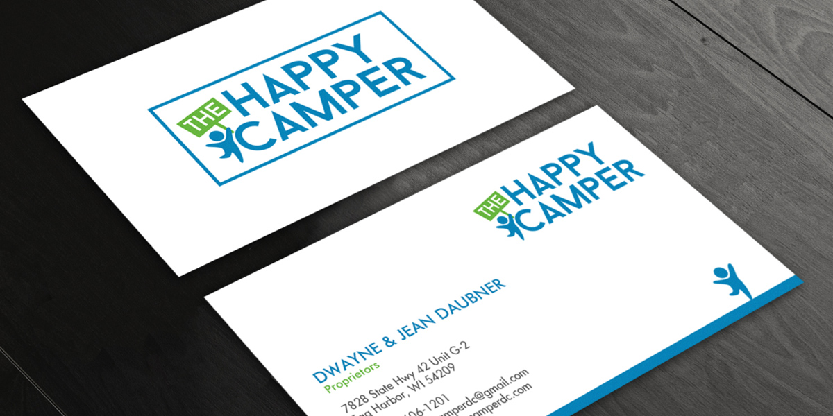
The Happy Camper: Drives Repeat Visits Up by 27%
Problem: Kids’ retail store with standard cards that failed to stand out
Process: Ran a contest to get minimalist cards with a professional appearance that matched its brand identity
Outcome: Repeat customer visits increased by 27%, and word-of-mouth referrals grew by 19%
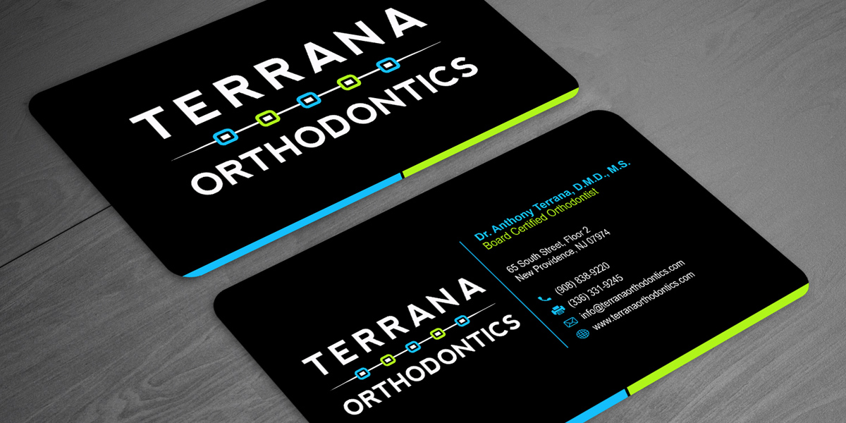
Terrana Orthodontics Attracts Customers with Business Cards
Problem: Practice lacked visibility and failed to earn trust.
Process: A bold, high-contrast design with strong typography and vibrant colors won the business card design contest.
Outcome: Walk-in inquiries rose by 34%, local brand awareness increased by 41%.
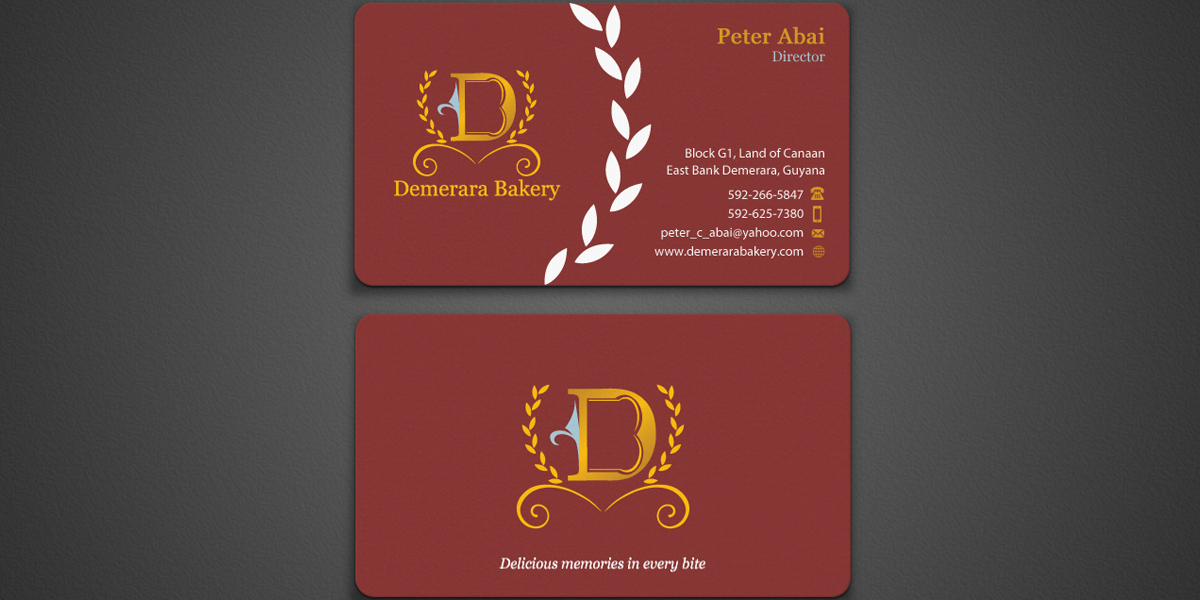
Demerara Bakery Sees Results with Business Card Designs
Problem: Small bakery had basic cards that did not reflect their high-value offerings.
Process: Received 181 concepts in a design contest. The winning design was premium, with a rustic layout.
Outcome: Client inquiries increased by 46%, 22% improvement in conversion rates.
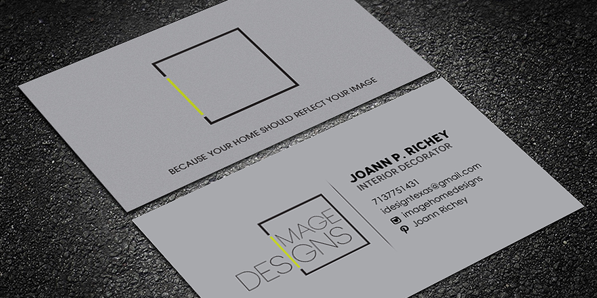
Image Designs: Increases Store Visits by 63%
Problem: Interior design had traditional cards that did not match their portfolio and creative capabilities.
Process: Contest was launched with a modern, professional business card design winning.
Outcome: Portfolio visits increased by 63%, and response rates improved by 29%.
By focusing on clarity, consistency, and functionality, businesses can create cards that not only make strong first impressions but also drive sales. When you invest in good design, you make sure your business card becomes a lasting extension of your brand.
Frequently Asked Questions FAQs
What do I get in a business card design package?
Designers provide high-resolution, print-ready files along with editable formats. These include proper sizing, bleed setup, and formats suitable for both print and digital use, making sure your card is ready for immediate implementation.
Can you help with both print and digital business cards?
Yes, for print, designs are prepared with proper bleed, safe margins, and high resolution to maintain accurate and clean physical output. Typography and layout are optimized for readability at small sizes, and files are delivered in print-ready formats. Digital files are optimized for screen clarity, scalability, and easy sharing, typically in formats like PNG or web-ready PDF.
How does the contest model improve business card design outcomes?
The contest model allows you to receive multiple design concepts instead of relying on a single approach. This creative diversity helps you compare styles, test ideas, and choose the most effective design, leading to stronger branding and better overall results.
Should I use both sides of a business card?
Yes, using both sides can help you organize information more effectively. One side can focus on essential contact details, and the other can include branding elements, a tagline, or digital integrations like a QR code.
What if I do not have a logo? Do I need a logo for the business card contest?
No, it’s not necessary, but ideal that you do. Designers can work with your business name, typography, and brand colors to create a strong, text-based identity. Many modern business cards rely on clean typography and layout instead of a separate logo. If you want, you can always launch a logo contest before and pick a winning design.
Can I run a contest for a die-cut business card?
Yes, you can. A die-cut business card contest allows designers to create non-traditional shapes and custom cutouts instead of the standard rectangular format. You just need to clearly mention your preference, such as rounded corners, circular shapes, or custom silhouettes.
What should I include in my business card design brief?
Mention what you want on the card (name, title, contact details, website, etc.), preferred style (modern, minimal, corporate, creative), and any inspirations or examples you like.
What if I need multiple business cards for different employees?
You can absolutely do that, as most business card contests are designed to support multiple variations under the same brand. Pick one design and designers adapt it for different employees by updating names, job titles, and contact details while keeping the same layout, colors, and typography.
Can I request special finishes like foil or embossing?
Yes, foil stamping, embossing, debossing, spot UV, or textured effects can be added. Just make sure to mention these requirements clearly in your contest brief so designers can prepare files correctly. These finishes may require specific layers or separated design elements, so be as detailed as you can.
How do I make sure the design prints correctly?
Your design should follow standard print guidelines such as using CMYK, maintaining proper bleed and safe margins, and using high-resolution files (usually 300 DPI). It’s also important to keep text clear and well-spaced, avoid overly thin fonts, and request print-ready formats like PDF.
How early should I start my contest before printing deadlines?
At least 1–2 weeks before you need them printed. This allows enough time for multiple design rounds, feedback, revisions, and final file preparation. If you’re using special finishes or complex designs, starting even earlier is ideal.