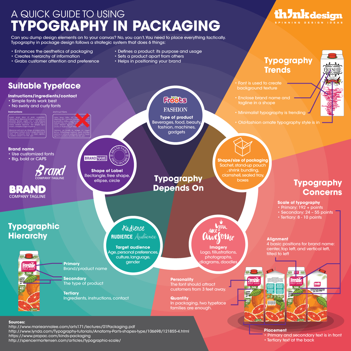
The Science of Typography in Packaging to Grab Customer Attention
Feature Image Source: Flaticon
Why use typography when a picture can speak a thousand words? This notion is not entirely applicable in packaging, at least. In your package design, you need a balance in design. This equilibrium is created by using visual elements along with written material. Together the two define and refine your product package design.
In graphic design, where your branding stationery and marketing material has to reach people around the world – with the correct meaning attached – you need words. These need to be beautified using the art and science of typography.
In Getting it Right with Type: The Dos and Don’ts of Typography (2006), it is written that “…typography is first and foremost about the communication of information.” It is a versatile design element because not only does it help in conveying a message, but also makes words attractive.
Hence, I will focus on how to strategically and aesthetically work with typography in packaging, in a way that it boosts your brand’s recognition, preference; and improves your return on investment. Tim Berry of Palo Alto Software, in his article Packaging and Labeling Your Products suggests that “well-designed packages offer a promotional tool and convenience value to the user.”
So let’s begin!
The Purpose of Typography
In Packaging Design: Successful Product Branding From Concept to Shelf, it is explained that “typography for packaging design communicates the marketing message on a three-dimensional medium, is initially viewed from a distance, and is viewed by people of varying cultural, social, and ethnic backgrounds – all in a short amount of time…”
You can very well wrap your product in a sachet, stand-up pouch, shrink bundling, clamshell, sealed tray, boxes, and bottles etc. – but if the information on it is placed synonymous to a long and dreary Microsoft Word document – then God help you. So what is the purpose of typography in packaging?
Aids In Positioning Your Brand
Typography helps a brand position itself. The way you want to position your brand depends on what you want to sell, and how you want people to perceive you. The fonts you choose and the way you compose text on packaging design tells people the kind of brand you are.
Helps Differentiate Your Brand
You must have noticed that typesetting varies on different products, and this helps a brand to set itself apart from others. A customer can easily distinguish between products and brands. With the choice and composition of typography, packaging of brands can be differentiated.
This packaging is surely different.

So is this one.
Defines Your Product Better
Carolyn Knight and Jessica Glaser, researchers from the University of Wolverhampton, UK say that “visual elements of typography speak louder than words”. Nevertheless, you must note that visual language is only significant when “created by carefully selected typography” (Smashing Magazine, 2012). Using typography in a tactful manner, a lot be said about the product even in a limited space.
Grabs Customer Attention
The first objective should be to draw your existing or potential customers from 3 feet away to picking your product up in their hands. If they simply stroll by, without even noticing your product then you’ve lost your chance! Typography isn’t the only thing that supports you in this, but it is one of them.
Affects Customer Preference
Package design guru Walter Landor, on making design look pleasant, once said, “the challenge is tremendous of course in a competitive economic system to make sure that people respond more favorably to this brand, as a result of a package…” and the way this is done is by making a product “easier for someone to buy.” By using typography, effectively, you can influence customers to buy the product, and feel exultant about what they’re getting.
Uplifts Appearance of Packaging
Visual content takes 95% of the share in attracting buyers via design. It includes images, color and typography. Fonts when arranged in different ways for varying purposes, create diverse effects. There is a difference between typography used to:
• structure information in a paragraph
• create a background texture on packaging
• decorate brand name and product type
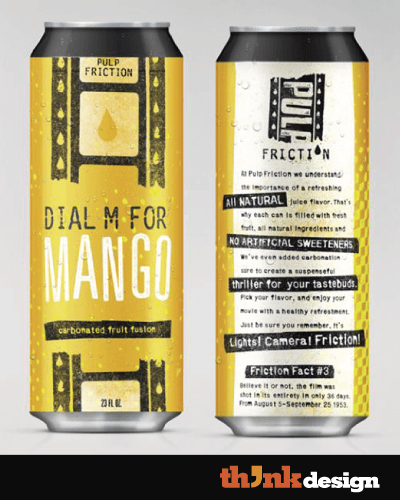
Image source
Creates Hierarchy in Design
Carrie Cousins says “hierarchy gives readers a sense of how to actually read material from start to finish with visual cues and flow”. Typography hence directs customers’ eyes around packaging. This is a clever marketing strategy to focus customers’ attention on brand name and product type more than the ingredients and instructions.
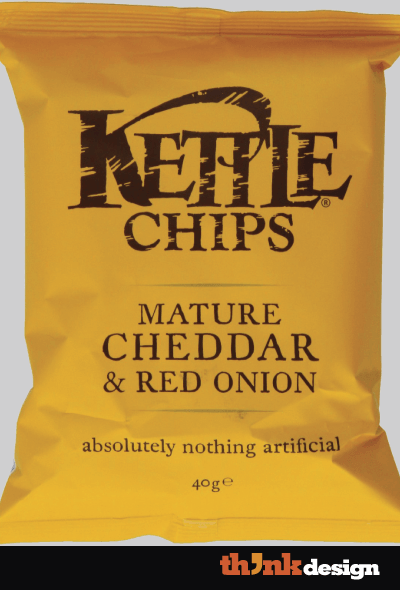
Image source
Hierarchy of Information in Packaging
As discussed above, “… typographic decisions relate to what are called hierarchies of information since in any design, some things will need to be read first, with secondary information to follow” (Graphic Design School, fifth edition, 2014). In package design, typography helps in segregating information, creating emphasis, and defining visual structure of information. Here are the things you must know
Primary
This section contains all the information that instantly helps you position a brand. The name of the brand. It is very evident on chocolate bars, or any packaging that is small enough to fit in the palm of your hand. In such products, typography pleasantly screams the product name like vendors on streets do for their products.
Secondary
This includes the type/flavor of the product, advertising slogan, the quantity, and sometimes the calories. You must have noticed that the primary and secondary text is usually in the façade of the package design. This set of information is all that’s important, once customers are less than a foot away from your product’s packaging.
Tertiary
The information in this hierarchal level includes the tiny written material (customers often ignore unless they are the finicky types) for which you need to squint your eye. It includes the instructions, ingredients, cautions, and contact information.
https://www.youtube.com/watch?v=9-nrw52rDpg
So how do you (the designer) use typography artistically and scientifically in order to grab customer attention from far away and up-close?
The Correct Typeface for Typography
Typography is incomplete without a suitable font, which helps a package designer convey intended meanings and emotions; and acquire favorable actions. This said you must have by now noticed that typography isn’t only the fancy stuff you see on Pinterest, it’s also about how the text is placed at the back, down or side of packaging where paragraphs of information is written. So what is the suitable typeface for typography in packaging?
The kind of customers
To better your typeface selection skills in packaging, you must understand that there are three kinds of customers:
- Those who scrutinize every tiny piece of information on the packaging before even considering to buy the product.
- Those who simply look at the package design, and are inspired enough to buy it. It’s like love at first sight. “I’m one of those designers that ends up picking the better designed product as opposed to the better one”, Julya Buhain (UCreative, 2014)
- And then those who don’t care about the design or the ingredients. They are more concerned about what’s inside – the quality, design, usability and durability of the product itself.
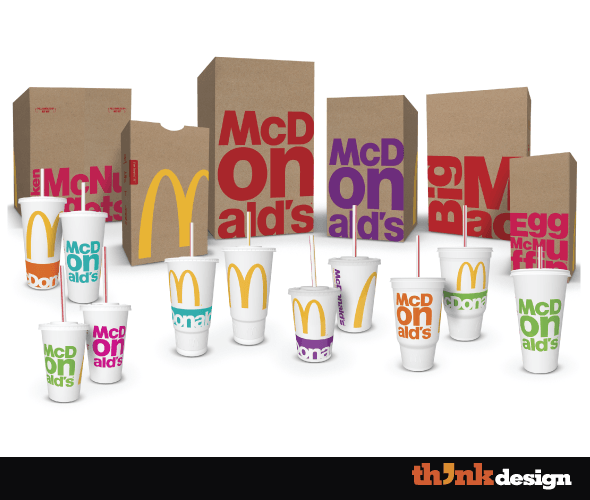
Brand/Product Name
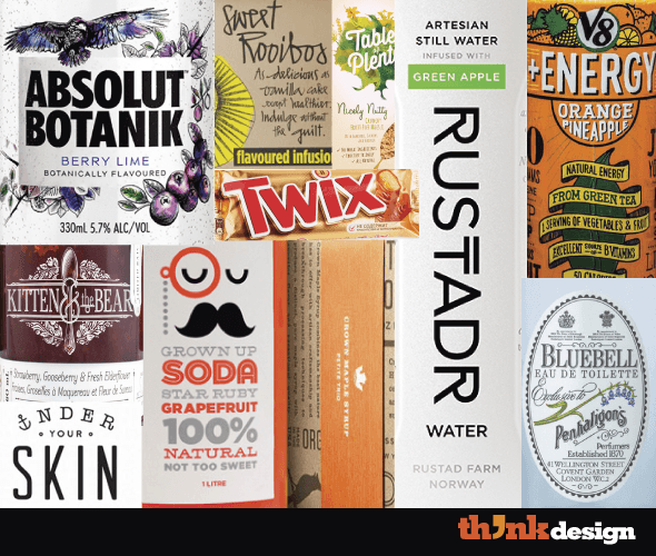
To pop the brand name or the product’s name from the rest of the design elements in a packaging, a customized font works best instead of using pre-made templates. Whichever typeface you’re selecting or creating from scratch, for your branding, make sure it’s big, bold or in capital letters.
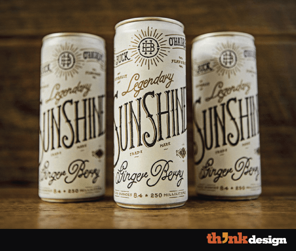
Image source
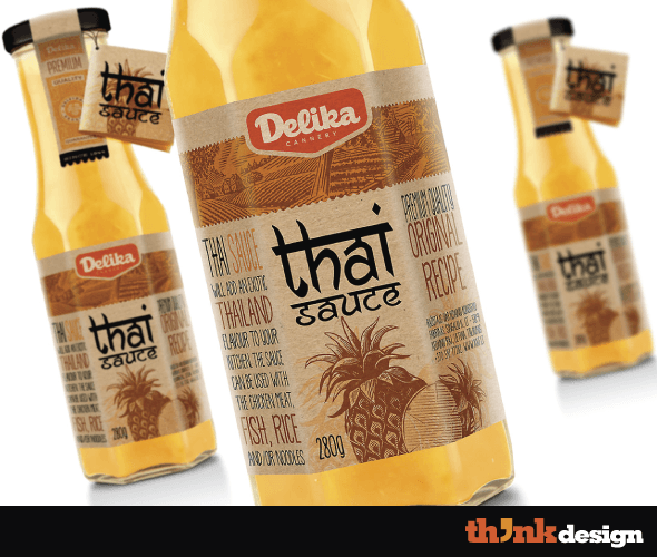
The Nitty-Gritties
The tertiary information in packaging is usually presented using simple serif and sans serif fonts for easier readability. In general a decorative typeface is avoided, but this depends on the type of product and the target market. However designers these days are using fancy, funky and use unconventional ways.
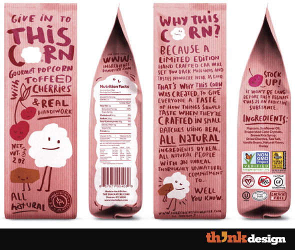
Image source
Factors Affecting Typography in Packaging
The way you use typography in packaging depends on several factors – from the type of product to the shape of packaging and much more. Before brainstorming ideas regarding typography in your product packaging design, you need to know the factors affecting typography.
Product Type
The type of product affects the design of the packaging. The “type” can be categorized in several ways. It can be a consumer product or a business product, a luxury brand or a high-street one, a kind of food or even a gadget.
Package Shape/Size
Packaging is available in different styles, shapes and sizes. The type of product and brand affects the physical attributes of a package. This then has an impact on the way typography is used by graphic designers.
Product Labels
Labels influence the appearance of packaging, and affect the way typography is used. Labels are tailor-made into customized hues and shapes. For certain products, such as those that fall under the Food and Drug Administration categories, need to follow certain guidelines for labeling their products.
Target Market
Target market research is the most vital part of any kind of design. Details about your customers influence the way you display information via the art and science of typography. Factors that are useful for package designers, include:
- Age – is your customer a child, a youngster, a middle aged person or someone old?
- Gender – are you targeting males, females or both?
- Language – does your target audience understand English, French or Chinese?
- Culture – what is the life style of your consumers?
- Personal preference – what does your customer like, love, dislike or hate?
Design Imagery
All the other elements of design affect your choice of style, size and composition of typography in packaging. The placement of logo design, photographs, diagrams, charts, icons, shapes and doodles etc. influence the way text is structured.
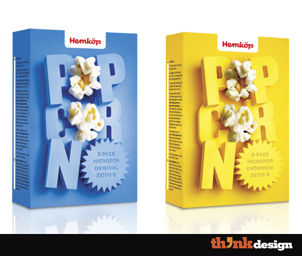
Image Source: Hemkop popcorn
Typography Technicalities in Packaging
Once all the thinking is done, don’t think that you won’t need to think in this step. Confused? It’s time to execute your idea. First you make design prototypes using the trial and error method – coming up with ideas is fairly easy but only those ones matter that can be materialized. Once a final sample is selected by the client, you get onto the software to finalize the package design and get it ready for mass production. It’s time to know the essential technical aspects of typography in packaging.
Quantity
William Beachy, in his article Become a Master Designer: Rule One: Limit your fonts said, “The best way to accomplish a consistent look to your design is limiting the number of artistic motifs (themes) that you use. The fonts you select are the first variable you want to limit. I typically like to pick just 2 fonts per design.” This is in fact a common rule in graphic design, at large.
Personality
Everything around us has a personality, be it a living or a non-living thing. Fonts have several traits, and when they are put together into a design using the technique of typography – you can convey messages and create moods. In packaging, fonts play a major role in attracting both existing and potential customers towards the product from at least 3 feet away.
Layout
Typography composition depends on the kind of information being conveyed in packaging. The primary and secondary information usually appears in the front. All the other written copy goes at the back of consumer product packaging.
Alignment
I am very particular about alignment, are you too? In packaging this principle of design helps create balance, easy-to-read arrangement, and visual connection of typography with other elements of design. Alignment in packaging is used to add emphasis and give structure to information. If we focus on the brand/product name then there are four common ways to align it: center, top left, vertical left, tilted to left.
Scale
The scale of typography as a whole, and the size of fonts in it have a huge impact on design. Primary information is visible if the point size is at least 192 plus point, secondary text should be between 24 and 55 point, and tertiary is usually 8 to 10 point.
These are the foundations of typography in packaging, however to grab customer attention the science of typography is not enough. You need to stay up-to-date about visual trends.
Typography Trends in Packaging
Being up-to-the-minute about graphic design trends is crucial. In fact being aware of the past is also helpful since designers are now using the past and present to create a fusion of epochs in design. Nonetheless, you should know these typography trends in packaging.
Creating Backgrounds
Among the countless uses of typography, it is used to not only create illusions of objects but to do a lot more. With different styles and sizes of fonts you can create texture on a package design using printing techniques like embossing and die-cut. You can also simply use typography as a background for packaging.
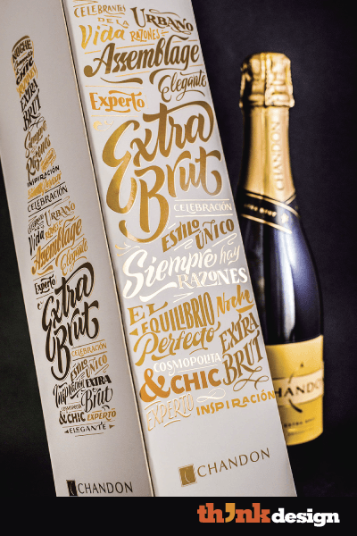
Image source
Framing Typography
Brand names, product types, slogans or other words that need prominence are enclosed in an open or closed frame. This isn’t the label, in fact a part of 2D design on the packaging. This is a step further in marketing to focus customers’ eyes right on the information.
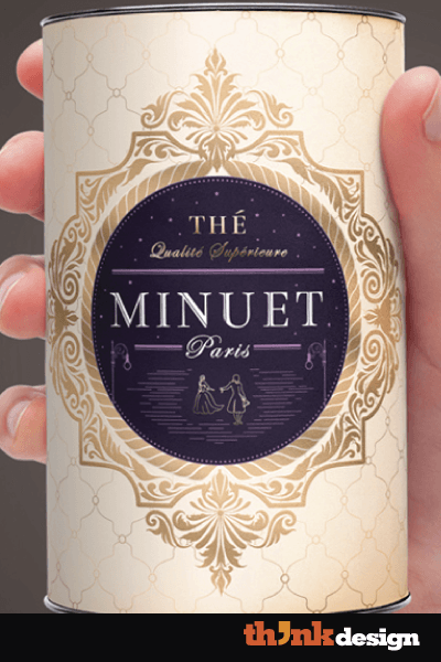
Image source
Minimalism
Defining the extent of minimalism in design depends on the graphic designers and their clients. Some package designs follow the extreme path, while others use this design trend cautiously.
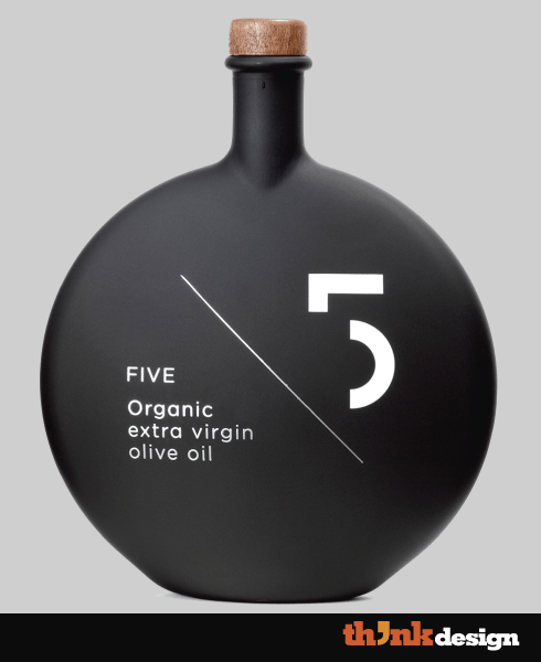
Image source
Old-Fashioned Style
Graphic designers are using vintage and retro design ideas in their works. The same trick is being infused in packaging for products like tea, wine, mint toffees, chewing, polish and beauty creams etc.
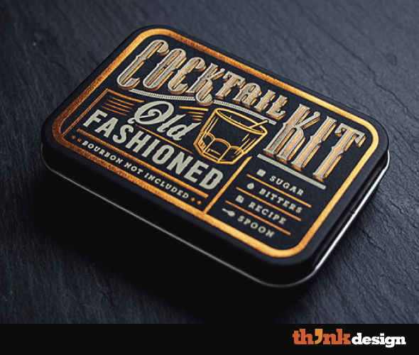
Image source
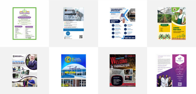
Note that typography is a single visual aspect of packaging design, so don’t forget other elements of design like line, color, texture, direction, shape and value.
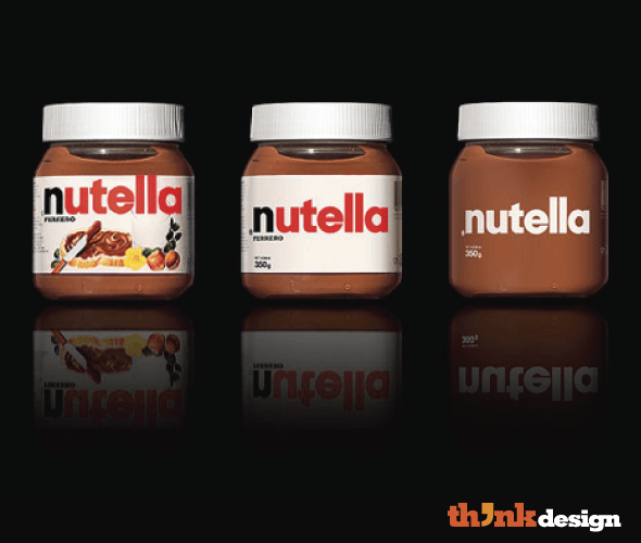
Image source
Found these tips valuable? Leave a comment below.
Embed this Infographic on your site using the html below: