Pro Techniques to Create Emotionally Appealing Logos in Fast Food Branding

Featured Image: Freepik.com/pch-vector
Fast-food establishments that succeed have distinctive and memorable logos that set them apart from their competitors. The restaurant’s objective, beliefs, and aesthetics are accurately conveyed in the logo.
Fast food restaurants offer various quick and convenient options for hungry customers, such as hamburgers, hot dogs, fried chicken, and pizza. Due to the number of choices available to customers, fast food brands need logos that can stand out and appeal to the right emotions.
Designing fast food restaurant logos can be challenging since it must reflect its brand personality and be memorable to customers. Logos are visual representations of your brand, making them somewhat more challenging to design. However, don’t worry; that’s what we’re here for.
Today we will discuss why having an emotionally appealing logo for a fast-food restaurant is so vital and how to create one. So let’s get started.
How Important Is It To Create Quality Fast Food Logos?
The logos of food companies are known to play a significant role in defining their brand identity. Generally, people form an impression of a place based on its logo. It is common for a pizza company to depict pizza in its logo. As a result, it can attract customers by providing a clear message.
For businesses in this industry, it is important to get quality logos designed. Marketing professionals should always remember that logos play a key role in defining their brands’ identity. A prime example is Sonic Drive-In, which not only maintains a distinctive logo but also offers a diverse menu, as detailed on the Sonic Menu Guide.
Consequently, it is recommended that you always consider the design of your logos. The design of unique food logos is particularly important if you are involved in the food industry.
Furthermore, you must know how to copyright a logo. It is also imperative to protect restaurant logo rights by registering it as a trademark. Trademarks apply to brand identifiers and can help protect your design, names, graphics, and the slogan you use alongside your logos. By doing this, you can ensure that your logo is not copied without your consent. You may want to talk to an IP expert lawyer for more details about registration and how much it will cost to register a trademark in your jurisdiction.
Licensing allows you to advertise your business freely in the market since it provides official endorsement from the authorities.
Pro Tips for Creating a Fast Food Logo
Now that you understand why logos are essential for your fast food brand, let’s look at some pro tips on creating one.
1. Know Your Restaurant Brand Identity
Brand identity refers to a restaurant’s beliefs, personality, and unique selling proposition. Something that truly distinguishes it. If you know what your brand represents, it is possible to design an appealing logo that incorporates all the values.
Decide what your restaurant goal is. What service are you providing, and how will you explain that in a logo? That is up to your creativity.
Establish the target market for your fast food restaurant and determine what they are looking for. This information can assist you in making style judgments that appeal to consumers.
Most fast food brands appeal to younger demographics (20-35-year-olds) because they like burgers, pizzas, and pasta compared to adults. So your logo should appeal to them and be youthful and energetic.
For example, Chipotle’s bold logo design conveys a brand commitment to professionalism, and the image of ‘red chili’ clearly tells the restaurant offers spicy food and snacks on its menu, which some people might prefer.
Image Source: 1000logos.net
Your brand personality and what you offer at your restaurant must be reflected in your logo in some way.
2. Choose the Appropriate Color Scheme
The choice of colors is a crucial element in the design of any logo, not just fast food brands. Choosing the right color combination for your fast food logo is very important in attracting customers.
We may create an entire library of books on logo design if we start discussing color combinations. We are giving you an idea of the colors most appropriate for your brand.
Colors should always reflect your brand. In the same way, the logo for a food business should adhere to the same theory. It is common for fast food branding to use bright, bold, and warm colors such as red, yellow, and orange to create a sense of excitement, hunger, and urgency.

Also, you can avoid selecting the same colors by using different shades and hues. Check out the above example of a logo for a food business.
3. Typography is of Utmost Importance
When designing a logo for a business, never underestimate the fonts. Font logos are quite memorable and give clear meaning about what services you provide.
You are advised to follow some simple steps when selecting the perfect fonts for your food business; however, there are only so many perfect guidelines.
Readability is one of the most important factors. Ensure that your fonts are easy to read because your customers need to remember where they bought their tasty burgers or who made the best french fries. Here are a few fast-food logos that have memorable and catchy fonts.
As a general tip, the number of fonts on a logo should be at most three.
4. Incorporate Relevant Images
The most common element of a logo is an icon or symbol. Some icons will be more appropriate for certain food business logos than others. For this reason, you should choose icons representing your food and services.
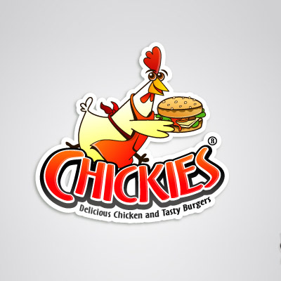
For example, look at the following logo of ‘Chickies’ and their tagline. It clearly shows a chicken handing out a burger which is exactly what the restaurant serves, ‘Chicken Burgers’.
5. Keep it Simple
Maintaining simplicity is also key to creating an emotionally appealing logo. A logo that can easily be scaled and reproduced will also look better on various media, such as billboards and menus.
Logos with fewer colors, legible fonts, and no complex graphics will be easier to remember. It can create an unprofessional appearance when you use fewer typefaces in a design.
There is often a correlation between picture quality and how much is displayed. If your images are too deep or complex, they may not reproduce properly on different devices. Instead of creating a complicated logo, create something memorable and simple.
ZillionDesigns.com
6. Add a Tagline to Your Logo.
When designing a logo, always include information about your company so that viewers will understand what it does or sells. This information is called a ‘tagline’, which many brands use.
The tagline of a business, especially a fast food restaurant, is typically a one-liner that conveys its message to its audience. It may be difficult to add a phrase to your logo, but sometimes it is the most effective way to assist your audience in identifying your brand.
Consider, for example, the logo of Subway. What immediately comes to mind when you hear “eat fresh” In most cases, vegetables, cold cuts, cheese, and other healthy foods are served. That’s exactly what they do; Subway also believes in providing healthy and fresh food to their customers, which is evident in their logo.
Consider the other example, ‘Snaps Burger’, which states Fresh Burger in a Snap’ or Shelter stating ‘Plant-based burger’, meaning vegan food. These taglines tell what the restaurant offers and its services.
7. Make Your Logo Flexible
Flexibility in a logo refers to using logo design across various platforms without losing its imagery. This can be very important in creating an emotionally appealing logo because flexible design ensures that the emotional appeal remains consistent across different platforms such as websites, social media, packaging, signage, menu, and advertising materials.
Emotionally appealing logos should be effective at all sizes, whether tiny symbols or huge signs to maintain their effectiveness. Whether written in colors, or different backgrounds.
Simple and basic designs make using a fast food logo easier to use on various platforms but if the design is too intricate or complex, it may be less appealing when scaled down.

ZillionDesigns.com
8. Find Inspiration From Competitors
A competitor’s logo should always be considered when designing an emotionally appealing logo. Taking inspiration from their incredible design can help you design your own, but don’t copy it 100% otherwise, it may result in copyright infringement.
Find their main selling point which evokes emotion it could be anything like color, image, or typography that the audience relates to.
During your competitor analysis, you might also come across some logos that fall short of evoking emotion and don’t effectively communicate their brand values. Learn from their mistakes to make your logo more impactful.
Image Source: logos-world.net
9. Change Your Logo Design to Add New Emotions
Many times we have observed that famous fast-food restaurants redesign their logo to adapt to the modern world. The target audience changes over time and so does their emotional response to a logo.
Also, the older audience might get bored over time with the same logo so bringing some change over time can reignite those emotions and they feel more connected to the brand.
A change can be very small like adding or removing a color, an image, or changing a font that gives a completely new look to the logo design. Some notable examples include:
- Wendy: Over the years, Wendy’s logo has undergone several changes. Since 2013, Wendy’s has introduced a more streamlined and modern logo, which focuses on the recognizable Wendy’s icon rather than the scripted font. Changing the logo was intended to evoke feelings of quality, freshness, and a contemporary look.
- KFC: KFC’s logo has undergone several iterations over the years. To evoke a sense of tradition, authenticity, and the founder’s legacy, the brand introduced a logo incorporating Colonel Sanders’ portrait in the 1990s. The Colonel’s image has been maintained in KFC’s logo; however, the design has been streamlined and modernized in recent years.
10. Additional Features To Consider
If you wish to stand out from other businesses in the food industry, you must be able to offer something truly unique. This uniqueness must be reflected in your logo too. You can try to stack fonts and icons in your fast food logo to achieve a vertical visual impact.
Your business name can be broken up with different fonts and color combinations. The fonts should be placed inside the icon, but they should be perfectly matched. Make the design more appealing by adding some other design elements.
Best Food Logo Ideas to Take Inspiration From
If you need help developing logo ideas, look at some famous fast-food logos you can find online. These will give you some inspiration and ideas on where to start designing your logo.
We will explain below some popular logos that you can look at and what they represent.
1. Simple and Minimalistic Logos
Nothing is better than a logo constructed with a simple design. This technique has been proven to be effective over the years. Since these logos have a minimalist design, they are easily understood by everyone.
Burger King is a good example of this in terms of its logo. The wordmark ‘Burger King’ is sandwiched between burger buns. It gives a clear indication of the company’s specialties and its services. These simple logos can be used anywhere for publication and branding too.
The Chick-Fil-A logo is very similar to that of Burger King. This wordmark’s unique design depicts a chicken head at the beginning. This logo indicates that the company offers the best quality chicken fast food items, delicious toppings, and sauces.
Image Source: 1000logos.net
2. Wordmark Logos
The logos of many food companies today contain wordmarks. You can refer to it as one of the simplest ways to represent your business in the market. In addition to food companies, companies from a variety of other industries also choose to use wordmarks as their primary branding tool.
People use wordmarks for various reasons, but the need for simplicity is one of the most common. It is not uncommon for businesses to present their names decently to facilitate their recognition within their industry.
Many food chains have adopted this strategy to maintain a neat market presentation. A unique font is used for the design of their logos. They rely solely on wordmarks to create their logos.
Pizza Hut, Tim Hortons, Sweet Green, and Panera Bread are notable examples. These logos showcase restaurant names in a classic font with minimum imagery and less color combination.

Image Source: 1000logos.net
Image Source: 1000logos.net
Choosing the right font is also crucial since it is an integral part of a wordmark. You can choose between italic and straight fonts depending on your brand theme.
If you select fonts, remember that your wordmark will be used in digital and print publications. Therefore, it is recommended that you select fonts that are compatible with both platforms. Besides sizing pixel quality, also affects the overall look of the logo.

Image Source: ZillionDesigns.com
3. Bold Logos
Following that, we will discuss the most desired food logos in the market, namely those that are strong and bold. It is precisely designed with glitzy colors to attract the customer’s attention. As a result of these logos, a brand can become recognized as a unique player in the market.
Several bold logos are very popular among foodies, including Dunkin’ Donuts. It utilizes a combination of catchy colors that effectively attract viewers’ attention.
The In-N-Out Burger logo features a distinctive double-arrow design with a retro-inspired font. The logo is notable for its bold, two-tone color scheme of red and yellow, common in fast-food restaurant branding that we discussed earlier.

Image Source: 1000logos.net
Choosing the right colors is extremely important to design a bold logo. An incorrect selection can lead to an unprofessional appearance for the entire emblem, negatively reflecting the business. Here is another example you can look at.
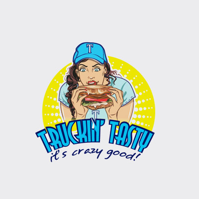
Image Source: ZillionDesigns.com
It is possible to find help in this regard through professional graphic design agencies. With good experience and expertise, they can create various logos according to your specifications.
Conclusion
Creating emotionally appealing logos for fast food branding is an important aspect of successful marketing. By using pro techniques, fast food companies can evoke emotions in their target audience, leading to increased brand recognition, loyalty, and sales.
It’s important to remember that a great logo is not just about aesthetics, but also about how it connects with the target audience and leaves a lasting impression on them.
