Top Tips For Graphically Presenting Product Information In Brochure Design
Featured Image: iStock/RLT_Images
Are you looking to create a brochure that not only educates your readers but also increases your reach? Perhaps these tips to design a creative brochure might help you get a potential customer to take action.
Brochures are a ubiquitous form of marketing that gives people the exact rundown of what you have to offer. However, creating a quality brochure that attracts buyers can be a pretty daunting task, especially with so many formats to choose from. Do you want to be bi-fold or trifold? Text-heavy or infographic based? There are too many choices to make that can be overwhelming and before you know it, you’ll be down with decision fatigue.
But don’t worry, in this article, we’ll walk you through everything you need to know about preparing the copy and images and the final edit of your brochure. Reading this can help you arrange your thoughts and give you great ideas for your brochure design.
So, let’s get started and create a brochure that will leave a lasting impression on your target audience!
Brochures in the Modern World
It might be hard to imagine, but the truth is that nearly every individual is becoming weary of the over-stimulation of digital advertisement. Think about how you engage with online ads. How often do you click on them?
As per IPG’s study, 65% of people skip video ads. And they do it at the first opportunity they get! What’s even more surprising is that not all of them skip the ad because they find it uninteresting. In fact, as many as 76% confessed that they skip ads out of habit. So, if you’re hitting the skip button the first chance you get, you’re not alone.
In this context, going back to basics might seem like a very primitive option; but it might be just what you require to capture the audience’s attention.

Image Source: Brochure Design
Focus on the Copy and Images
When designing a brochure, it’s important to start by understanding the length of your copy and the kind of images you’ll be using. This knowledge will help you make decisions about the layout, format, length, and font size. But don’t get too attached to one solution, because being flexible and willing to make changes is key to creating a successful design.
Remember, readers tend to scan pages quickly, so don’t overwhelm them with big blocks of text. Use headlines, sub-headlines, and bullet points to structure the content and make it easy to digest.
When it comes to images, aim for high-quality and cohesive storytelling. Make sure your images can be used at a larger size without losing quality or appearing pixelated.

Image Source: ZillionDesigns.com
Create a Flow with Your Graphics
The way you present your copy and images in your brochure must have a flow that is not just easy on the eyes but captures attention. It’s not enough to present information like an infographic. You’ve got to make sure that even the infographic flows.
Fonts
Firstly, you have to make sure your fonts match your branding. This helps create a cohesive message throughout all the visual marketing designs and materials. it’s best to stick to no more than two fonts and use font families to highlight specific copy. Now, while there aren’t strict rules about what fonts to use, traditionalists tend to use serif fonts for lengthy body copy and sans serif for display copy.
But don’t be afraid to get creative! You can use italics to highlight important text or bold sans serif fonts for impactful quotes. Just remember to always test print your copy over a dark background to make sure it’s easy to read.

Image Source: ZillionDesigns.com
Colors
Once the fonts are decided, you can move on to the color scheme. Color can also help create a hierarchy within your copy. Try highlighting headlines and using dark colors for the main body of text. Use your negative space effectively! If you have the color story for your brand, make sure you stay in line with their colors and overall branding, including logos.
In case you don’t have one, try online logo designers to ensure that your design is consistent and recognizable.

Image Source: ZillionDesigns.com
Maintain a Balance with Spacing
Let’s talk about designing a user-friendly flow for your printed materials. Always keep spacing in mind. It’s important to consider how readers will receive the information—will they read it in one go or pick it up and put it down?
Be mindful of balancing text and visuals on each panel. Remember, they should work together to create a striking finished product. To make it easy on the reader, keep your copy bite-sized and avoid large blocks of text.
When arranging your content, think about the logical flow and how it will complement the way your brochure unfolds. If you don’t have high-quality imagery, you can use graphics to create a balance and depth. The brochure can play an important role in branding and help small business promote their products with effective visual design content.
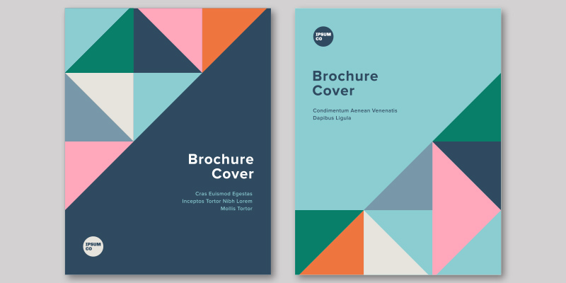
Design an Impactful Cover
Crafting a captivating cover is a crucial aspect of brochure design. It’s the first thing that will catch your reader’s eye. Consider it like a billboard for your brand message. But how do you create an effective cover that stands out from the competition?
To start, keep it concise and straightforward. Your cover should be easily readable from a distance, especially if it’s displayed on a rack. Avoid cluttering it with too much information, and instead, opt for striking imagery that represents your brand or client. Remember, sometimes a picture is worth a thousand words. In case you are struggling to remain concise, you can utilize a summarizing tool that will quickly eliminate all the unnecessary details from your business cover.

Image Source: ZillionDesigns.com
Pick the Right Fold Option
Have you ever noticed that any brochure that you’ve ever come across comes with unique folds? If you haven’t let’s break it down for you in a way that will make you a brochure-folding pro! It will also help you pick the one that presents your copy the best.
The Bi-fold
First up, we have the bi-fold. This is probably the most common type of brochure fold, where a single sheet of paper is folded in half, creating four panels. This is perfect for those who want to convey a simple message or highlight a few key points.
Pros:
- Bi-folds are easy to design and print and can be cost-effective for businesses on a budget.
- They are versatile and can be used for a variety of purposes, such as product guides, event programs, or restaurant menus.
- The four panels provide ample space for information without overwhelming the reader.
Cons:
- The limited space can make it difficult to include a lot of detailed information or images.
- The panels can be difficult to read if they are too small or cramped.
- Bi-folds may not stand out as much as other, more unique types of brochure folds.

Image Source: ZillionDesigns.com
The Tri-Fold
Next, we have the tri-fold, also known as the letter fold. This is where a single sheet of paper is folded into three sections, creating six panels. It’s a popular choice for brochures for real estate companies because it’s easy to design and allows for a good amount of information to be included.
Pros:
- Allows for a good amount of information to be included due to the six panels
- Easy to design and print, making it a popular choice
- Offers clear sections for different information and visuals, making it easy for readers to navigate
Cons:
- Can be more expensive to print than bi-fold brochures due to the additional panel
- Can become cluttered if too much information is included in each section
- The outer panels may not always be visible when the brochure is displayed in a stand or rack.

Image Source: ZillionDesigns.com
The Gate Fold
Then there’s the gatefold, where the brochure is folded twice to create six panels, with the outer two panels folding inward to meet in the middle. This type of fold is great for when you want to create a big impact or reveal a surprise.
Pros:
- The gatefold brochure is perfect for telling a story, as it opens up to reveal a large central image or message, which can be very effective for grabbing the reader’s attention.
- It allows for a lot of information to be included, as the panels can be folded out multiple times to reveal more content.
- The design can be very creative and unique, with various panel sizes and shapes, which can make your brochure stand out.
Cons:
- The production cost for a gatefold brochure can be higher than other types of folds, due to the complexity of the design and the need for precision folding.
- It may not be as easy to handle or store, due to its larger size when opened up.
- If not designed properly, the gatefold brochure can be confusing for the reader, as they may not know where to start or how to navigate the multiple panels.

Image Source: ZillionDesigns.com
The Z-fold
Moving on, we have the Z-fold, where the brochure is folded in a zig-zag pattern, creating six panels that fold in on each other. This type of fold is perfect for showcasing a series of images or steps, as each panel reveals something new.
Pros:
- The Z-fold is space-efficient and allows designers to display a lot of information on a single sheet of paper.
- The way the Z-fold opens up allows the reader to easily see all the information in a logical order, making it easier to read and follow. This makes it a great choice for conveying important information in a clear and concise manner.
- The Z-fold is versatile and can be used in a variety of contexts. It can be adapted to suit different design needs, making it a flexible option for designers.
Cons:
- The Z-fold requires precision and accuracy to ensure a neat and professional-looking final product. Multiple folds and creases need to be carefully made to avoid creases that are crooked or uneven.
- While the Z-fold can hold a lot of information, there is a limit to how much can be included on a single sheet of paper. This may not be ideal for projects that require a lot of detailed information, as it may be difficult to fit everything onto the page.
- Because the Z-fold is a common folding technique, it may not stand out as much as other, more unique folding methods. However, the creative use of colors, graphics, and typography can help make a Z-fold design more visually striking.

Image Source: ZillionDesigns.com
The Accordion Fold
Last but not least, we have the accordion fold, where the brochure is folded in a similar pattern to an accordion, with each panel folding in on itself. This is a great option when you want to create a booklet-style brochure with multiple pages.

Image Source: Behance.com/Graphic Arena
- The accordion fold allows you to fold a large sheet of paper or material into a small, compact size. This makes it easy to store and transport.
- Accordion folds can be used in a variety of ways, such as for brochures, flyers, and even decorations.
- Accordion folds are relatively easy to create, even for beginners. It requires only a few simple folds.
Cons:
- If the accordion fold is used for text-heavy documents, it can be difficult to read as the reader has to unfold the document and refold it constantly.
- The size of the accordion fold is limited to the size of the paper or material being used, which can be a disadvantage if you need to include a lot of information or images.
- The folds of an accordion fold can become weakened over time, increasing the risk of tearing or damage to the paper or material.
So, these are the five main types of brochure folds that you can choose from. Each one has its own unique advantages, so be sure to choose the one that best fits your message and design.

Image Source: ZillionDesigns.com
Brochures to Tell Your Product Story
Brochures are a super way to present your product information. But you’ve got to have a solid copy presented strikingly. Once you’ve got the copy and graphics down, you’ve got to select your fold and see how the information flows when all is put together.
If you’re still at a loss, you should get the help of an expert. Try getting your brochure designed by Zillion Designs and see your product information come to life!