Capturing US Political Logo Designs
Featured Image Source: Vecteezy/frankmib6
Logo designing seems to have taken over the political world! With Obama’s logo capturing the attention in the last elections, other political candidates of 2012 campaign appear to have decided to step up the game of their campaign. The logo design competition begin!
Who said that only companies or businesses can use logos? Logo designs are a representation and an identity. They are a great way to gain public attention and appear to have gained a dynamic momentum at the political front. These can become a very strong factor in branding a candidate.
US Political Logo Designs – Main Factors
The standard colors used for the US political party logos are red, white and blue, which obviously represent the United States and the American flag, while creating the feeling of patriotism. Because of their importance, political logo designs have to be created while keeping in mind all the important rules of logo designing. A political logo can make or break the image of a political candidate!
While some candidates have since dropped out of the running for the presidential nomination, we still wanted to take a look at their logos. With this post, I am covering the current and past competitors of the 2012 presidential race.
Barack Obama’s Logo (D)
This logo tops my list because of its genius design. Designed by Chicago-based agency Sender LLC, it was the flagship symbol for Obama’s presidential campaign in 2008. It is one of the most recognized and talked about political logos.
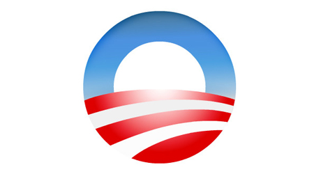
Image Source: 1000logos.net
Simple and hopeful, the logo stands for “a new day.” The overall “O” image obviously stands for Obama. The inner, white semi-circle represents a rising sun over the plains (here in red and white). The red, white and blue in the design represent the American flag.

Image Source: 1000logos.net
The same image is being reused for Obama’s 2012 campaign, only this time the ‘O’ stands in place of the zero in 2012. It continues to deliver the same hopeful message of change.
Ron Paul’s Logo Design (R)
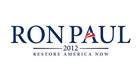
Image Source: wikipedia.org
Classy and simple, Ron Paul’s logo design puts the focus on the candidates name. The “A” in the logo stands for “America” and has the colors of the American flag. The use of Sherif font gives the logo a classic and elegant look.
Jon Huntsman’s Logo Design (R)
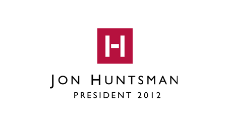
Image Source: logos.fandom.com
This logo stands apart from the rest of the political logos in this post with its unconventional use of black and its modern approach. Simple yet strong, the logo design has stirred up quite a controversy. Some criticize that it is ego-centric and it doesn’t represent patriotism, but rather stands out as a brand name. Many are even calling it a cologne logo lookalike. What do you think?
Herman Cain’s Logo (R)
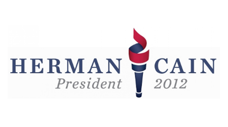
Image Source: wikipedia.org
This political logo has a positive appeal to it and does not seem to be too outlandish or ego-centric. The symbol of torch used in the logo represents openness, respect for the past and a hope for a brighter future. I believe it should have had an elegant font; currently, the symbol stands out more than the candidate’s name itself.
Michele Bachmann’s Logo (R)
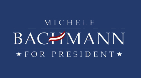
Image Source: wikimedia.org
Here’s another political logo design subjected to quite a few controversies. Many believe that this logo also pays tribute to a toothpaste squiggle (see one right in the middle?). While others say the red and white design causes confusion between Austria’s and America’s flags. Although the font is simple, the creative use of red and white color stripes fail to inspire.
Mitt Romney’s Logo Design (R)
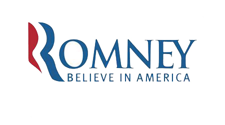
Image Source: wikipedia.org
Romney’s logo design focuses on the candidate’s last name, but doesn’t really seem to do justice to the ‘R.’ While the ‘R’ in the logo stands to create a sense of togetherness, the colors and style have been criticized to look like Aquafresh toothpaste’s squiggle rather than the American flag. It has also been said that the joined ‘EY’ at the end is a bit over dramatic.
Rick Santorum’s Logo (R)
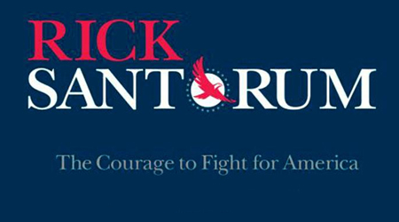
Image Source: wikipedia.org
The first thing you notice about this logo is the soaring eagle with the letter ‘O’ behind it, representing the shining sun. The eagle here is the symbol of courage and represents rising high, although some might think as of it as related to the Native Americans (but that is not the case). After all, the bald eagle is the most popular American symbol.
Images Source: Google Images


