What Makes a Five-Star Hotel Logo Different From a One-Star Hotel Logo in Mexico?
Featured Image: Unsplash/Jorge Aguilar
Logos in the hotel industry are held up to high standards. The most well-known chain logos tend to use ornate graphics and classy text in order to present clean and refined image.
Alternatively, if a hotel or resort is near a beach, it should try to capture the essence of a relaxing getaway in its branding (not all do, sadly). Let’s take a look at classiest hotel logos from Mexican hotels that perfectly fit the industry’s common design aesthetics, and also a few that even the most run-down motels wouldn’t want for their brand.
***** Five-Star Logos
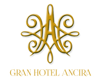
4. Gran Hotel Ancira (Monterrey)
Though the originally curly font for this logo was replaced with a less curled serif font, there is still an air of nobility that emulates from Gran Hotel Ancira’s logo. The ornate design and gold color are common for the classier hotels around the world and in Mexico.
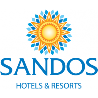
3. Sandos Hotels & Resorts (Cabo San Lucas – Cancun – Playa del Carmen)
Sandos locations across Mexico have different color schemes for their logo. However, the main logo’s combo of a golden-orange sun on a backdrop of blue diamond tiles is what makes the brand stand out. It reflects what guests would want if they stayed near an ocean; a warm, radiating sun over crystal blue waters.
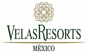
2. Velas Resorts (Vallarta-Nayarit Riviera Maya)
With a muted color scheme, floral imagery, and serif typography, the logos for Velas Resorts evoke the same calming feelings that a guest at a hotel wants to feel during his/her stay.
And now for the #1 hotel logo in Mexico…
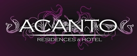
1. Acanto Hotel & Suites (Playa del Carmen)
Not only does this boutique hotel logo utilize a consistent, dignified font and a good divider, but it also uses purple, a color often associated with luxury and elegance, in all of its variations. Add in the unique, curlicue-style wisps in the background and you have a logo that tells guests they will live in opulence while staying at Acanto.
* One-Star Logos
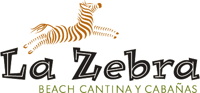
4. La Zebra Beach Cantina Y Cabanas (Tulum)
A logo with a zebra for a hotel does not inspire confidence. The hotel may have been trying to make this brand stand out with the unique imagery, but the use of a somewhat stereotypical-looking African font makes one think of a zoo rather than a hotel.
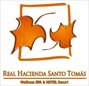
3. Real Hacienda Santo Tomas (Villa Victoria)
The typography of this logo is actually crisp and dignified, and the use of the warm colors blends well. However, the image looks like clip art and suggests that the hotel is a cheap knock-off rather than the real deal.
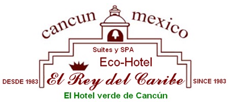
2. Hotel el Rey Del Caribe (Cancun)
The typography of this logo is what causes it to stand so low in our ranks. As if the inconsistency in fonts didn’t make the logo look scattered enough, the variance of font sizes is a head buster for anyone looking at it for more than 2 seconds.
And the #1 worst hotel logo in Mexico is…
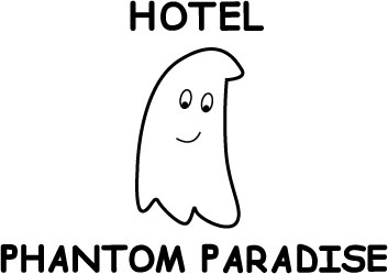
1. Hotel Phantom Paradise (Playa del Carmen)
Even if this hotel wanted to go with a more “haunted” motif to its branding, there are several ways they could’ve approached that theme, and this isn’t one of them. The text and image are thoroughly uninspired and say nothing of value about the hotel, good, bad, or otherwise.
Do you know of any other stunning (or not so stunning) hotel logos from Mexico? Do you have another industry and country whose logos you would like us to analyze next? Leave your comments below, or tweet us @ZillionDesigns!
