SALES / SUPPORT : +1-877-525-5646   |  


Contractor logo

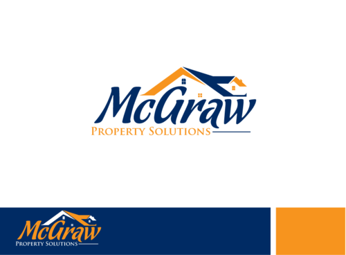
McGraw Property Solutions

Contest Holder JTennant1984 ?

Last Logged in : 3703days5hrs ago

Concepts Submitted

32

Guaranteed Prize
250
Winner(s)

1

Marketing collateral veildAll design entries are veiled from other designers till the end of the contest.
tick_gray

Live Project

tick_gray

Deciding

tick_blue

Project Finalized


Project: Contractor logo
Industry: Construction Logo
Contest Launched: Feb 23, 2014
Selected: 1 winning design from 32 concepts
Winning Design by: x3mart
Close Date: Mar 04, 2014


Contractor logo - Construction


Awarded as a winner
Project Report    

Sort by:


#26

#14

#25


Creative Brief


Contractor logo

McGraw Property Solutions

Construction

Our target audience are homeowners of medium and high wealth.

We want a logo that communicates a serious, reputable, and trustworthy company. We prefer to stay away from web2.0 feel as well as real techy and edgy. Logo marks with text, text only, and contained logos are of high interest. While we do target storm damage vicitims, we aren't a fly by the night storm chaser. We want to use Blue & Yellow color scheme. We want to be easily branded with Yard Signs as we like to stand out in the neighborhood. We are proud of our work.

Related Contests


2 brochure flyers- trifold or bifold, whichever looks better...
$400
Prize Money
35
Concepts
Guardian Select Services Brochure
$200
Prize Money
54
Concepts
property maintenance company
$200
Prize Money
67
Concepts
Cover Sheet For Work Booklet
$300
Prize Money
58
Concepts

Discussion


Comments

  • March 04, 2014 1:01 AM
    x3mart x3mart
     
    As per the site! It should be the confirmation page: "Once you have seen all of the designs and decided on a favorite, you can click on the finalize link on the bottom left of that design. When you click "Finalize," you'll be taken to another page where you will need to confirm your decision. Once this is done, the winner will be announced and you will receive your final design files in 3-5 business days."

    Like Icon 0   DislikeIcon 0
  • March 04, 2014 12:57 AM
    JTennant1984 JTennant1984
      Project Holder
    That's not working. When I click finalize it takes me to a page where I can click on your logo that is enlarged, yet I can not do anything else besides click on the enlarged logo. I'll email the customer service people and see what they say.

    Like Icon 0   DislikeIcon 0
  • March 04, 2014 12:49 AM
    x3mart x3mart
     
    Message sent to private message Message(1) top right! Thanks!

    Like Icon 0   DislikeIcon 0
  • March 04, 2014 12:42 AM
    JTennant1984 JTennant1984
      Project Holder
    Sorry everyone for the confusion. I no longer wish to move this project into the logo design category, and am happy with logo #26. can we finalize this logo?

    Like Icon 0   DislikeIcon 0
  • February 25, 2014 8:03 AM
    JTennant1984 JTennant1984
      Project Holder
    Draft #15 is our favorite so far. Can you change the font to something more like the font in #16, so the "a" is more clear. Also, we noticed the window quadrant is out of balance. We can fix that before finalizing, but you're definitely in the lead at this point.

    Like Icon 0   DislikeIcon 0
  • February 23, 2014 12:42 PM
    JTennant1984 JTennant1984
      Project Holder
    Draft # 1 - I like the idea of a handwritten font, but it needs to be more legible. Can you maybe combine your idea of a handwritten font with a logomark/enclosed graphic?

    Like Icon 0   DislikeIcon 0
  • February 23, 2014 12:40 PM
    JTennant1984 JTennant1984
      Project Holder
    draft #3 & draft# 4 - So far, #3 is my favorite. I really like # 4 since you've found a creative way to make it a type only logo. I think it feels unbalanced. Can you try making the M look more readable at a glance? Also, is there anyway to make the graphic part of the M look more like a roof and less like a mountain ridge?

    Like Icon 0   DislikeIcon 0