SALES / SUPPORT : +1-877-525-5646 |
Login
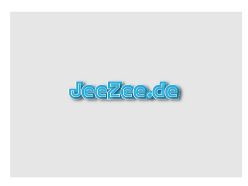
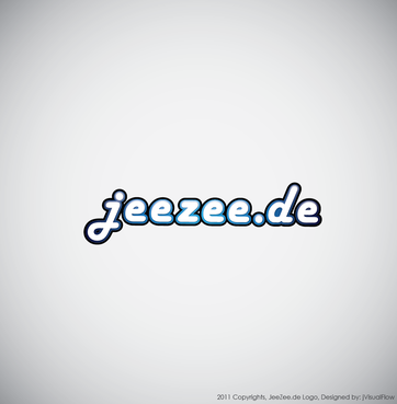
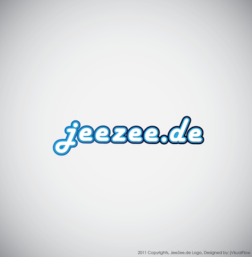
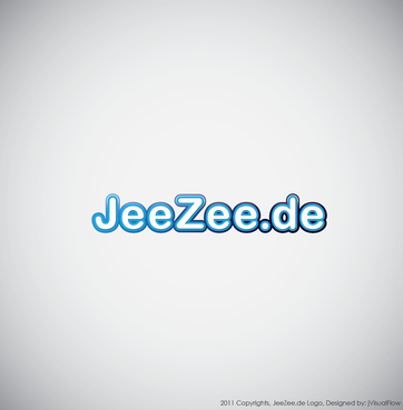
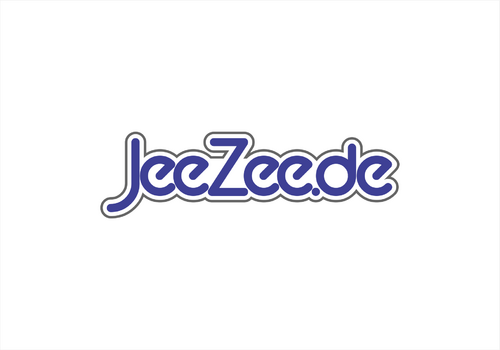
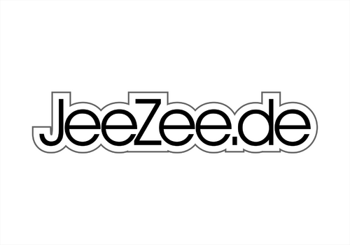
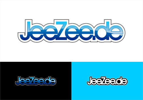
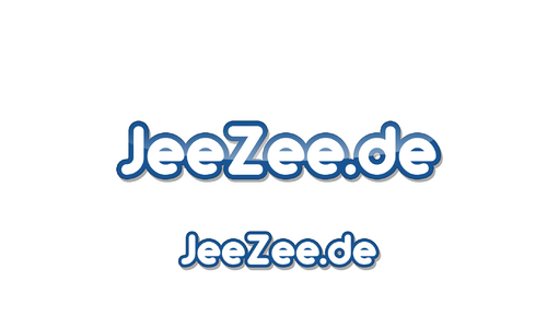
JeeZee.de
|
Contest Holder
webdirector
?
Last Logged in : 4517days2hrs ago |
Concepts Submitted
196 |
Guaranteed Prize
200
|
Winner(s) | A Logo, Monogram, or Icon |
|
Live Project
Deciding
Project Finalized

Entertainment Logo
JeeZee.de
Yes
This logo is for a similar site like Fiverr. You can see the site here: www.jeezee.de. The total look is important. This logo will be going on my Website as given.
Entertainment
Logo Type
![]()
Web 2.0
![]()
Unique/Creative
Retro
not sure


Comments
Project Holder
Project Holder