SALES / SUPPORT : +1-877-525-5646 |
Login
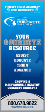
Michigan Concrete Association 33.5"x 86" Display banner
Michigan Concrete Association
|
Contest Holder
hmsmith
?
Last Logged in : 3734days10hrs ago |
Concepts Submitted
52 |
Guaranteed Prize
200
|
Winner(s) | Marketing collateral |
|
Live Project
Deciding
Project Finalized
Project: Michigan Concrete Association 33. ...
Industry:
Construction Logo
Contest Launched:
Apr 01, 2014
Selected:
1
winning design from 52 concepts
Winning Design by:
destudio
Close Date:
Apr 13, 2014


Creative Brief
Michigan Concrete Association 33.5"x 86" Display banner
Michigan Concrete Association
Construction
Our member companies which include concrete producers, concrete pavers, cement companies, concrete contractors, engineering firms, suppliers & product manufacturers. We also work a lot with the Michigan Department of Transportation and local road agencies (cites, villages, counties)
the MCA logo must be used. It can be found on our website at www.miconcrete.org You can find our primary objectives (which may be some good text to use in the banner itself) on our website at: http://www.miconcrete.org/about Also, you can get a really good idea of who we and what we do for our members by going to our website at http://miconcrete.org/node/27 Our colors are blue and white, I would like to see color incorporated into our banner, but the primary color scheme must remain blue & white. We are in direct contrast to the asphalt industry, so using a lot of black or yellow is highly discouraged.
Related Contests


Comments
Project Holder
Project Holder
Project Holder
Project Holder
Project Holder