SALES / SUPPORT : +1-877-525-5646   |  


Providence Presbyterian Church

Providence Presbyterian Church

Contest Holder aaylnx ?

Last Logged in : 4417days8hrs ago

Concepts Submitted

42

Guaranteed Prize
400
Winner(s)

1

A Logo, Monogram, or Icon veildAll design entries are veiled from other designers till the end of the contest. Featured Featured Contest
tick_gray

Live Project

tick_gray

Deciding

tick_blue

Project Finalized


Project: Providence Presbyterian Church
Contest Launched: Feb 13, 2012
Selected: 1 winning design from 42 concepts
Winning Design by: ironmaiden
Close Date: Feb 20, 2012


Providence Presbyterian Church - Religion and Spirituality


Awarded as a winner
Project Report    

Sort by:


#13

#14

#6

#1

#40

#39

#38

#37

#36

#35

#34

#33

#31


Creative Brief


Providence Presbyterian Church

Providence Presbyterian Church

Yes

Providence is a church in the Kingwood (Houston) TX area. Our mission/purpose is simple: we proclaim the good news of Christ and equip people to serve in his church.

Religion and Spirituality

Logo Type
Logo Type


Unique/Creative
Clean/Simple
Modern
Traditional

I'd like to keep the color scheme simple. Not lot's of colors. I'm not opposed to using blue or green, but I also really like designs which have a combination of black, white, grey(s), silver. If a kind of chromatic use of grey/black/white is used, then yes, there could be more than 2 colors.

2

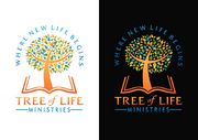
Please avoid the use of a cross. We are in a wooded area so the use of a leaf or tree could be woven into the design if done tastefully. Alternatively, an open book (symbolizing the bible) could be part of the design as well. I said that I'd like to have the words "Providence Presbyterian Church" in the logo, but for simplicity's sake I'd also be interested in seeing a logo with just "Providence" in it.

Related Contests


New Church Logo
$250
Prize Money
90
Concepts
Logo for young adult ministry
$265
Prize Money
46
Concepts
Logo for Outreach Ministry
$200
Prize Money
75
Concepts
Logo for a Hypnotherapy Company
$200
Prize Money
57
Concepts

Discussion


Comments

  • February 14, 2012 8:25 PM
    aaylnx aaylnx
      Project Holder
    I like #7. Could you make the green for "Presbyterian Church" somewhat darker? I think it's a little too light to easily read now, but nice design.

    Like Icon 0   DislikeIcon 0
  • February 13, 2012 8:06 PM
    aaylnx aaylnx
      Project Holder
    Sorry. Foliage is too large/overshadowing of the actual text logo. If there is to be any foliage, it should be very minimalistic.

    Like Icon 0   DislikeIcon 0
  • February 13, 2012 5:50 PM
    eugene eugene
     
    The two leaves depict the old and new Testaments - Law and and grace - the background is the rising of The Sun (HIS SON) and displying your wooded area and the nature where you live and worship.

    Like Icon 0   DislikeIcon 0