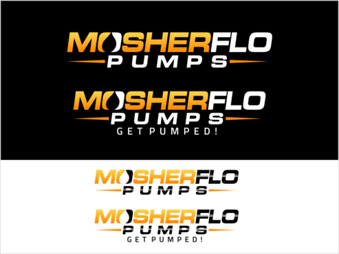
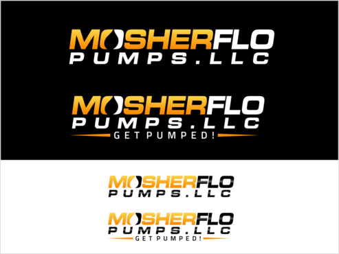
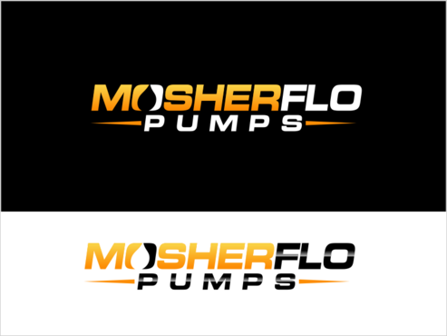
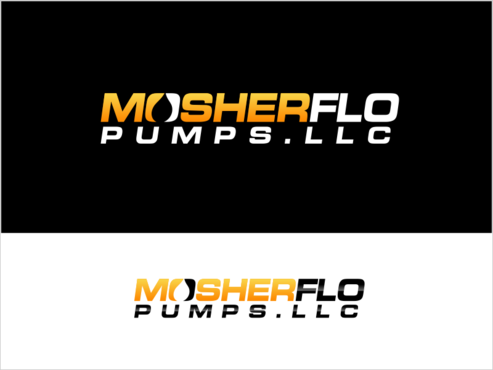
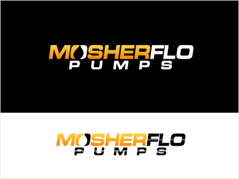
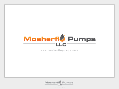
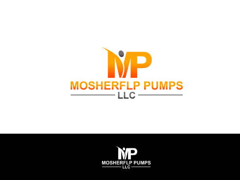
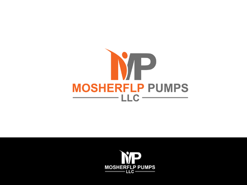
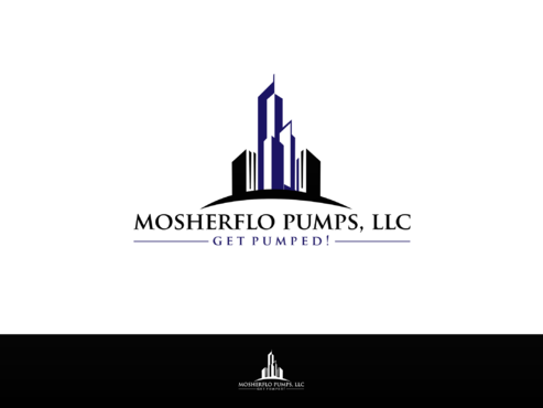
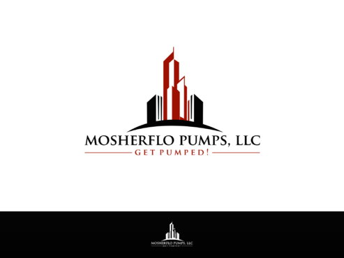
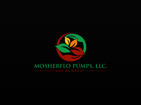
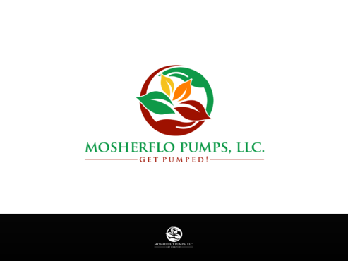
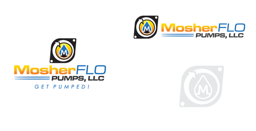
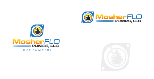
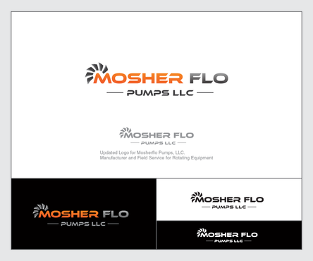
Updated Logo for Mosherflo Pumps, LLC. --Manufacturer and Field Service for Rotating Equipment
Mosherflo Pumps, LLC.
|
Contest Holder
MosherfloPumps
?
Last Logged in : 1017days22hrs ago |
Concepts Submitted
64 |
Guaranteed Prize
300 |
Winner(s) | A Logo, Monogram, or Icon |
|
Live Project
Deciding
Project Finalized

Creative Brief
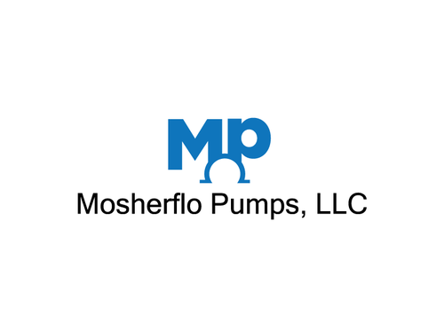
Updated Logo for Mosherflo Pumps, LLC. --Manufacturer and Field Service for Rotating Equipment
Mosherflo Pumps, LLC.
Yes
We want to convey that we are a fresh, cutting-edge approach to the OEM manufacturer which is parts interchangeable with the main OEM's. In essence, we are a knock-off, but we offer the inventory, the knowledge, and the home-grown version of the other companies that advertise that they do the same thing. We are family-owned and operated and we are the only on-demand company that offers both field service, on-site evaluation, and the field service and parts and inventory for repair and sale in the industry. We are growing exponentially because we are different. Our customers are our friends. We work through distribution and direct with our local customers. We offer business to both the petrochem and the oil and gas industries, along with the municipal industries. Currently, I am buying out the pump division of R.B. Mosher Co. and turning it into Mosherflo Pumps, LLC. I love my old logo, but I want to do something different, especially for my field service. I know this is a lot to absorb and I am happy to speak directly with the designers. The logo design will beget the job of the new website design. I had our logo for R.B. Mosher Co. @ www.rbmosherco.com done on your website. I love it. My Mosherflo logo for the pumps is in need of being tweaked just enough so as not to be sued just in case my brother gets a wild hair. Please call me if you want to get a better idea of what I want. My guys new uniforms are dark blue. I love my blue and yellow brochures but perhaps there is something more we should be doing. My Mosherflo Teal, which I can share with you, is OUR custom color. I said include the tagline in my logo, but that is optional. I may need multiple logos design. Win my heart with your design and you might win my web, and my other multiple designs needed as we grow exponentially this year.
Manufacturing
Logo Type
![]()
Symbolic
![]()
Abstract Mark
![]()
Illustrative
![]()
Mosherflo Teal? I can send a copy of a couple of our pictures of pump skids. This with the orange that our coupling guards display work well together. I would also like to see the black and yellow that we currently have; however, I am trying to get away from just being a break-off of the original company and become my own company that has stood on its own either way with a handshake and a trust that I build with each of my customer relationships. My facebook page shows some of our newer colors--Mosherflo Pumps, LLC.
not sure
Related Contests