SALES / SUPPORT : +1-877-525-5646 |
Login
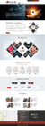
Website for an Instructional Design Co.
IDSweb
|
Contest Holder
Khmlogo
?
Last Logged in : 635days21hrs ago |
Concepts Submitted
152 |
Guaranteed Prize
350
|
Winner(s) | Complete Web Design Solution |
|
Live Project
Deciding
Project Finalized
Project: Website for an Instructional Desi ...
Industry:
Information Technology Logo
Contest Launched:
Oct 14, 2013
Selected:
1
winning design from 152 concepts
Winning Design by:
itmech
Close Date:
Oct 23, 2013

Creative Brief
Website for an Instructional Design Co.
IDSweb
Information Technology
www.instructionaldesignsolutions.com.au
We provide end to end Instructional Design Solutions to the corporate world.
too many moving distractions.
Cutting-Edge
Sophisticated
Modern
Green
navy
dk orange
top
http://manhattanspine.com/
I do not want the site to look anything like the current site. "professional image required" Contact form required. Not too busy with too many scoling images. space where logos of clients can be placed and a place for say 3 "..." testimonials.
Related Contests


Comments
Project Holder
Project Holder
Project Holder
Project Holder
Project Holder
Project Holder
Project Holder
Project Holder
Project Holder
Project Holder
Project Holder
Project Holder
Project Holder
Project Holder
Project Holder
Project Holder
Project Holder
Project Holder
Project Holder
Project Holder
Project Holder
Project Holder
Project Holder