5 Typographic Elements that Tickle Your Web Design Funny

Featured Image: Pexels/Kaboompics.com
Typographic elements are one of the single-most overlooked features of any web design online. Designers usually undermine the influence of typographic elements. Sure they take placement, color, style and font into consideration, but did you all know that typographic elements can be used to entertain the audience?
Entertain? How is that possible, you ask? It’s really not rocket science. The fact is, most of the time people seeing a funny graphic design see the ‘whole picture’ rather than individual elements and in doing so, they do not realize that it is not the ‘picture’ alone that makes the design entertaining, rather it is the individual elements that create the funny.
This article is really Psych 101 for designers. When you are creating a web design that you want to use to ‘entertain’ people, keep these winning design elements in mind. These elements will not only help you create an overall ‘humorous’ design but even if the elements are separate the effects will be worthwhile.
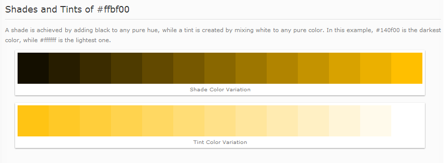
1. Color Me Saffron or Amber
The color which makes a person laugh, feel excited, be energized and actually laugh out loud is either Saffron or Amber (Hex #FFBF00) a perfect balance between yellow and orange.
Any marketer will tell you, “Color sells, and the right color sells more.” We know that right? I mean red is supposed to be happy, green is soothing and black is authoritarian. So which color is funny? Research clearly shows that ‘orange’ a ‘warm’ color creates optimistic energy and makes people laugh.
Before you run off to use orange in your design there is more to read. Any designer worth his salt will have thought by now, “What hue of orange?” That, people, is the key. We all know orange cones placed strategically on the road do not make any driver laugh (especially during peak traffic times).
Yes, yes, you doubting few, I know ‘yellow’ also denotes happiness. However, orange is a flamboyant color while yellow suggests happiness. Find the balance and you get laughter. So the colors saffron and amber become the two shades that should be considered if the design being created needs to ‘entertain’ people or tickle their funny bone.
2. Typeface the Laughter
Use the right typeface in your headlines and body and it will influence the readers towards humor.
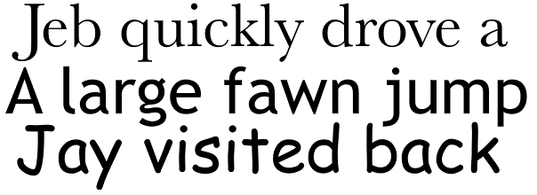 Think about it; there are hundreds of typeface families, including: Baskerville, Computer Modern, Trebuchet, Georgia, and the (loved-hated) Comic Sans.
Typeface research has actually shown that typefaces have personality. When Baskerville was used in some polls, results showed that people agreed with the statements more while Comic Sans caused the most disagreements. So if the typeface influences people towards agreeing and/or disagreeing then why not laughter?
Some fonts and/or typeface seen as inciting your funny bone: Linotype Originals, Linotype, Funny Bones, Minion, Myriad, and Base 9 and 12.
3. White Space
Make white space active; use it like a punch line.
How can white space influence humor? Well, used in the right dimensions, it can help create the effect of a ‘punch line’. We have all heard jokes in the real world. When it’s time for the punch line there is a pause before the end comes. Make the whitespace work the same way. Have the typography arranged such that each line or word works in a way that the audience is influenced most.
Take the example of memes. We have words that are arranged in such a way that people read the ‘crux’ at the end-with there being ‘space’ between two lines/phrases.
4. Hierarchy Humor
The < h 1 > < h 2 > tags have been talked down to the bone. Hierarchy is important nada, nada, nada. However, it’s not only about the size (though size does matter), also take into consideration the prominence of the other typographic elements.

Source: iStock/nyul
You have to achieve web design Zen by taking into account color, whitespace, typeface and then the size of the hierarchical elements. The visual elements should be arranged according to importance. It’s related to the top web design trends (#3 Storytelling) for 2014 as listed in Forbes.
By using the visual and textual elements in a hierarchical way you can depict more than just humor, you can actually tell a story.
5. Write it Kerning
Though not as important in the body kerning does become important in the headings and the bold text. A wider space allows the text to become more ‘readable’ and when people are not stressed in their inability to read the squished up font, they will find more humor.
So focus on the kerning and notice that a bit more space can go a long way. Notice the space between characters in memes? There is a science behind that.
Web designers can gain a definite competitive edge in web design if they focus on the details. These elements may seem completely unrelated to the words funny or humor, but the influence they have on the audience has been researched-maybe not together but definitely in terms of the in individual elements. So use these as a marketing tool and take a step into success.