Disney Logo Plays off Complexity in Redesign

Feature Image Source: iStock/RinoCdZ
The Disney Channel has long been a staple of Disney entertainment, and their logo has gone through numerous iterations. Their latest version has been an accepted part of the industry since 2002, but as companies often do, Disney decided it was time for a change. Interestingly enough, though, Disney channel has decided not to follow the increasingly monopolistic trend of simplification, actually it has gone one step further.
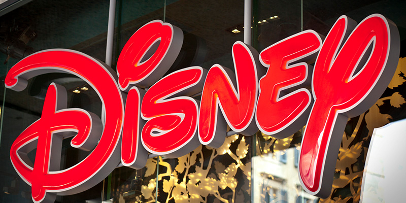
Using their old logo they added more whimsy and artistic flair, increasing both the types of typography in the Disney logo and the effects that went behind it. The new design emphasizes the impact as it combines all that matters in typography with complexity in image design to fashion a sophisticated new logo that is intelligent but also playful and fun.
Complexity in Typography
The added typographic elements were the best changes made. The word Disney was emphasized, and given a bounce via extrusions that make it bubble out from the middle. A sort of 3D effect, and adding the Mickey Mouse ears was a clever touch, and one that really gives the logo its Disney flair (especially because the body of the I looks like the body of Mickey Mouse).
In addition to the bubbliness, of the “channel” the hand-drawn font breaks from its simpler predecessor and adds to the child-friendly message targeting its audience. The older version tried to add a more sophisticated feel to the channel smacking of computers and savviness (honestly a bit of desperation as well).
This new version returns Disney to its roots, and most importantly does that in a modern and digital way.
Also Explore: The Tricks to Choosing the Right Font
Intricacy in Effects
The effects used to create a more enhanced version of the name ‘Disney’ give it the depth it requires. The gradient, in particular, was a stunning addition. The way it tracks across “Disney” draws your attention to it, and then while leaving “channel” the effect is memorable. The way that the gradient is kept to the top section allows the child-like handwriting to rest on its own merits. “Disney” gets more emphasis while “channel” doesn’t have to falter under the weight of that emphasis. It was a good and subtle touch that really made this new logo an excellent decision.
Bottom Line:
Disney is one of the most powerful global brands but unlike others, it refuses to follow trends, rather it creates its own. The logo is simplistic but more dominating in its effects. The added complexity here adds not only to the visual playfulness but to the full meaning of then brand-money-grubbing aside, it’s supposed to be a site of memories, playfulness, magic and fun. The magic of Disney is captured in this new logo and allows the old to creatively embrace the new.

