5 Elements Of Luxury Design For Your Jewelry Logo
Feature Image Source: iStock/Tenny Teng
Designing for sophistication and luxury is a specialized job. When you are branding upscale and high-end businesses such as Swarovski and other jewelry brands, you need to pay special attention to design elements which can help you create a royal, luxurious, and sophisticated look. This is essential for your brand image because you want to exude opulence, lavishness, and class.
If you are new to luxury design, don’t be apprehensive. Distilling the subtle elements which make any graphic design sophisticated and luxurious is easy –all you need it an eye that notices. To start with, you need to understand that sophisticated design needs to appear effortless and professional –however, don’t let this mislead you into thinking it is easy. Much like how a classy waltz looks effortless but has years of practice behind it on the dancer’s part, similarly, the luxury design appears simple, graceful and unforced at the end, but has behind it hours of sweat and blood, along with experience. So the road to the nimble, premium design is long –however, you can easily start by focusing on five main elements which make up luxurious professional logo design.
1. Custom Fonts
What comes to your mind when you think of luxurious fonts? Calligraphic fonts or hand-written fonts are often associated with images of opulence, wealth and sophistication. Similarly, narrow modern fonts, such as elongated sans-serifs, are also associated with images of lavishness. In addition to this, serif fonts like Didot, which rely on alternating thick and thin strokes, also look very classy. So if you are designing a jewelry logo, go for any fonts from these categories.
However, if you truly want to take your jewelry logo to a level of premium exclusiveness, go for custom fonts! Custom fonts will not only be luxurious, they also have the privilege of being one-of-a-kind –and this automatically assigns a class to your logo. Whether you use a custom font or a pre-existing font, always be sure to choose one that is readable, clear and aesthetically pleasing across all medium –whether print or online.
2. Simplicity Or Minimalism
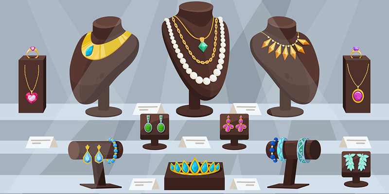
Simplicity is the hallmark of any good logo. A simple logo is one that has a minimum number of elements –only the amount that is exactly needed to put forward the message. Clean lines, minimalist shapes and just the right amount of color makes a logo stand out, and it is not surprising that luxury graphic design focuses heavily on simplicity or minimalism. What is the first thing you notice when you visit a high-end jewelry store? You will notice the store actually has very little jewelry items on their display shelves and the jewelry items will be carefully curated and displayed across space.
Do you think this is accidental? No! It is because minimalism instantly conveys a sense of elegance, charm, and opulence. Moreover, minimalism and simplicity is always the safe route –you can never go wrong with them, and you will always appear upscale with them. Contrast this with a heavily detailed jewelry logo –while it may have the potential to work, there is also more room for it to appear tacky and second-rate.
3. Space
Space is essential to design. It helps your viewers decode your message, and assign proper grouping to the individual elements of your design. However, space can also work in a very posh manner. Having lots of negative space in your logo not only makes your logo look expansive and spacious, it also gives it a very prestigious look –because what does a lot of classy space mean in real life? A lot of wealth! This is why it is important for you to pay attention to the white space in your logo design.
4. Sophisticated Colors
Some colors and shades appear more sophisticated than others. For example, a black and white combination is sophisticated, as are pastel colors. Soft blues, pinks, greens, beige, gold, and silver are some of the popular sophisticated colors. When you are branding a jewelry store, you can choose the color palette according to your audience. For instance, a jewelry store targeted towards teenagers can use a soft blue color to attract their audience –it looks classy yet lively at the same time. However, if you are targeting older women, you can easily go for strong contrasts such as blacks and golds.
5. Decorative Elements
Being simple or minimalistic does not mean your jewelry logo cannot or should not have decorative elements. In fact, decorative and ornate elements are exactly what help differentiate between just any minimalist logo and a luxury minimalist logo. If you really think about it, luxury is more than necessity – by its very nature, it is decorative. This is why it is extremely important for your jewelry logo to have a few decorative elements. This can usually be done in a number of ways, for example:
i) Lines & borders: Intricate, thin lines and borders instantly lend a swanky feeling to a logo. And these can be used in many creative ways –for instance, if you are going for a crest or an emblem, it can easily incorporate thin borders and lines. It is important for the line quality to remain subtle because if it is not so, your design will appear heavy and over-the-top. Lines and borders can also appear hand drawn –which is again a characteristic that instantly looks luxurious.
![]()
ii) Texture: Certain textures also make logos look more luxurious. For instance, if you go for metallic textures, the shine and quality in those textures will make your logo appear sophisticated. When you are going for a printed logo, you can go a step further and incorporate a tactile element in these textures as well – who says you need to limit yourself to the visual!
![]()
iii) Other Effects: There are a plethora of graphical effects which can be used to add a touch of glamour to your jewelry logo, for instance, an embossed look, even if it is just a visual emboss, or a gold foil look, or calligraphic lines and effects can also be added. Similarly, you can also go for some high-art looks.
These were just some ideas to get you started on a killer logo design for your jewelry store. Using these five elements in your logo will give you an easy blueprint for luxury design – however, one thing always stands true; there is no substitute for experience that is gained over the years. So while these five elements help you get started, the truly effortless look in design emerges from years of practice in luxury design.
Famous logo Source: brandsoftheworld.com
Other logos: zilliondesigns.com/