13 Mistakes That Can Kill Your Logo Design
Featured Image Source: Pixabay/James_Jester
New logo designers may be under the notion that the more complicated and colorful a logo design is, the more it will be appreciated. This is one of the first mistakes that can be made. When these designs are used to participate in logo design contests and none of these initial designs are accepted by clients, some are left confused and disappointed.
Amateur logo designers tend to make a few logo design mistakes at first, which can become disastrous for them in the long run. Two other mistakes some designers make is avoiding to learn the basics of design and/or they don’t have a creative design process to follow. In today’s post I’ve decided to educate fellow designers about the 13 critical mistakes that can kill any logo design. Read on to make sure that you are not guilty of these mistakes.
1. Lack of Process & Planning

Image Source: Pexels/Tookapic
Very few logo designers spend time doing research about the industry of the client they are working for. Even fewer realize the importance of a creative logo design process. In professional logo designing, research and sketching comes before creating a logo on the computer. Jumping on the computer without sketching and basic planning is a failed design waiting to happen.
2. Neglecting the Essence of Logo
A logo represents the essence of a company, what it stands for and what message it wants to convey to its audience. Be sure to think from a potential customer’s perspective. What would a certain image mean to you? What will your first impression of the logo design be? Focus not only on the design, but on the meaning.
3. Following Trends Blindly

Image Source: Pixabay/1018786
Following all design trends will most likely lead to outdated design concepts. Create designs that can stand the test of time and will look great even a century later. Example: The Coca-Cola logo still looks good a hundred years after its creation.
4. Creating Complicated Designs
Filling your logo design with too many colors and shapes is a big mistake. Simplicity is the best way to go. If you think that creating a complicated design will win you a logo design contest, at times, you are wrong. Simple logos tend to be the most memorable. Want an example? Think of the logos of McDonald’s or Nike.
5. Being a Copy Cat

Image Source: Pixabay
ings around you, all while keeping in mind the client’s perspective. To be a copy cat means you have copied pieces of another person’s design work. Copying another designer’s concept is dishonest and shows your lack of creativity. Be Original, Be Creative, Be Unique!
6. Using Clichéd Images
Using airplane images for a travel logo design, hammers for construction logos or books for education logos is seen as redundant and clichéd. Try to be innovative. Use special characters, unique metaphors or abstract symbols to create an identity. You don’t want your client’s design to become lost in the crowd.
7. Adding Special Effects

Image Source: Pixabay/voltamax
Graphic design expert Jacob Cass says, “If a logo requires color or special effects to make it a strong logo, it’s not a strong logo.”
If your design is strong it will look great in black and white, as well as in full color. Lose the colors and see where your logo stands.
8. Using Clipart & Stock Images
Successful logo designers never use clipart or stock. Clipart images are visually poor and will give the design an unprofessional look. Avoid clipart, stock vector images or anything similar and create your own, custom images. The client will fully appreciate your design’s individuality.
9. Typography Issues
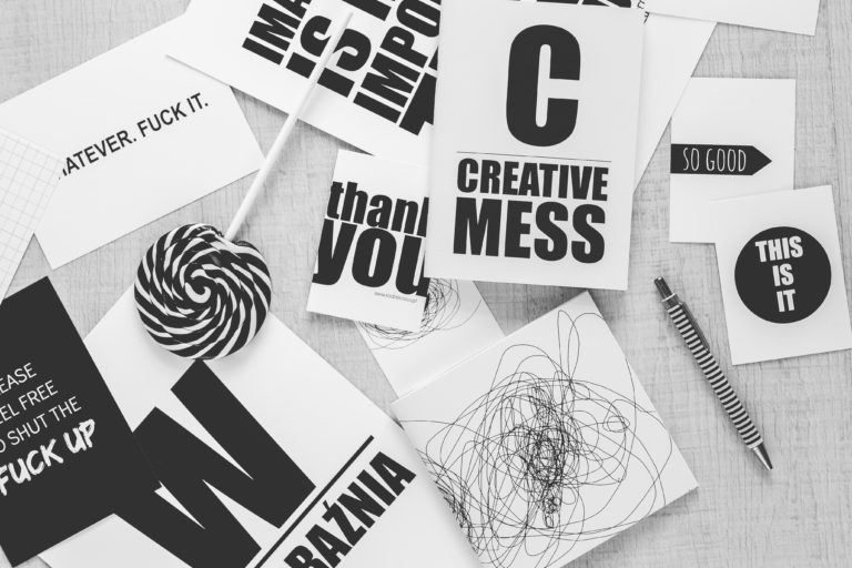
Image Source: Pexels/Kaboompics
Using the wrong font and inappropriate style can ruin a perfectly good design. In a logo design, the typography has to be industry specific. Otherwise the meaning could be completely lost. For instance, using Comic Sans for a law firm logo has more of a childish feel, it does not portray a serious, successful and professional law firm.
10. Hurrying to Create a Logo
Most logos fail when designers do not spend quality time to create and ignore the importance of having a design process. A design that is made in a short amount of time tends to be unsuccessful. Your speed doesn’t determine your efficiency. Logo designing is an art that requires understanding and research, which requires time.
11. Lack of Communication with Clients

Image Source: Pexels/Negative Space
Most amateur designers do not understand the importance of communication and get offended at the slightest bit of criticism. They don’t discuss their ideas with their clients and give no creative input. This is not healthy if you want a client to understand your point of view. Communication is the key to success. Explain to the client what you are trying to achieve in your logo design concepts and take their criticism positively. Remember, criticism is just another person’s opinion.
12. Sending Raster Files
Raster files tend to become pixilated when scaled or sized for various printing needs. Always send your client the vector format file of your design. This will allow your client to print the logo on a small business card, a large billboard, t-shirts or any other item without affecting the quality.
13. Not Cleaning Up the Logo

Image Source: Pexels/ Lisa Fotios
Before sending out the design to your client, make sure that it is neat. Any extra twirls or any excessive colors must be removed. Sending out a messy design discredits you as a professional, thus you want to spend time with the finishing touches and in finalizing it.
Avoid making these logo design mistakes and learn from others. Learning these lessons will be crucial if you want to establish a long term, professional career.

