5 Essential Things Designers Should Know About Colors
Image Source: Freepik.com
I gave you a brief insight into the world of colors in a previous post, starting from color history to color psychology. Now, I want to educate you regarding the technical side of colors that needs to be offered to be a successful graphic designer. Remember that this field requires extra research, experimentation and practice.
1. The Color Wheel
There are three sectors of the wheel. They are called the primary, secondary and tertiary colors.
Primary includes: Red, Yellow & Blue

Image Screenshot: color-hex.com
These are the three central colors from which other hues are derived. These three colors are unique and cannot be created through a combination any colors.
Secondary includes: Green, Orange & Purple
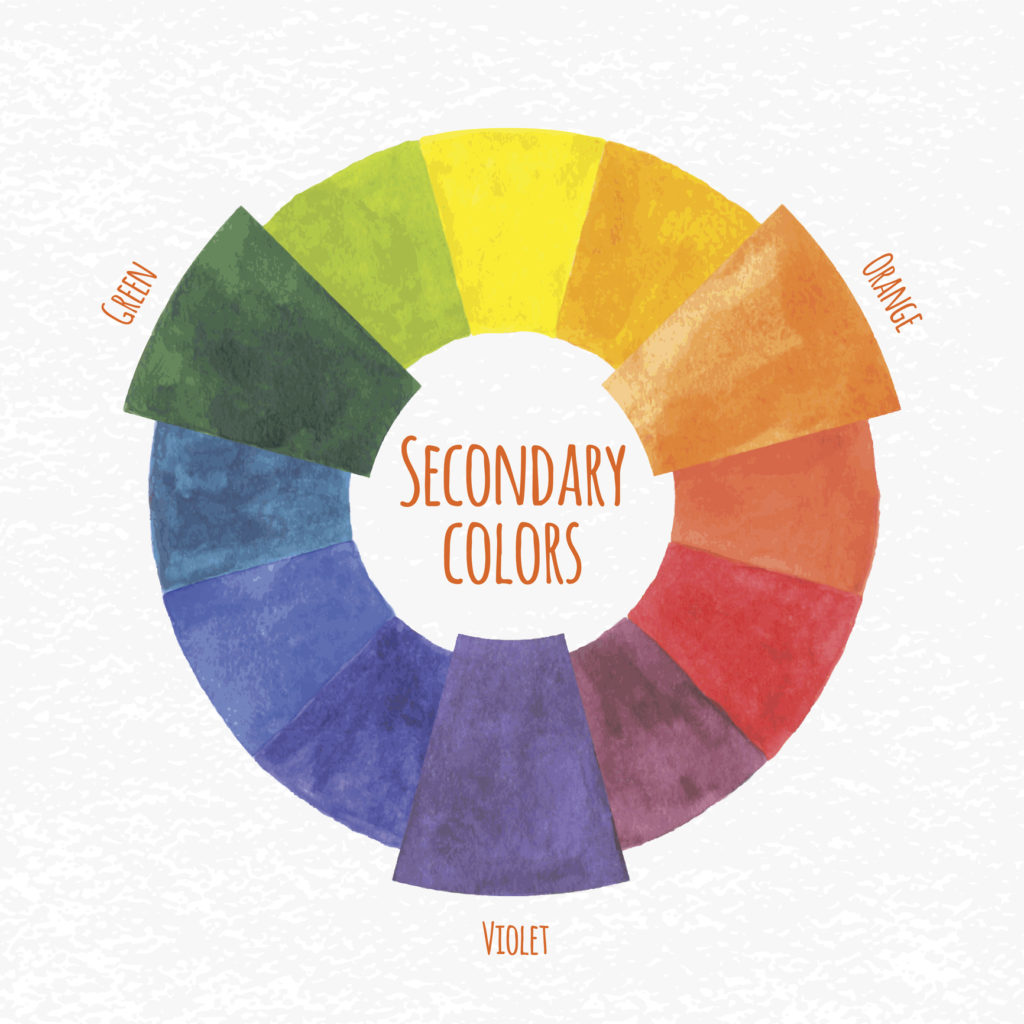
Image Source: IrinaTrumpe/iStock.com
These colors are formed through the combination of the three primary colors. Green is created by combining blue and yellow. Orange is created by combining red and yellow and purple is created by combining red and blue.
Tertiary includes: Yellow – Orange, Red – Orange, Red – Purple, Blue – Purple, Blue – Green & Yellow – Green
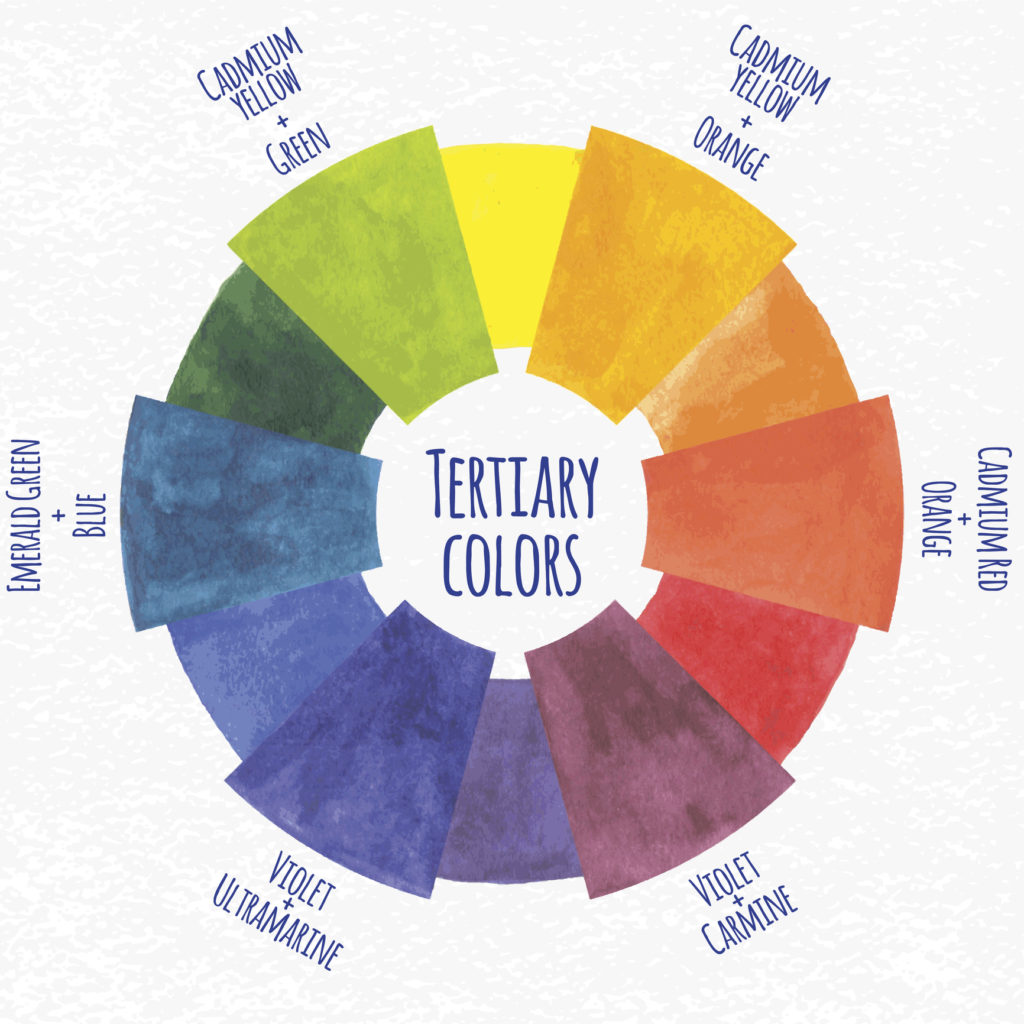
Image Source: IrinaTrumpe/iStock.com
These are hues are created by combining primary and secondary colors. Hues are also added during the combination. You can also use color grading software to match different hues and create synchronous combinations.
2. Cool vs. Warm Colors
Colors are divided into two categories: cool and warm.
- Cool colors are shades of blue, green, pink, purple, violent and indigo.
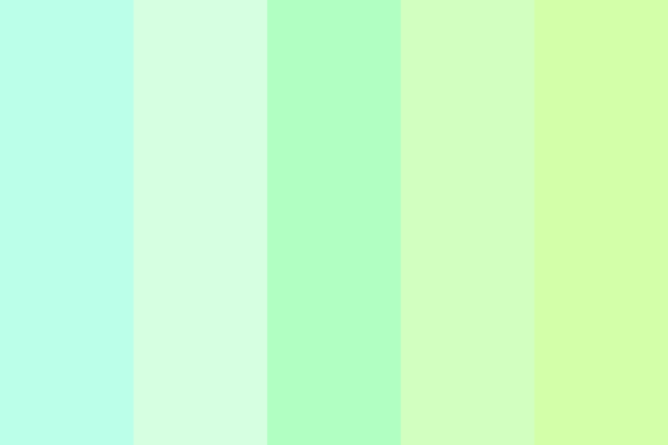
Image Screenshot: color-hex.com
- Warm colors are shades of yellow, orange, brown, red and shocking pink.

Image Screenshot: color-hex.com
Cool colors induce relaxation and a soothing effect, whereas warm colors excite and attract attention. Corporations and professional business industries typically prefer cool colors to reflect professionalism. Commercial businesses such as food, beauty and the entertainment sector tend to prefer warm colors to garner attention. When you create a logo design, make sure the colors clearly reflect the correct industry.
3. Color Harmony
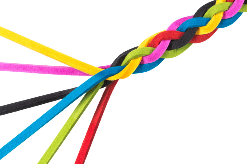
Image Source: FredFroese/iStock.com
Color harmony is the art of creating various visually appealing color combinations. As a designer, you must know the art of combining colors in a way that they attract the viewer. For example the pairing of blue with yellow, red with green or yellow with green in various shades are pleasant combinations. The observer should not be repelled by overdone color combinations or color clashes. An example of this is yellow and orange, which are two bright colors that can be visually overpowering when used together.
4. Color Context
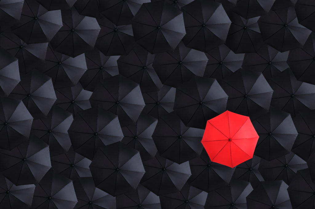
Image Source: skodonnell/iStock.com
Graphic designers should also understand how one color affects the presence of another. In technical terms this is also known as color context. Understanding this will help you create backdrops, foreground and background images more efficiently. For instance, red color is best visible against a black or white background but against a pink or brown background, the red would seem dull.
5. Color Schemes
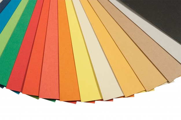
Image Source: freepik.com
There are various color schemes used by artists. The most common are:
Monochromatic: This effect can be used when you want one single color to stand out in an artistic design. For example, you can create an underwater portrait using all the shades of blue with tints of white (which is also known as absence of color) to highlight various features.

Image Source: freepik.com
Analogous: The colors in this scheme are typically three colors that are next to each other on the color wheel. This is one of the best ways to create a harmonic design.
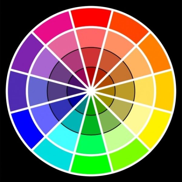
Image Source: freepik.com
Complementary: The colors in this scheme are typically opposite of each other on the color wheel.For red, yellow and blue, there is green, purple and orange respectively.
Image Source: freepik.com
Good knowledge of colors can help a graphic designer go a long way. It is important to know about colors to understanding color psychology, their uses and meaning will allow you to manipulate colors in design. Once you have a grip on color, this will enhance your skills. Always research and experiment to improve your knowledge.