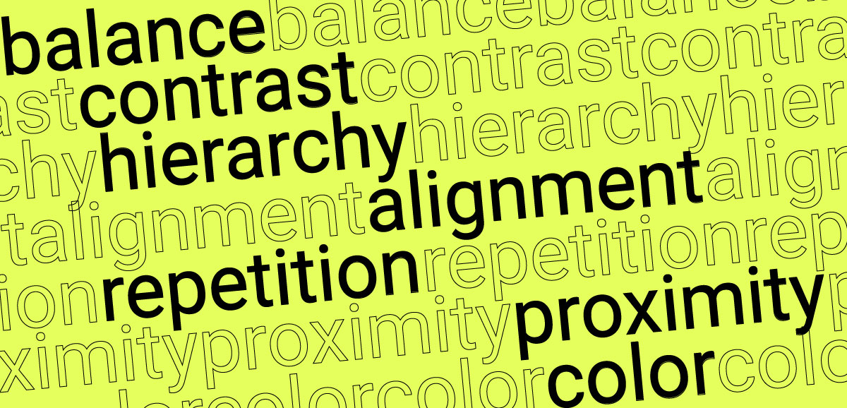
The Lost Art of the Film Title

Image Source: pixabay.com
If you are willing to spend tens of thousands of dollars on a movie release, common sense entails that you would actually add a couple of thousand more, to stand apart from all the other film titles being released at the same time. Simply put, we ask allegedly imaginative marketers in the entertainment industry to take responsibility for creating lame, lackluster campaigns because they have used and then overused ‘popular movie fonts’ like San Serif Geometric, Trajan, Helvetica Neue, and Gill Sans UltraBold, Calligraphic Fonts etc.
Researching the evolution of Hollywood films I stumbled across a website that has a mind-blogging amount of information. The designer behind the information on Movie Title Stills Collection is Christian Annyas who realized that Hollywood has somehow managed to overlook the power of the font. Sometime in the art of the film title , the text of the titles has taken a backseat in all marketing campaigns.

Annyas suggests the thirties was the golden era of typography, as films featuring actors like Humphrey Bogart, used innovative text styles for the titles, a combination of bold lines and script style. To the new graphic designers such typography may seem tacky but imagine the effort and imagination the typographic designers put into them. They were doing everything by hand, and did not have the support of the software’s designers boast today. Each film title was crafted to be unique and the titles could be identified by the text alone.
However, film typography took a back seat for the majority of movie makers and even now, in the digital era where everything can be done with the help of software, imagination seems to have become an infrequent luxury. That is not to say that all typographic designers and movie makers’ in Hollywood are creatively challenged. It just means that the trends in marketing films do not support font creativity or allow the average film maker to follow the trends in typography. Nevertheless, the lost art of the film title should be brought to limelight and designers should find ways to bring back the glory.
Title Sequence
Amidst this Dark Age for film typographers some designers have made the more far sighted of directors; sit up and take notice. One notable designer has to be Saul Bass of the Psycho (1960) fame in which, he worked for Alfred Hitchcock, and designed the memorable title sequences, actually innovating the field by creating a new type of kinetic typography.

He has also worked with names like Stanley Kubrick, and Martin Scorsese and it is his Anatomy of a Murder (1959) that really captures the ideal of a text based title in Hollywood movies.

The fact is movie makers that actually use custom fonts create a ‘brand’ identity for their movie. It becomes the corporate representation of the film and if we look through the major blockbusters of the decade most if not all actually made use of custom fonts.
For all you oldie buffs consider the title ‘Casablanca’. Yes, the first thing to come to mind is the chemistry between Bogart and Bacall but those who have seen the movie remember the handwritten script of the title word ‘Casablanca’.

More of a Sci-Fi fan? Would you recognize the film title ‘Star Wars’ if it did not use its customized font?

Coming to a more current era the block buster Harry Potter has its own visual identity. Harry Potter written in any other font would become unrecognizable. Then there is the Lord of the Rings that is in the same league, or shall we say in a league of its own!

Even Disney realizes the importance of customized font titles and one of the biggest blockbuster’s ‘Frozen’ (coming in sixth in top grossed movies ever) uses a customized font that is copyrighted by Disney.

The film industry has never been shy of overdoing things and yet, the art of the title sequence seems to have become lackluster at best. As mentioned directors like Hitchcock and Kubrick have shown a lot more perception and the success of their films becomes almost inevitable. Though their brilliance is what made the films big, it is the title sequence and design that made the films memorable in terms of marketing identity.
Typography has lost its importance in the digital era as the title sequence and credit rolls focus more on imagery. However, the most successful films and directors combine the interaction between the imagery and typography to create something unique. In the past designers like Bass made typography an Art and also a focal point in the marketing campaign.
Today the potential of digital graphics and typography is undermined even as designers in studios like Disney strive to brand their films. Consider how Susan Bradley created inspiring typography in the title sequence of “Ratatouille” using aspects of the slab-serif typeface Rockwell and then depicting Paris through cursive text (an inspired move).
Reviving the Art of Title in Films: Digital Typography
The history of cinema is rich and profound. It reflects the culture of the society and becomes a timeline of historic thought sadly, the art of the title in films has to a large extent gotten lost during its evolution, much like a trend of fashion.
However, titles are an integral aspect of film making and can actually mark the success of a film by making it memorable to the audience, on and off-screen. The ease of manipulating digital technologies has created a ‘mass film making’ concept that allows hundreds of films to be churned out yearly (as if by an assembly line). Yet, while millions maybe grossed on release of the films the ‘common’ titles are eventually forgotten.
Ingenuous and innovative title sequences exclusively created for the film are the ones that are remembered and recalled with satisfaction. There is no arguing with success it is time to bring typeface back into the art of film making.

Top 5 Film Title Sequence Resources
Forget the Movie Watch the Titles: A wonderful site focused on showcasing a wide variety of file title sequences ranging from blockbusters to obscure releases. It is the dying trend of the opening title sequence that creates the best films.
Art of the Title: A site honoring the creators and innovators who contributed to the field of title sequences and made the creative process memorable and historic.
Title Design Project: A beautiful showcase of some of the best known film title sequences in the film making industry.
Movie Title Stills Collection: a collection by Christian Annyas who traces the evolution of film title history and creates a stunning timeline of its golden age and eventual downfall.
The Art of Film & TV Title Design: A Youtube.com video created by PBS studios that outlines the importance of the title sequence and shows the most inventive people in the field like the creators of Zombieland and Mad Men.