Complete Web Design Solution Project for accessories for nursing moms and toddlers
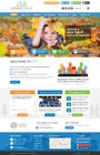
MIRACLE BABY
|
Contest Holder
mitiha
?
Last Logged in : 3828days1hr ago |
Concepts Submitted
38 |
Guaranteed Prize
350 |
Winner(s) | Complete Web Design Solution |
|
Live Project
Deciding
Project Finalized


Creative Brief
Complete Web Design Solution Project for accessories for nursing moms and toddlers
MIRACLE BABY
Children
https://www.facebook.com/miraclebabymexico
VISION: - We differentiate ourselves by offering products and services of high quality and added value at competitive prices, through research and development, to women who are at different stages of gestation of a baby, from pregnancy, childbirth, lactation, and the first years of life. - That no woman sits alone in overwhelming moments where they do not know what to do, or if what she did was right or wrong, we will be opinion leaders, and through the use of technology, coaching and accompany all moms. VALUES: - Respect, integrity, friendship, hard work, commitment, responsibility, happiness, love GIRO: GIRO - Promotion of products (brands) for pregnant women and with toddlers - Provide advices and tips to pregnant moms throughout pregnancy, childbirth, breastfeeding, and early years of the children (mainly out of a blogg) COMPANY IDENTITY: - Brand Concept: The Miracle Baby™ brand stems from the fact that it is simply a miracle on how another being is created. A baby is a miracle of God. Just as a farmer plants a corn grain (seed), and as it grows, days go by, he knows not how or when, or even having to do anything, but until the corn is already fully formed, a baby is formed from the union of the "seed" of man in the "soil" of women, without any of the two, knowing how or when, it grows until birth. - Logo’s Concept: It represents a seed inside the womb of a mom, wrapped up in such a love that no one can understand until they themselves become a mother. Very similar to the love God has for us. - Must be a brand that visually represents warmth, love, peacefulness, tranquility, but also, kind of edgy, modern, successful, high tech, a "We mean business" kind of way. - The colors are pink, aqua blue, brown, white - Differentiation is within the marketing strategy - Images must be of very good quality, though not many (except products), something clean TARGET: - Women - Single women, married, divorced, cohabiting - Age target: 1. Main: 25 - 39 years 2. Secondary: 20-24, 40-70 years (Not to rule out grandmothers, as they become grandmothers with their children’s children) - Segment: B, C+, C - Working or not working - Study level: University degree - Pregnant, and / or have small children (toddlers) - Very much concerned about her health, and even more, the health of their children. Also with the environment, - They are known to "move" on the internet, they’re strong on social networking
Complete Web Design Solution Project
Cutting-Edge
Sophisticated
Modern
PINK
AQUA BLUE
BROWN
top
http://designedtomove.org/
http://www.discovershadow.com/
http://loftcitychurch.com/welcome
The 3 web pages above mentioned are what we’re looking into design, look and feel, regarding, cutting-edge, unique/creative, professional, clean/simple, however it’s not a reference of the feminine, trendy, glamorous, children, and family oriented,. We liked also the way you scroll down between pages and there’s information or an image When you scroll down the menu on top stays When you scroll down, there will be a middle image between pages that has a quote or information Each page has to be different, the titles or have to be like a 3D image with an image on the background http://www.uddercovers.com/ This page is from our top competitor. Although I like the products images, the web page seems like a typical template. On the SHOP NOW it has some images of the products, which you can enlarge. That's very important. INFORMATION OF THE WEB PAGE - Points of interest: The visitor has to see "something" that you will call immediate attention: 1. The logo + some infographic 2. After that something like "all you need for you and your baby" - Site Map: Page 1. Home a) Shows the logo MIRACLE BABY™ b) And an image 3D message: “Creados con amor” c) 1st reel Pink background d) 2nd reel image of a mom and baby on background with the a) + b) info up front SCROLL DOWN in between a quote “I’LL SEND TO YOU LATER” on a white background Page 2. About Us a) Why MB b) Vision c) Values d) Aqua blue background SCROLL DOWN in between an image INFOGRAGHIC Page 3. Products a) By Product sections b) Pictures and description of each product • You can increase the image SCROLL DOWN in between an image Page 4. Products SCROLL DOWN in between an image INFOGRAGHIC / Quote Page 5. Contact a) Generate a database b) Response to your mail with a letter c) Links (LOGOS) 1) Facebook 2) Twitter 3) Pinterest 4) Instagram 5) Youtube 6) Business Partners*** d) Brown background… or something else SCROLL DOWN last image
Related Contests