SALES / SUPPORT : +1-877-525-5646 |
Login
Yambil Dental Care
|
Contest Holder
adealdds
?
Last Logged in : 1194days15hrs ago |
Concepts Submitted
95 |
Prize Money
200
|
Winner(s) | A Logo, Monogram, or Icon |
|
Live Project
Deciding
Project Finalized
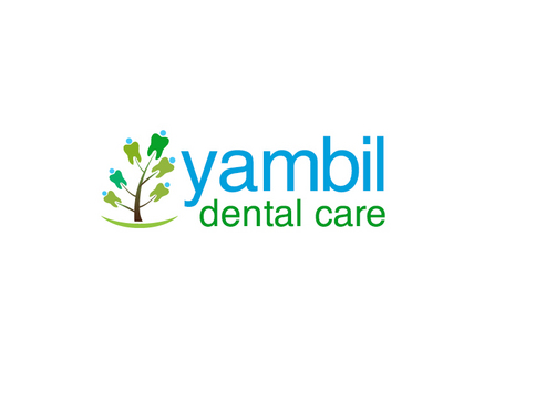
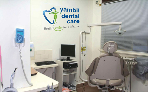
Logo for a dental clinic
Yambil Dental Care
No
Family oriented general dentistry.
Medical
Illustrative
![]()
Professional
not sure
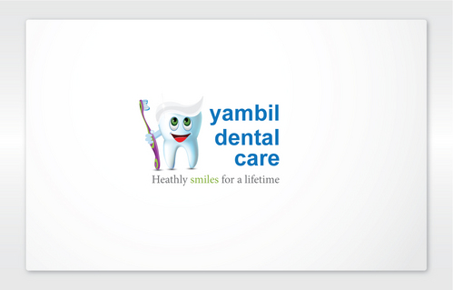
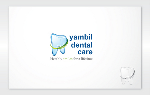
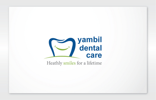
current "logo" is text only, consisting of the 3 words
Yambil
Dental
Care
as seen here.
Long established business (30+ years)
http://www.facebook.com/yambil.dentalcare


Comments
Project Holder
Project Holder