Live Project
Deciding
Project Finalized


Creative Brief
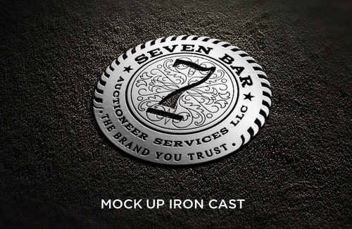
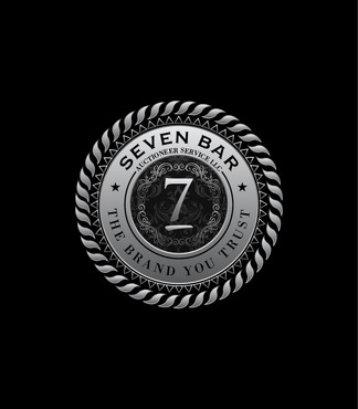
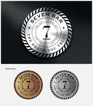
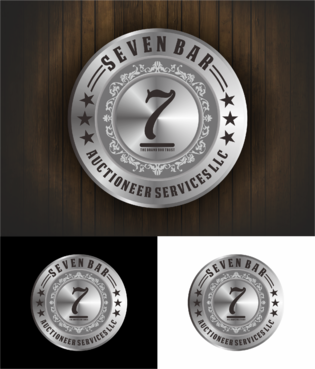
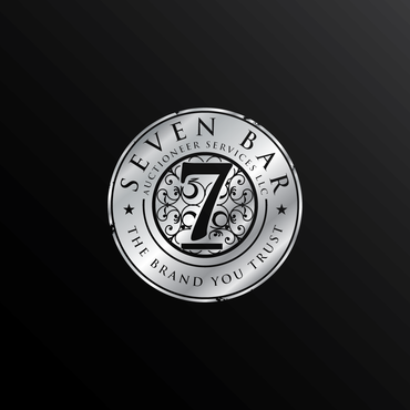
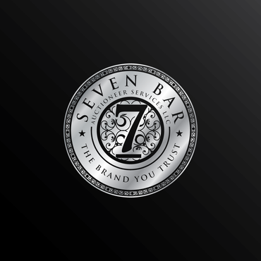
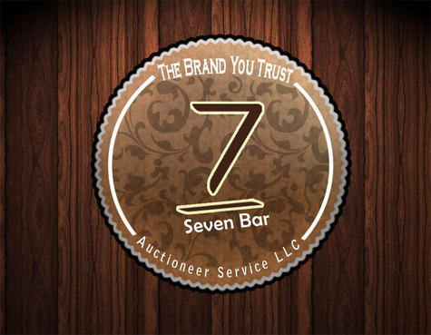
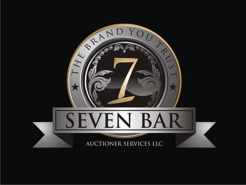
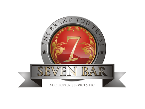
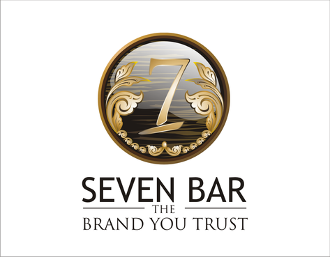
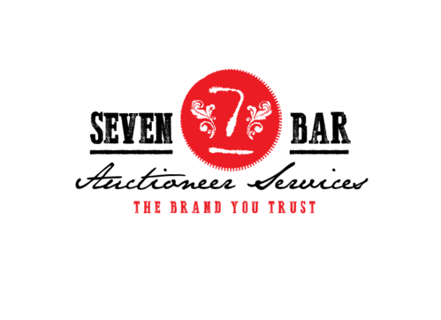
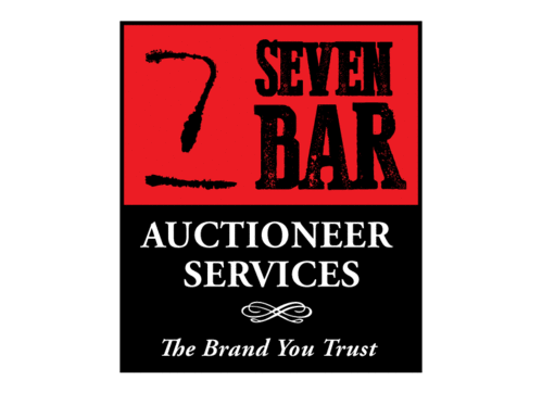
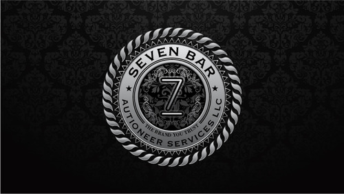
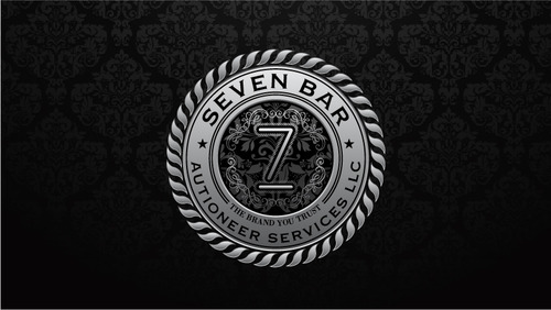
Logo for Seven Bar Auctioneer Services LLC
"The Brand You Trust"
This is my family ranch brand, the kind you would brand cattle with. its a 7 w/ a line under it. I have some photos of it. "Seven is the perfect/"chosen" number and straight and narrow is the way, is how the concept of the brand came about. Its a actual registered brand in my name
Trade
Starting a new "Auctioneer service company. from estates to antiques, real estate, collectables, equipment...etc..
not sure, I have been looking at 3 colors. Red, Black, and some blue. On diffrent note idk if you remember the old "WINN Dixe" groc/ store brand and that whole marketing deal or not. Im want this be based around the bases if the use of a actual cattle brand. but i want style,class,strength, and luxury all in one.. tough bill i know.
Related Contests