SALES / SUPPORT : +1-877-525-5646 |
Login
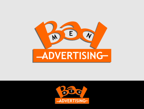
retro logo for a spoof 1960s ad agency
Badmen Advertising
|
Contest Holder
miamiwriter
?
Last Logged in : 3806days9hrs ago |
Concepts Submitted
6 |
Prize Money
200
|
Winner(s) | A Logo, Monogram, or Icon |
|
Live Project
Deciding
Project Finalized
Project: retro logo for a spoof 1960s ad a ...
Industry:
Advertising Logo
Contest Launched:
Feb 14, 2014
Selected:
1
winning design from 6 concepts
Winning Design by:
LestariDesain
Close Date:
Feb 23, 2014


Creative Brief
retro logo for a spoof 1960s ad agency
Badmen Advertising
The Free. In Free Enterprise
Yes
1) The logo is for a website only
2) it should be retina ready
3) the website is part of a series of Internet art pieces It is not a real business
4) I need a favicon
5) I would like one color to be orange
6) looking for something very 1960s in style masculine not feminine
7) the site is responsive
8) go to the website badmenadvertising .com to get header dimensions
9) the logo should be centered on page not to left
Advertising
Illustrative
![]()
Character
![]()
Masculine
Retro
Orange plus wharf ever you want it could be just orange and gray or it could be colorful
not sure
The site is tongue in cheek and not serious but it should give the appearance of being almost serious satirical best describes it
Related Contests


Comments
Project Holder