How To Avoid Designing Generic Logos and Overused Concepts
In the logo designing game, there are many players. Logos are the face that clients put to a company name, so every business or organization out there has one.
With so much competition, it's understandable that certain concepts will be overused; after all, if something looks like it's working, then someone will create a knock off version.
That explains the prevalence of certain types of logos in different markets and genres.
But a "generic logo" is not what you as a business owner should want for your company's face. You want to stand out from the rest, with a unique logo that stands at par with your services.
A logo should be customized for the company, not picked out of a lineup.
One of the best ways to avoid an overused concept for a logo is to know it when you see it.
In this article, we'll take a look at a few types of generic logos and derivative designs, and discuss how you can avoid falling in the "everyone else is doing it" trap.
Generic Workmark or Lettermark Logos
A font based logo, such as a fashion logotype, funnily enough, is a logo that is based largely on a font. Whether it’s a wordmark or a lettermark, the typeface is what makes the logo stand out, rather than an image.


But when the typeface just isn't up to the job, the logo doesn’t even have a chance.
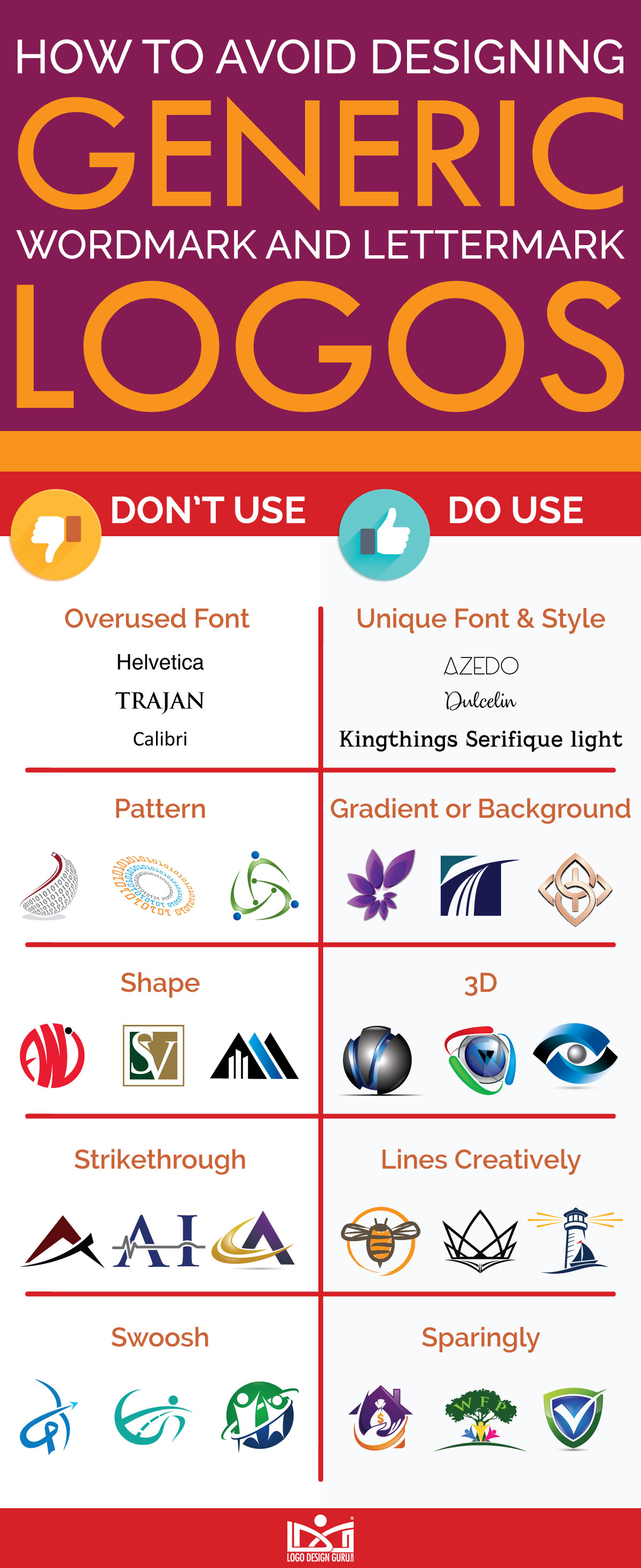
Generic logos that only have their choice of typeface to offer must be very selective with that font.
Extremely simple, minimalist fonts do have their place, and they can be used well — but that usually requires some element other than just a font on its own. A simple block or frame logo with a simple letter won’t do a whole lot to stick in the viewer’s mind.
Credit: freepik.com
Credit: freepik.com

Credit: freepik.com
Credit: zilliondesigns.com
The same goes for spacing and repetition. Using a generic font multiple times does not make it less generic.
Lettermark and wordmark logos are common because they are a great way to inform your audience exactly who you are, and to remind them of your company name rather than relying on the representation of a graphic based logo. But they also require you to walk a fine line; sticking with a commonly used variant of a font based logo, though it may seem safe and reliable, can also sink your chances of being memorable and unique.
Generic Wordmark or Lettermark Logos
Even small variants in logotypes can make a huge difference.
So if you’re looking at a possible logo that seems quite common and you like the font, try tweaking the colors and some of the lines to make it your own.
If you want a wordmark logo, try linking or staggering the letters rather than simply including them in a straight line; if a lettermark logo, adjust the letter or model it after an image so it’s more than just a font.
Beware of fonts that are overused, such as Ethnocentric, which pops up continually in lettermark and wordmark logos, and fonts that just have no business being in any self-respecting logo, such as Papyrus.
Let’s analyze a few of them, shall we?
Satisfaction:
Satisfaction is a level, flat, cursive font commonly seen in genres and markets such as handicraft shop logos and boutique shop logos. But since one thing you don’t want your handmade store to say is "generic and just like everything else," consider a hand-drawn or cursive font like Bambusa Pro instead.
Avenir:
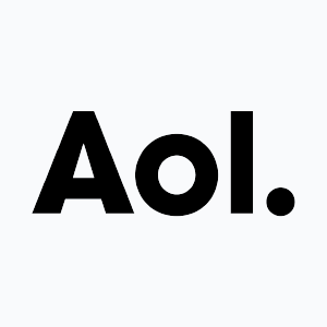
A bold but safe and generic typeface, Avenir is known for telecommunication company logos such as AOL. While it’s important to let people know exactly who you are, consider a less used font like Brandon Grotesque, also a sans serif with no fear about its identity.
Credit: Brandsoftheworld.com
Credit: Brandsoftheworld.com
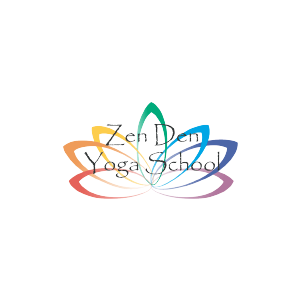
Papyrus:
Packaged on all personal computers using a Mac or Microsoft operating system since 2000, Papyrus is easy to get, easy to use, and easy to forget.
For something lanky and different that doesn’t want to make a designer weep, opt for another font such as Futuracha.
Credit: brandsoftheworld.com
Credit: zendenyogaschool.com
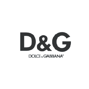
Futura:
Based on geometric shapes, this font is frequently used in corporate logos or in larger pieces of design where its slightly generic perfection can make a big impact.
It has also been latched onto by some fashion apparel logo designs, such as Dolce and Gabbana. For the same feel with a less common font, opt for Proxima Nova or a similar font.
Credit: brandsoftheworld.com
Credit: brandsoftheworld.com
Helvetica:
On a general note, Helvetica can be considered as a rather tightly-spaced font. In some instances where the size of the design is small, this typeface works amazingly but then designers need to make sure it is legible.
A font that has been popular for a long time and is often favored by logo designers, Helvetica is a classic; but just because something is popular doesn’t mean it’s always the right choice.
Its very popularity makes it an overused logo design element. Remember the saying about too much of a good thing! Everything from airlines to undergarment sellers use this type in their logo. Give another font, like FF Din, a try in your logo.
Credit: brandsoftheworld.com
Credit: brandsoftheworld.com
Trajan Pro:
Trajan Pro is an older style, a traditional typeface based on Roman capitals. It’s used commonly in law-related pieces of design, as it has a solid, respectable feel. If you like the vintage taste of this font, as well as the respected quality, try the vintage font Akura Popo, which is similarly solid and traditional while also being less frequently seen.
Handel Gothic:
Another sans serif font based on geometric shapes, Handel Gothic has some unexpected curves to it which, theoretically, give it an extra tone of unusual quirk. However, just as with the other fonts on this list, it’s sort of been done to death. Try a futuristic font such as Neo Sans.

Font-based logos can be done well when the type is chosen carefully and paired with a unique color palette. Google’s logo is a good example; though the type is fairly plain, the colors are vibrant, and the logo itself is both memorable and ubiquitous. Other famous logos, like NASA, Disney, and Coca Cola, rely on the uniqueness of their font choice to carry the logo — and it works. In short, do what everyone else is doing, but do it differently.
Generic Abstract Logos
What is an abstract logo?
Abstract logos are logos represented by an image that isn't necessarily literally representative of anything. They tend to be more simple, and if they're designed well, they should have an immediate visual impact on the viewer, evoking a quick response. For example, the democratic and republican symbol is generic yet the abstraction of an idea is used to connect the animals to politics. The Nike swoosh is another good example — though "swoosh" isn't a particularly definitive word, everyone knows the logo.
So abstract logos can be extremely memorable.
When are they not?
The job of an abstract logo — the job of any logo is to produce a response in the viewer and to be memorable to them. With an abstract logo, success depends on the viewer; some designs will appeal to one person more than to another.
But cold, clinical, generic abstract designs are never a good idea for a logo.
If your logo looks like it was put together in five minutes, or just says "amorphous blob" to the viewer, it won’t leave a good impression on your potential customers. You want your logo to be memorable, it’s true, but not because of how bad it is!
Credit: istock.com/Stefan Ilic

Credit: istock.com/vladwel
Simplicity is often best when it comes to logos, but there is such a thing as too simple. If you are drawn to a certain shape that qualifies as "generic," try adding a pattern or color choices that make it stand out and evoke something in the viewer.
Even better, try variations in the same shape. Thicken the lines or move them entirely; morph the shape organically, little by little, to make it something truly unique. The Nike swoosh, mentioned earlier, is simple, but it works because it has direction.
Abstract logos that are poorly designed can just look like jumbled up shapes and colors. Look for harmony between the elements and remember to keep it simple.
While we're talking about Nike and swooshes, let's analyze the concept a little further. Since the swoosh is technically an abstract logo element, it lends itself to all sorts of variations. That in itself, however, isn’t always ideal. Since it is so easily adapted, it tends to get adapted over and over.

Credit: istock.com/artvea

Credit: istock.com/artvea

Credit: istock.com/artvea

Credit: istock.com/artvea
Waves: Waves are easy, right? Just put a couple of lines on the page, put a bump in them, and adjust the thickness. Yeah, they’re a little too easy. For any company or group that has a connection to water, it can be very tempting to stick with an easy to identify generic logo such as this. But there’s a lot more out there! Be as the ocean — don't limit yourself.

Credit: freepik.com

Credit: freepik.com

Credit: freepik.com

Credit: freepik.com
People:
Sometimes it seems as though every community, family, or communications oriented organization has been taken over by the swoosh people. Communicating the idea of people coming together humanizes a brand and doing it with an amorphous swoosh shape is easy. But don’t be afraid to think outside the box. It’s refreshingly cool out there.

Credit: freepik.com

Credit: freepik.com

Credit: freepik.com
Credit: freepik.com
Shapes:
The Pepsi logo is one classic example of a more generic swoosh shape becoming a memorable logo, though that may have a lot more to do with the color scheme (and a big marketing budget) than any merit of the swoosh shape itself. As can be seen from this example, it's probably much easier to do it wrong than to do it right.
Generic Iconic Logos
Iconic logos, to put it simply, are based on icons. An iconic logo will center around a graphic image, often minimalistic and easy to replicate. Think of the bird from the Twitter logo, or the simple blue and white scheme that creates a box for Dropbox.

Credit: freepik.com/rawpixel

Credit: istock.com/arivana ningsih

Credit: istock.com/Stefan Ilic

Credit: istock.com/troyka
Iconic logos can easily be made to stand out, with a little thought and experimentation.
The iffy part comes along when a company turns to what amounts to clipart to create their logo. A logo could use the shape of a heart as an effective and memorable logo that is easy to relate to, but if it is just created with a standard, generic shape, it would need something special to make your logo stand out.

Credit: freepik.com

Credit: freepik.com
Credit: freepik.com
Credit: freepik.com
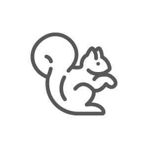
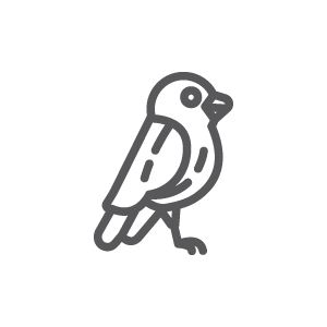
Animal logos, too, are frequently seen. Whether it's a line drawing or a silhouette or just the head, an animal can be a cute, appealing logo choice; but if it’s something that’s used in every animal-related industry, it’s going to get overlooked.
Dogs, cats, frogs, birds, fish, chickens and horses logos are some of the obvious choices, largely because of their familiarity; it's much rarer to see slightly more exotic animals, because they may not come across as so immediately comfortable.

Credit: istock.com/-VICTOR-

Credit: istock.com/-VICTOR-

Credit: istock.com/-VICTOR-

Credit: istock.com/-VICTOR-

Credit: istock.com/LueratSatichob
Credit: istock.com/LueratSatichob
Credit: istock.com/LueratSatichob

Credit: istock.com/LueratSatichob
But there's so much scope for creative design decisions with animals, it would be worth exploring some lesser-known possibilities, like hedgehogs, raccoons, or the occasional antelope. More cliche animal depictions can also be used in logo designs creatively and innovatively such as in penguin logos, cat logo designs, and fox logos.
It's easy to think inside the box when it comes to designing an iconic logo. It’s a big box! But by combining shapes, creating new shapes, and thinking about what your company signifies rather than just what it does (using puzzle pieces for a fix-it company, for instance, rather than a wrench or a hammer icon) you too can put together a logo that means something other than, "Oh, look, another generic logo."
Take a look at any given industry, and do a quick run-through of logos up for sale on logo sites. Even a cursory glance will probably tell you the facts: each market has its favored style of a logo, and by “favored,” we mean “overused to the point of being generic.”
A particularly noticeable example is the housing industry. Almost anything to do with housing — real estate logos with building, rentals, home repair, etc. — is susceptible to a home invasion.
This is because these concepts are easy — they directly tell the viewer what the company is about, without having to be clever about it.
Unfortunately, lack of cleverness does not equal memorability; any industry with a glut of a certain logo type or element is going to dissolve into a mishmash of generic companies, and only those who reach for something different have any chance of standing out.
Good advice is to do some research before developing your creative logo. If there is a definite and obvious trend within your market, be ready to avoid jumping on the bandwagon.
Below, we'll take a look at some of the most egregious offenders in certain markets.
Real Estate:
As mentioned above, anything that has to do with housing tends to drift toward that same rut when it comes to logos; ie, the logo will be something that has to do with housing.

Credit: freepik.com

Credit: istock.com/HS3RUS

Credit: istock.com/ecyaseen

Credit: istock.com/Stefan Ilic
Health:
Swooshy people, mentioned in a previous section, are commonly seen in health-related logos. Logos for doctors, clinics, hospitals, and even logos for day spas and gyms frequently fall into this trap. The trap of the swooshy people. Also commonly seen for clinics and hospitals are heart logos.

Credit: freepik.com

Credit: freepik.com

Credit: freepik.com

Credit: freepik.com
Dental: Since it's challenging to put together a logo for dentistry that doesn't scare people off — nobody likes to go to the dentist, right? — perhaps it isn't all that strange that so many dental logos turn to tooth based design.

Credit: freepik.com

Credit: freepik.com

Credit: freepik.com
Credit: freepik.com
Finance:
If there's one thing frequently seen in logos for financial institutions, from banks to credit unions to cash checking operations, it's the color green. Other trends commonly seen include the dollar sign (oddly enough), or icons and fonts that are meant to communicate trustworthiness and strength, such as bold typefaces, simple shapes, and primary colors, such as red or blue. You may also very well see graphs or arrow type logos, indicating an upwards momentum.

Credit: freepik.com

Credit: istock.com/marko187

Credit: istock.com/marko187

Credit: istock.com/marko187
Communication:
The telecommunication logos display globes as graphic elements, in an attempt to impress on the viewer just how wide and extensive their communication can actually get. A color palette featuring blues or monochrome hues are also frequently seen.

Credit: istock.com/Stefan Ilic

Credit: istock.com/abu hasan ahmad

Credit: istock.com/Stefan Ilic

Credit: istock.com/marko187
Automotive:
Not surprisingly, any business in the automotive industry, whether it be car wash brands or selling car parts company leans heavily on using cars in logos. Not just any car, either; the car in question are almost uniformly fast, modern, low profile sports cars.

Credit: freepik.com

Credit: freepik.com

Credit: freepik.com

Credit: freepik.com
Photography:
Cameras are frequently seen in photographer logos. No one knows why. It’s baffling. Snark aside, the lens itself is also adapted into a logo regularly, as it lends itself well to especially a circular, filled logo.

Credit: freepik.com

Credit: freepik.com

Credit: freepik.com

Credit: freepik.com
Beauty:
Generic images are rife in beauty logo designs, possibly especially because so many small businesses start from home, without much money to put into either marketing or the logo. Affordable business card designs available on sites like Vista Print lean heavily on cursive fonts, line drawings of half faces with wavy hair, and stylized elements like butterflies and lotus flowers.

Credit: freepik.com

Credit: freepik.com
Credit: freepik.com

Credit: freepik.com
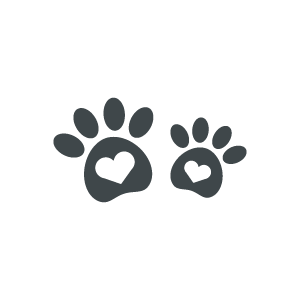
Veterinary:
As mentioned previously with iconic logos, vets and pet stores logos, animal feed and supply stores, and other animal-related businesses frequently turn to the same set of animal types for their logos. Cat logos as well as dogs, horses, and cows, chickens and fish are easily adapted and the recognition is immediate. However, that means that they tend to be overused.
Credit: freepik.com

Credit: freepik.com

Credit: freepik.com

Credit: freepik.com
Generic Design Elements in Logos
Logos can cover a fairly wide variety of symbols, shapes, and icons. The elements of a logo may include the image, a portion of the image, the color scheme, layout, or font choice. As we’ve covered aspects of these already, let’s address certain egregious examples. However, principles of logo designing are as important as the elements and help designers create a complete look for brands.
Generic Shape Elements:
Logo designs with basic shapes like a triangle, star or a heart are setting themselves up to be labeled as generic or overused logos. Not only are these types of shapes often indistinguishable from clip art but they also pop up all over the place, being the favorite go-to’s for uninspired designers. If your logo lends itself to using a traditional shape, try to adjust the lines to make it your own.

istock.com/Avector

istock.com/Ganna Galata

istock.com/Stefan Ilic

Trans-letter swoosh: Another commonly overused logo element is the letter-joining swoosh in lettermark or wordmark logos, and though the idea is to unify the monogram, what it often does is just render your logo indistinguishable from everyone else with the same concept.
istock.com/Eko Priyono Asmadi
istock.com/Eko Priyono Asmadi
istock.com/Eko Priyono Asmadi
istock.com/alluranet
Arrows:
Arrows are on-trend, but as with pretty much anything else, there's a right way and a wrong way to go about using them. Logo design trends, when not used carefully, can quickly become overused, and a generic version of even a popular design style is nobody's friend.
Credit: istock.com/200degrees
Credit: freepik.com
Credit: freepik.com
Credit: freepik.com
Globes:
Globes are also frequently seen in logos. They are commonly used in information technology logo designs, communication logos, travel logos, or in multinational brand identities. They are simple shapes, which are usually good for a logo, but often the effective execution is decidedly lacking.

Credit: freepik.com

Credit: freepik.com

Credit: istock.com/Stefan Ilic

Credit: istock.com/Amanmana
Sometimes logos can combine overused logo elements, perhaps with the idea that they will cancel each other out — but that doesn’t usually work well.
The goal of any logo is to be memorable and effectively communicate to the viewer what the company is.
Choosing a generic or overused logo is exactly not the way to achieve this goal. By giving these time-worn logo elements and overused concepts a wide berth, you're giving your logo a chance to be its unique self, making a lasting impression on everyone who sees it.
*This post was originally published on Logo Design Guru.
Written by Raquel Addams