The New Rule-Book Of Kerning For Fashion Logotypes
Feature Image Source: iStock/bortonia
What the hell just happened to the new ZARA logo? All the rules about kerning just went out the window. You must have had this thought the moment you saw this fashion logotype, but to be honest I thought it was unconventional. Nevertheless, it does make you feel a little uncomfortable. We all have been warned about the same old typography rules to the extent that now when a piece of graphic doesn’t fit the criteria, we troll it.
Technically when the type becomes the point of focus, we are more likely to pinpoint the imperfections. Let us first understand what in the world kerning means and why is it important. For a lay man or a newbie designer, it becomes difficult to even comment on logotypes if they are not so sharp with identifying and justifying typographic deviances.
In this article, I will be covering the following topics:
- The definition and importance of kerning
- Difference between kerning and tracking
- An introduction to fashion wordmarks
- Rules of kerning in fashion logo designs
Kerning And Its Importance
According to Adobe, “Kerning is the process of adding or subtracting space between specific pairs of characters.” If the kerning is not done right, as a graphic designer or typographer you will immediately spot the anomalies and many times cringe at them. Nevertheless, there are two ways to do kerning in a software either automatically adjusting the spaces with the given panels or manually increasing and decreasing the gap. The better way is to not let the design tool do it for you instead, do it yourself.
Some of the challenging letter pairs to kern “perfectly” include LA, WA, WE, Wo, Ya, Yo, Va, Te, Tr, oL and so on. The space between letters depends on the type of letters, and here they are:
- Rounded – O, Q
- Half-rounded – D, B, P
- Half-opened – L, E, K
- Opened – W, T, X, V
- Rectangular – N, H, M
The structure of each letter, the one that precedes and the one that follows it impacts the setting of kerning. This heavily influences the look and meaning of a word. For example, “Therapist” can easily become “The rapist” if the kerning is not attuned according to the context.
Fashion Design Logos
Beauty Supply Logos
Boutique Logos
Bags Design Logos
Kerning Versus Tracking
Just like the many misunderstood graphic design terms, kerning and tracking are often confused as well. For a long, even I had a problem understanding the clear-cut difference between these two processes. Let us see how well I can explain you the contrast.
| KERNING | TRACKING | |
| 1 | Controls the spacing between two letterforms. | Adjusts the space between all the letters in a word. |
| 2 | Used to fix awkward spacing between two letters. | Used to balance the overall look of letters when combined. |
| 3 | Makes the word appear visually pleasing with befitting denotation. | Affects the visual density of a word, phrase or paragraph. |
| 4 | Some design programs use in-built kerning tables to apply automatic kerning to text. | Tracking is not on auto-mode, you have to use the character panel in software to change it. |
Types Of Kerning
In a design software such as Adobe Illustrator or Adobe InDesign, there are three types of kerning options available. Sometimes mathematical spacing works but many times you need to kern optically, that is visually.
Manual Kerning
When you start your project on a graphic design software, in some cases, there is a need to do kerning manually by either using the shift+ right or left arrow key on the keyboard for a default 10 pixel move or by just pressing the arrow keys without shift for moving one pixel at a time. For example, the space between the letters “M” and “O” may seem perfectly fine but the space between “O” and “X” may not feel equally distributed as the M and O. In this sense, you need to space out characters manually.
Optical Kerning
According to Adobe Help Center, “Optical kerning adjusts the spacing between adjacent characters based on their shapes, and is optimized for use with Roman glyphs.” Design TutsPlus suggests that “Optical Kerning is a good choice for fonts with inadequate built-in kerning.” For example, you may have seen that with some fonts the punctuation marks such as a question mark is jammed into the letter that precedes it. In this case, optical kerning helps solve the issue.
Metric (Auto) Kerning
Image Source: Design TutsPlus
Now that we have a basic foundation about kerning, let us dive in the world of fashion typography.
Fashion Logotypes
From luxury brands to high-street brands, the fashion industry is concentrated with two kinds of logotypes: wordmarks and lettermarks. A continental wristlet wallet may not cost much but the moment you step into a Michael Kors boutique, the price shoots up! It’s the brand name and the logotype on the product that changes the game.
In the fashion industry, the brand name is pretty much everything. Some of the most famous and high-end brand names include Prada, Gucci, Ralph Lauren, Giorgio Armani, Versace, Prada, and Hermes among several more. On the other hand, popular sports fashion brands include Puma, Adidas, Nike, and Reebok etc. Then we have the high-street brands in the fashion world such as Mango, Zara, H&M, Topshop, Wallis, and New Look. If you observe, most of these brands focus on creating a wordmark or lettermark.
At a point in time, most of the luxury fashion brands used serif fonts to write their respective names. The logo design was simply the name written with a typeface of choice and that too in black. It is only now after the minimal trend fiesta and the prevalence of sans serif fonts that some of the fashion brands are redesigning their visual identities to meet with contemporary aesthetics.
For example, the serif font wordmark of the brand Burberry has been around for almost 100 years, but recently it made the switch. In 2018, just before the London Fashion Week, Burberry Group Plc launched its new brand identity with a sans serif all-caps treatment designed by graphic designer Peter Saville.
Image Source: Underconsideration/Brand New
It is good to follow trends once in a while, but there is a truth about logo design trends that should be known before relying too much on the fads. Well, you cannot blame the fashion industry since it too thrives on trends.
Seeing the rising trend of serif to sans serif, graphic designer and founder of LogoLounge, Bill Gardner observed and identified the change happening in the fashion industry. Fashion logos like Balenciaga, Berluti, Calvin Klien and Yves Saint Laurent have already transformed their visual identity to what The Fashion Law calls “blanding”, and if this trend continues then all the fashion logotypes will look similar. The only thing that will set them apart will be their branding and marketing.
Image Source: The Fashion Law
New Rules Of Kerning In Fashion Logos
Many fashion logos have rid themselves of symbols and instead, focus on the typography and spacing. Here are a few rules to keep in mind when designing fashion logotypes:
1) Adjust Kerning For Adaptable Logo
Fashion consumers have transferred their buyer’s journey from in-store to online. For many, a fashion website or social media has become the top place to shop. Keeping this consumer behavior in mind, fashion logotypes should fine-tune their kerning to make their logo designs adaptable i.e. responsive and readable for different screen sizes such as a laptop, iPad or smartphone.
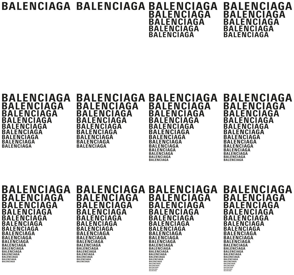
Gif Source: Bureau Mirko Borsche
2) Pick A Font Easy To Kern
When I was working for a fashion magazine, I found kerning to be the most challenging part of designing. While some typefaces have letter structures that are easy to kern, many are difficult to deal with. For a fashion logotype, it is essential to use a font that creates pleasant spaces between letters.
According to the website Fonts In Use, here is a list of some fashion and apparel fonts that have been used by the fashion industry:
- Helvetica
- Futura
- Cooper Black
- Eskell Display
- Akkurat
- Bebas Neue
3) Experiment With Kerning
The new world order of design industry is the willingness to experiment. We are tired of seeing the cliché typographic logos, color palette and symbols – we the consumers of design want something out-of-the-box. Zara is brave in this sense and so is Saint Laurent with its letters “N” and “T”. Even the old logo of Yves Saint Laurent was unique and there was hardly any space between the upper and lower sections of letter heights.
4) Change Kerning With Font Style
All the fonts in this world have different styles and anatomy of typeface, so when you select one for a fashion logo remember that the kerning will vary. For example, a cursive font will have to stick together enough to touch the swirly serifs of the letters. On the other hand, designers are using monospaced font or adding more than the usual space between pairs of letters. So the kerning depends on the type of font being used and the way it is being used.
Image Source: VectorLogoSupply.com
Image Source: Squirrelsisters.com
5) Kern With Composition in Mind
Not all fashion logotypes are wordmarks, some are lettermarks too. These lettermarks in logotypes are influenced by the layout of the letters. Consequently, kerning is also affected. Fashion logo designs can afford to be avant-garde because that is what fashion is about – being unusual and unique.
Image Source: Fashionunited.de
Fashion Logo Collection
It is not necessary that a fashion logo has to come from a fashion retailer only. The fashion industry is full of businesses beyond retailing such as blogging and distribution. It can even be a shops selling a variety of items like undergarments, shoes, dresses, suits, and accessories.
In this design era, you can break rules and make new ones. As long as the logo is good in aesthetics and function, you can make exceptions. Of course, big brands are always under scrutiny by the design squad but what about startups and small business. Can’t fashion brands have experimental logotypes?
Look at these fashion logos and observe how the kerning changes from one font to another, from one style to another, from one design composition to another, and from all-caps to small.
Image Source: ZillionDesigns.com
Image Source: ZillionDesigns.com
Image Source: ZillionDesigns.com
Image Source: ZillionDesigns.com
Image Source: ZillionDesigns.com
Image Source: ZillionDesigns.com

Image Source: ZillionDesigns.com
Do you think kerning should be free from rules?
