How to choose the right typeface for your graphic design?
If you're a graphic designer, then you know what I'm talking about before I even say how much of a slog it is to nail down the right font for your designs.
And, if you're reading this, then you're also looking for some advice to perhaps 'ease' your journey to aesthetic perfection. Well, you've come to the right place.
This is, in fact, the post you've been looking for, and below, we'll be running through the simple steps to design that you can follow to help you filter the right fonts for all your graphic material.
What do I mean by that? Well, keep reading, and you'll find out.
Back in the old days, fonts were scarce, difficult to get hold of, and unless the one you wanted came preprogrammed into a text editor, you were pretty much stuck.
But, now, we're not. They do so much more than simply display text. There're big ones, small ones, fat ones, thin ones, slanty ones and curly ones, serif and sans serif. More than you can shake a stick at — and they all do something a little bit different for us.
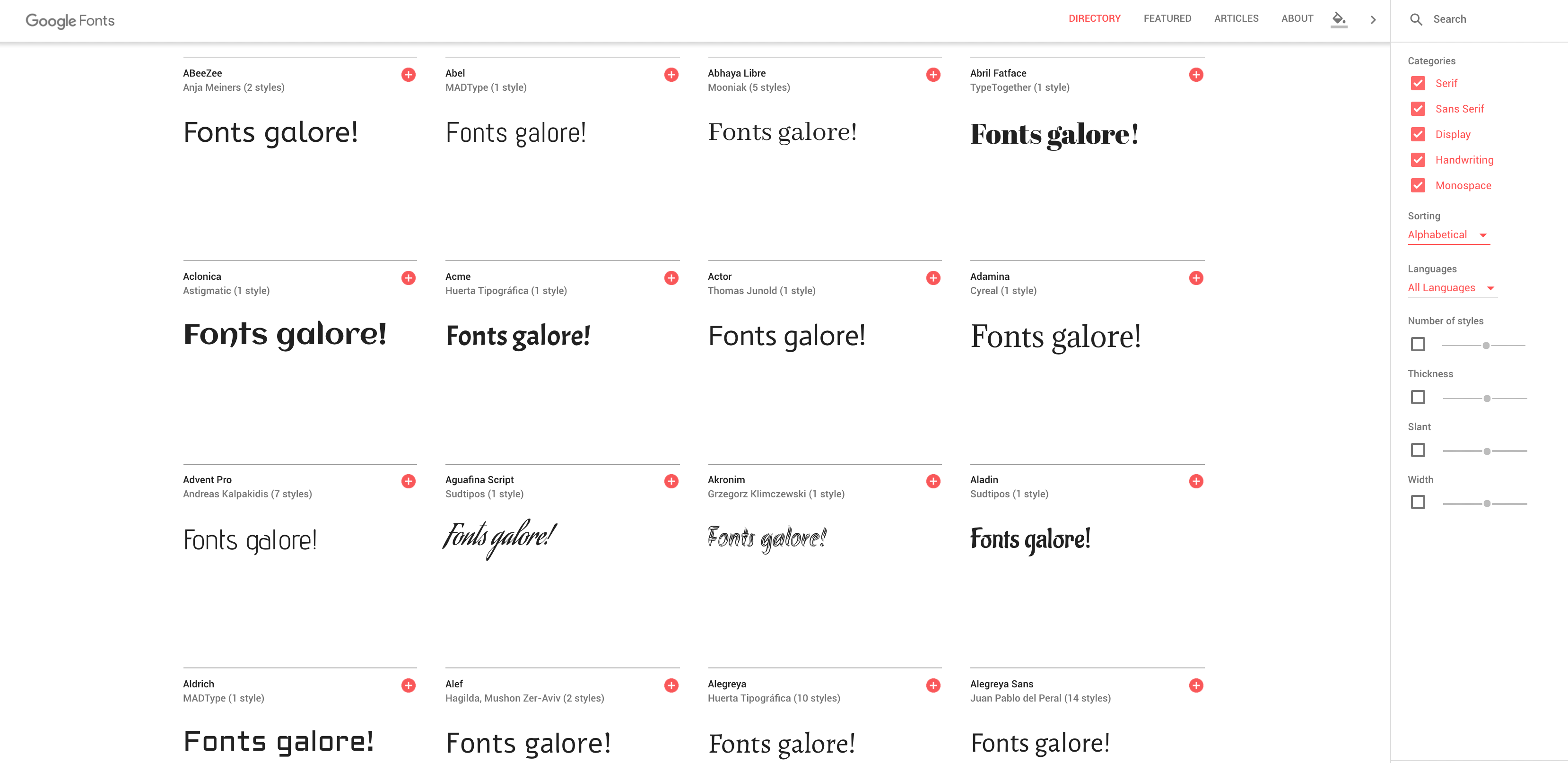
Fonts are in abundance these days, and if you know where to look, you can snag thousands of them for free. Which brings us to our first point.
1. Do I stock up now, or look for one when I need it?
Er, if it's anything like trying to choose an outfit before heading out, I'd say buy for the occasion. By having many fonts for digital work in your software, you'll spend more time flicking through them all, looking for that perfect one you can't quite remember the name of, then you will be designing whatever it is you're designing.
Leave them where they are and then once you've decided what sort of font you want - download a variety of fonts that match your criteria, and flick through that shortlist instead.
2. The Initial Choice
There are some screener questions, which will help you narrow down the sort of font you want.
What do you want the font to do?
Well, is it simply there to convey information, or do you want it to carry a boatload of contextual weight?
With the number of fonts and styles we now have access to, we can say so much with the look and shape of a font that we don't need to put a lot of things in writing.
When they say a picture is worth a thousand words, a font is worth a million, because it's a combination of the two.
Ask yourself what you want your font (not your words) to say, and then draw a big line under it.
Do you want it to tell the person seeing it that the design is classy? Modern? Traditional? Is it for a college or school? Is it for Kids? Is it for a newspaper?
Think about the instant decision you want your viewer to make, and you're halfway home already.
3. The Reaction
We're delving deeper into the proverbial rabbit hole, here, and I'd like to take a quick second to share some interesting information.
There've been studies conducted that have asked people to give a word as a reactionary description when they've been shown fonts. It's nothing especially surprising - curly fonts, and those that look like they've been written by children connote happiness; thicker fonts are more assertive; serif fonts are traditional and bland, but sans serif fonts are modern and clean. You could have guessed that, sure, but it's still good to know.
If you're designing something for someone else, then you need to be thinking about them, and their target audience. What you think looks good might not fly with the client, so it's always good to think about what the function of the design will be. If you're selling crayons, then you'll want a fun, happy font. If you're doing a pamphlet or logo design for a funeral home, perhaps a more traditional, less fun font would be better.

4. Versatility
The versatility of any font is another thing you'll want to consider when designing text-based graphics.
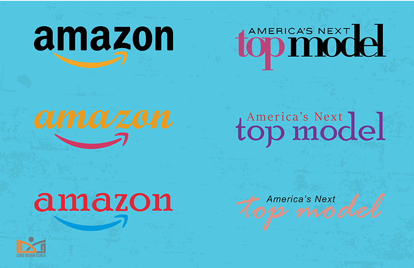
A lot of the time, a font will look just perfect when it displays the company name, a single word, or a phrase. But, often (and more often than not), when it's used for a different purpose - a tagline, motto, subheading, or even for body text, it will end up looking rather out of place. If you're designing a lot of things for a company, we suggest choosing three fonts for different purposes, though I'll touch on that in a minute.
For now, we want you to think about where this font is going to show up, and how it will look.
Is it going to be in bold and black?
How does it look spaced out?
Can it be written on a curve without looking terrible?
Can it be colored in?
Does it look good over an image, or under one?
What does it look like when it's outlined?
Chances are that you'll be using any font you choose for a company a lot, and having no design skills themselves, they'll demand things that you just can't make work. But, if you anticipate the ways that you'll be using your font, then save yourself some grief in the long run.
5. The Big Three
Heading. Subheading. Body. Three different fonts. Three different styles. Three different functions.
Never, and we repeat, never rely on one font as a saving grace.
Your heading font should be the foremost concern, as it will be representing your business everywhere you go. It may or may not be a part of your corporate logo, but it should be a part of the company. It needs to tell the viewer everything they need to know about what they're looking at, just by the feel of it.
Your subheadings should be different. They have the opportunity to carry a different contextual weight and should add a little bit of diversity to the company. One with a fun, ultra-clean heading font might go for something a little more traditional for a subheading font to tell the viewer 'hey, yeah, sure we're modern and sleek - but we're also reliable and respectful.
As for the body font - choose something plain. Either serif, or sans serif if you want to be traditional, or modern, respectively - but the paramount factor here is that it's nice to look at in large bodies of text, and it's easy to read.

Source: entrepreneur.com
6. Brass Tax
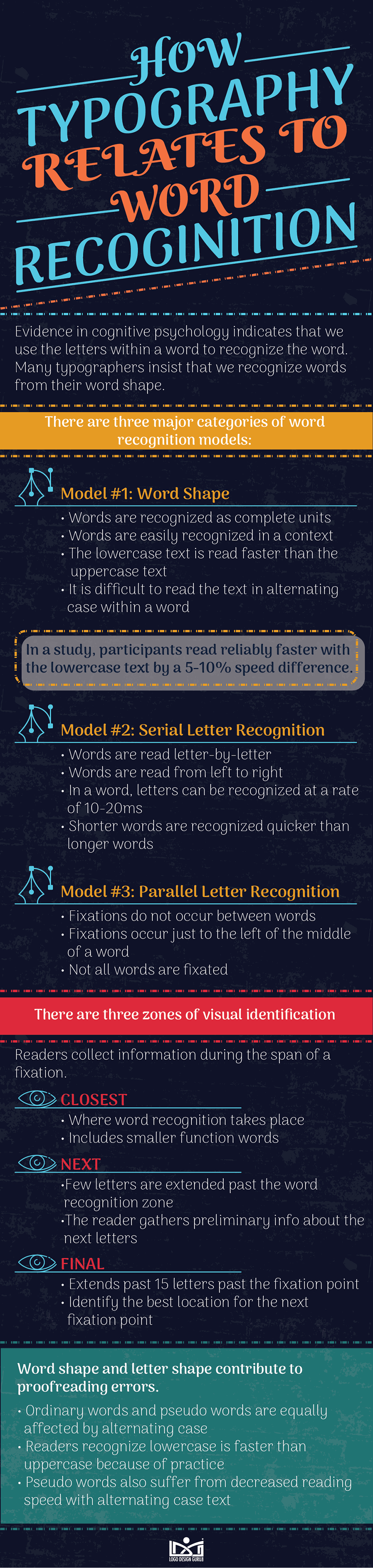
Alright, down to the science. There is one here. W mentioned a little earlier that there are emotional reactions to different fonts, and that's great to bear in mind. But, beyond that, you can do more to help the viewers engage with what they see. How you arrange information, and what they take in can be a great way to get people to dig your designs.
There are lots of different theories as to how humans process words and information. A lot of it is to do with the shape of words, the order of letters, and the context in which they occur.
Now, there is something to be said for a wacky design with weird lettering or bizarre fonts but - for the most part, which is what we're doing here - generalizing - you want your heading, your logo, your subheadings, your stickers, or whatever else it is that has your lettering on it - to be recognizable and readable.
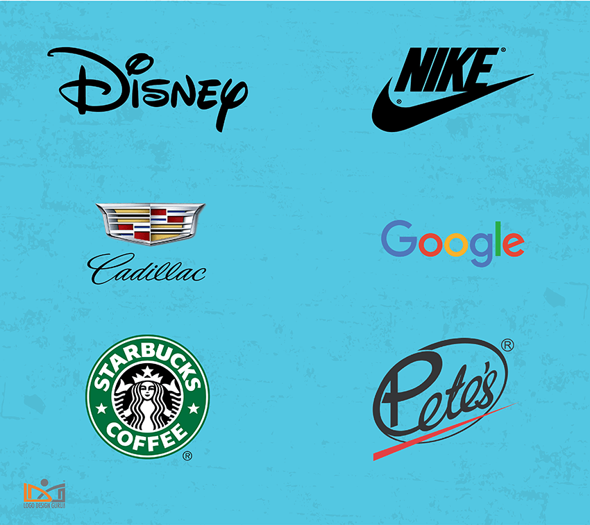
Seeing and identifying shapes is one thing, but if you asked someone to draw the Disney logo, they couldn't, but they could sure as heck write the word out. While exciting and bold lettering can often be great if you're doing something conceptually; in the real world, having something be instantly recognizable as a word or group of words, is a much more concrete way to capture the attention than simply by having an exciting look.
Source: brandsoftheworld.com
7. Typeface & Font
Typeface and Font are often used interchangeably. While, to the layman, there's no discernible difference, to us mouse-jockeys, there is.
Explaining the difference between typeface and font is better done with an example. Helvetica is a typeface while the different variations of this typeface like bold, thin, italic, condensed are fonts. Nevertheless, you will see people use words like typeface and fonts interchangeably.
A typeface is the type of font, and Font is the individual permutations within that typeface.
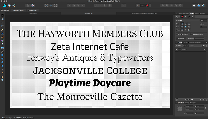
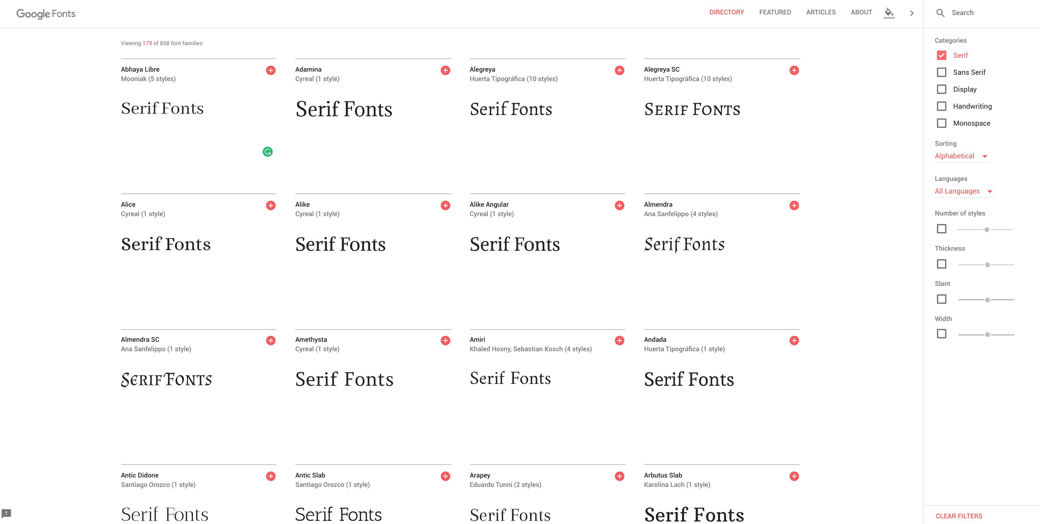
Serif is a typeface, like Times New Roman, Georgia, or Playfair Display. These sorts of fonts have little tails hanging off things - they're your stalwart traditionalist fonts likely to pop up in newspapers, novels, and 'reputable' or 'formal' websites like upmarket hotels, restaurants, and that sort of thing.
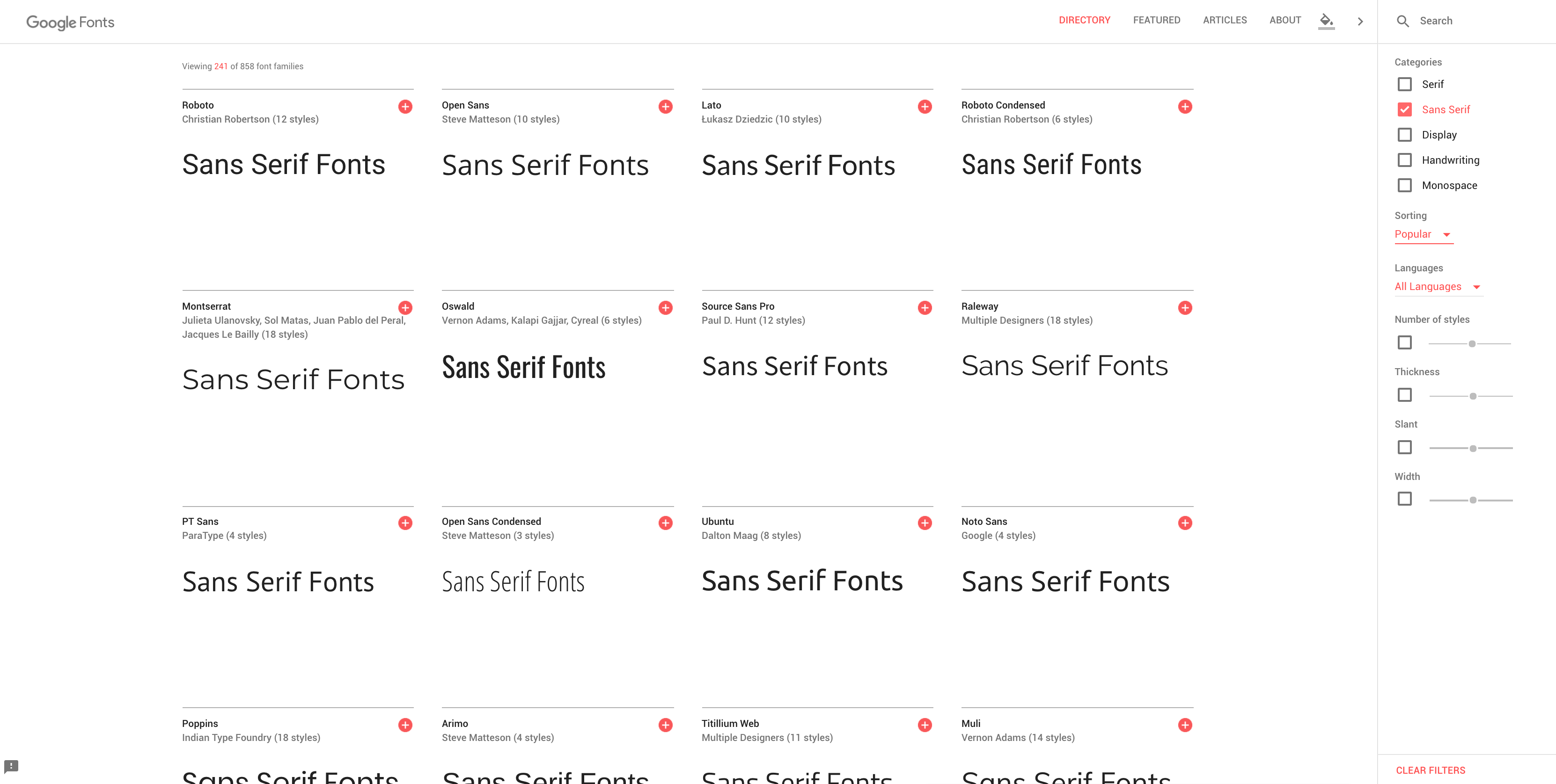
Sans Serif, like Roboto and Source Sans, is the opposite. These tail-less, clean, round fonts are all about the new and reliable. They'll be your go-to’s for website content, brochure designs, and pretty much everything that comes in a block of text written. They don't say a lot about anything, other than you care about the eyes of your readers, and that you're reasonably up with the times.
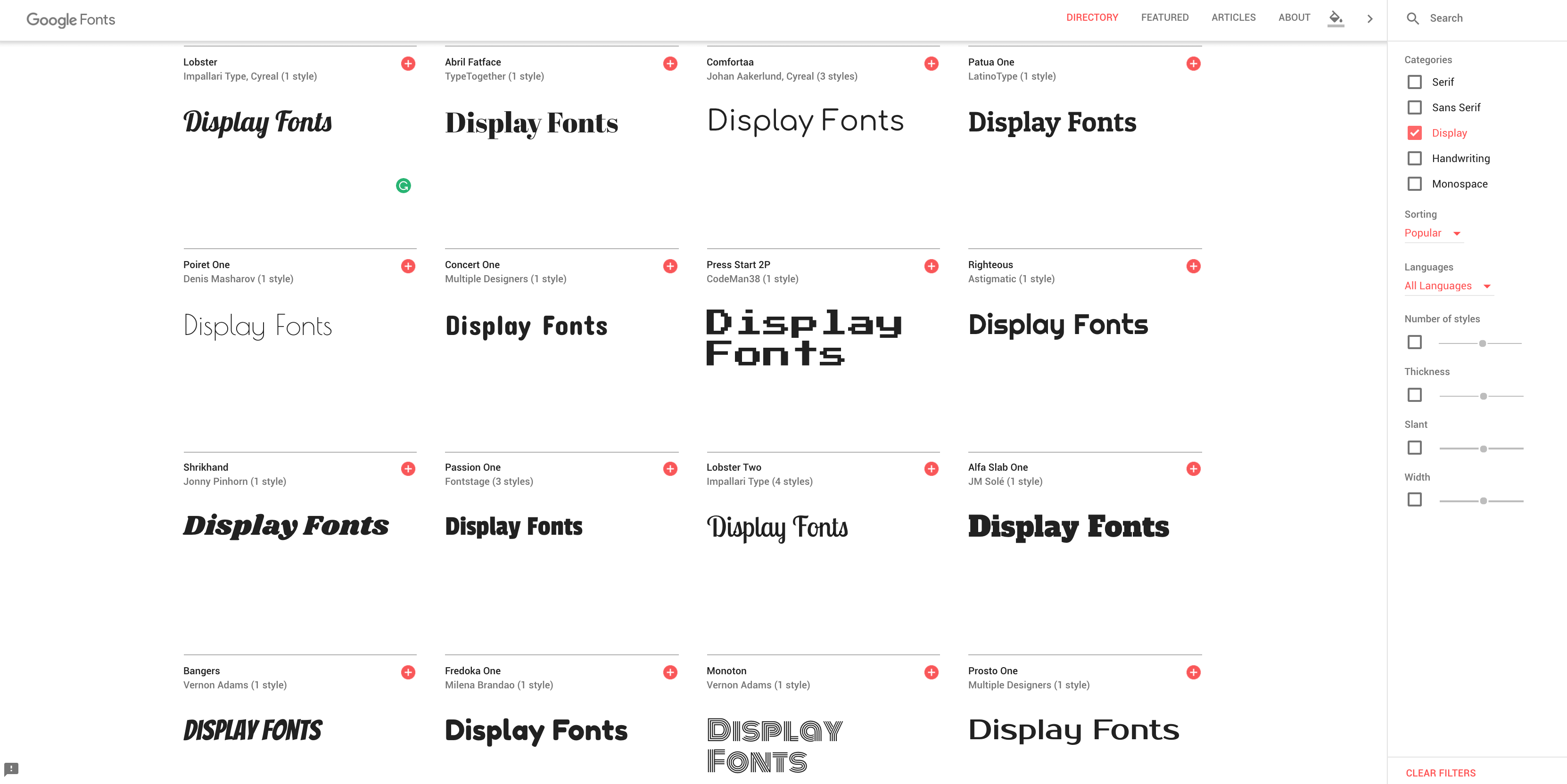
Display fonts are a little different. This broad term encompasses lots of different sorts of fonts, but usually, they tend to be large, bold, and full of personality - and yet, often they retain a note of seriousness to convey their assertive means. Contrail One, Oswald, and even Bangers are good examples. You may find them at the top of news articles, on a lot of logos for media companies, and often above takeaways, go figure.
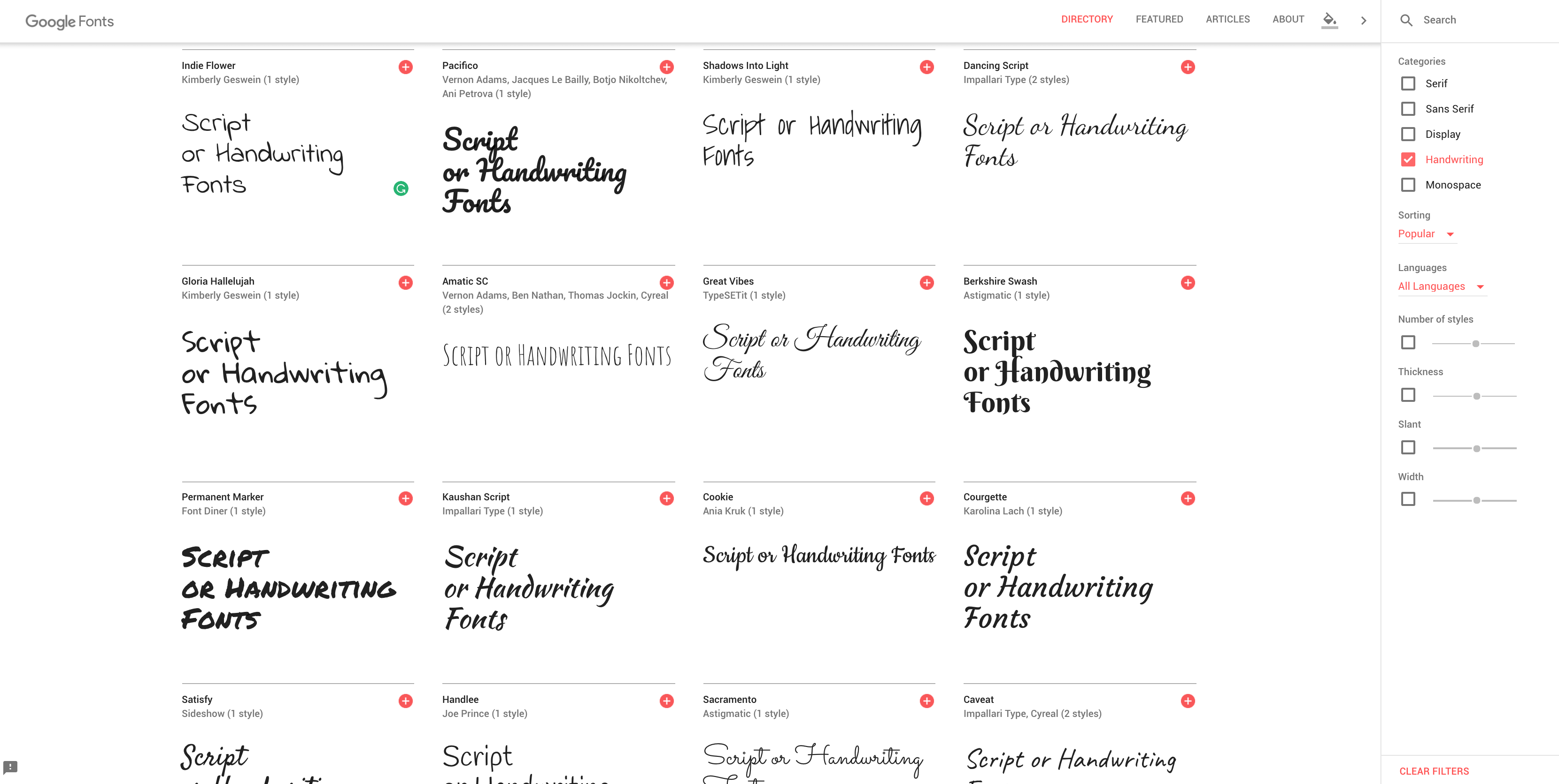
Script fonts, in a nutshell, imitate handwriting. These are used when designers need to convey a level of artistry or creativity, for the most part. Bradley Hand, Corsiva, Pacifico, and Dancing Script are all popular examples. Businesses that utilize creativity, want to embody formality, use a name in their title, or utilize a certain skill tend to use these sorts of fonts - hair salons, women's clothing shops, perfumes, car brands (like Cadillac), will often use script. And lastly, we have Monospace.
Monospace fonts imitate typewriters and are generally more spaced out than other fonts. They can either be sans, or serif and come in a variety of sizes and shapes. Courier, PT Mono, and Anonymous Pro are all good examples of this typeface. These sorts of fonts can be used traditionally, to signify a throwback to a simpler time - like if you were selling typewriters, or antiques, perhaps - or they can be used ironically - say in a computer logo or hip cafe logo design that want to celebrate progress by drawing attention to the anachronistic of those fonts.
There are (arguably) more, but you can slot every font into those categories for the sake of keeping things straightforward. Knowing the typefaces will put you ahead of the curve when choosing a font. Narrow it down to one typeface, and you're already 80% of the way home.
8. Recap
The task is not an easy one, that's for sure. Often, we'll spend hours pouring over fonts, trying to decide. A lot of the time, you'll never find a perfect font, because you'll have something in your head that you can't attain. So, unless you're into creating your fonts (which is painstaking), then I'd follow these steps.
First, decide what you want the font to say outside of the words it's using. Decide who your target viewers are going to be. Ask yourself what kind of font will appeal to them. Take the answers of those questions - I want the font to say 'we're a fun company!', the target viewership is young mothers looking for daycare for their children, and they'll respond to a font that looks fun enough to provide a good time for their child, but serious enough to be a reputable establishment that will also provide mental stimulation.
If those are your parameters, then you know where to start.
You'll likely be thinking either Display or Script. Display fonts can be fun, yet serious, and Script fonts can be respectable, yet artsy. If you decide that your client is opening a more educative daycare, then you'd go with Display. From there, you'd be thinking, ok — rounded corners, something that looks quite approachable, and not too in-your-face.
Answering questions about the purpose of the font will continually narrow your net.
Then, all you have to do is cast it. Most sites now (like Dafont, and Google Fonts) can write sample text in the font field, so you can see how it looks.
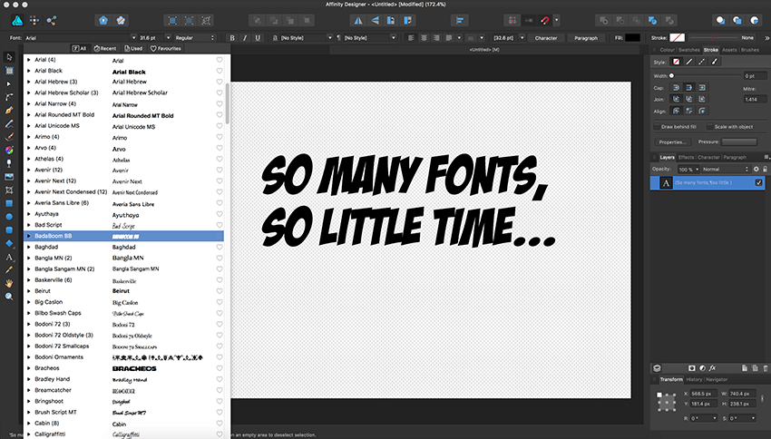
Choose a half dozen that look good, make sure they're '100% Free', 'Free for Commercial Use' or you have the right license to use them, and then download and install. Make a big sheet and test them out - see how they look. Write notes - pros and cons - and keep pushing. Whittle it down. Tweak the sizing, the spacing, the height, the width. Change the color, write them on a curve. Put them on images, on different color backgrounds.
This isn't an exact science.
Right font choice comes down to planning and testing — but, if you keep in mind everything we mentioned above, then you'll give yourself a heck of a head start. And, in as time-consuming a task as designing is, well... any sort of time-saver is welcome, right?
*This post was originally published on Logo Design Guru.
Written by Raquel Addams