15 Website Designs to Fall in Love with
Featured Image: iStock/Cnythzl
The web is quick to pick up trends and advance accordingly. This explains why most websites are rushing towards minimalist and responsive designs. If this is what the trend dictates, you only have one chance to cast the first impression. Just like a book is judged by its cover, your business is usually judged by your website design. Aim to make the user fall in love with your website design. A proven quick fix is to implement WordPress themes for corporate websites.
While a lot of website owners scratch their heads to find the perfect combo, there are some who have an outstanding grasp on web design aesthetics. The designs they bring to life are intuitive and generates fast user response. Here is a list of website designs with excellent user-experience but there is one thing brilliant about each that stood out above the rest. Read on to find out for yourself.
1. e-Wedding
Not that the name needs any explanation, but the images embedded perfectly complement the business idea. The homepage is not cluttered with content or visuals but presents the two components in complete balance. Moreover, the web displays conveying images, strong call-to-action and an effective heading to motivate the users to create their website. Not only the idea is unique, it is also free from jargons.

Image Source: ewedding.com
Self-explanatory
What we have learned from e-Wedding is that when the layout of a website is not obvious, or in other words self-explanatory, it is breaking the law of usability. If the homepage leaves too many question marks, the user is inclined to choose alternatives. It is pretty hard for the visitor to comprehend what is the value that a given website holds unless the site architecture and navigation aren’t intuitive enough.
2. Scrapd
There is something unique about this static screenshot. It appears clean and less busy despite a video in the background. There is not much content but the design and navigation aligns perfectly to narrate the idea with subtle use of animation. There is a reason why the website design provides perfect user experience.

Image Source: scrapd.nl
Interactive Storytelling
Visual ways to tell a story always stand out. They do not overload the reader with written text but with videos and images to narrate the website’s idea and answer the 3 pressing questions (who we are; what we do; and why you are here) without making the visitor read a lot.
3. Session M
Session M offers digital loyalty and engagement solutions for mobile and they have used a static background which is pretty rich. In this age when everyone wants their website to be dynamic, they are not trying to force a trend. They have a rich image with icons that conveys the brand message.

Image Source: Sessionm.com
Rich Backgrounds
So far, the most underused component of web design is the lack of rich background images. Normally, web owners present content with the use of black text against a light background or vice versa. However, they fail to realize that they are missing the opportunity to attract attention with an image. While some trendy websites have been adding images in the backgrounds in the past few years but the fact that there are more options beyond static images, opens up a whole new world of creativity.
4. Rivers SmokeHouse
This is truly a website design you will fall in love with. The rich background speaks a thousand words, all representing the business in question. The parallax scrolling feature of this website provides a guided tour through all the services and the menu, without the tedious clicks required to navigate around most websites.

Image Source: 4rsmokehouse.com
Scrolling is in, clicking is out
One page scrolling sites are ideal for interactive storytelling. It completely negates the hassle of multiple drop-down navigation. Users love to scroll when they are on web or swipe their finger when on mobile devices. Nobody bothers to click unless something interesting comes their way or their path is blocked by a smart call-to-action.
5. OAK
I would say, this site is an amazing blend of latest and relatively old web trends. They have made very good use of the white space. Though it’s hard to decipher what the website is about in the first look, due to less clutter and professional content organization, the user is motivated to find out.

Image Source: oak.is
Whitespace Efficacy
In a time when websites are adopting minimalism, the simple way to present content is by making use of white space because it helps reduce cognitive load, and let the user concentrate on content. If you don’t appreciate the grey, chalky or egg white, then there are 10 more shades of white. The bottom line is when the content needs to stands out, the background should be clear and crisp.
6. Shoot
This website has a daunting task of presenting who they are and what they do in the online world. Obviously visuals were not enough. So their approach is to showcase information at good intervals to make it scan-able for the audience. The idea is not to hook the audience for long duration but to guide them to some value proposition.

Image Source: Shoot.sh
Highlight Digestible Information
When a user visits the site, he/she scans the page for information that is of use to them. If the layout is complex and hard to read, there is no chance of the visitor getting hooked. If the layout only presents visuals without showing any content, it can be misleading. It’s important to present text in digestible chunks.
7. Eppi Design
Eppi specializes in branding for its customers and in turn helps them connect with theirs. Their presentation is artistic which is of course reflective of their work but uses a simpler communicative style. Also the user experience is enhanced due to the fact that the website is responsive and allows freedom of usage on all devices.

Image Source: ephraimjoseph.com
Responsive Makes Things Easy
Responsive web design is a recent and groundbreaking innovation of 2011 which simplifies user experience and appears to be the ruling currency for web design. I say this because when there is an option to go responsive; all the other alternatives are ruled out.
8. Techtonica
The subtle use of icons matched with a perfect color palette makes this website an eye candy. Though most designers would love to critique on the layout, the use of flat yet prominent grid makes it perfect.

Image Source: Tectonica.co
Flat will continue to rise
All the tech giants have quickly molded their website design to stay updated with flat design a year or two back and many are skeptical about its staying power. Nonetheless, this flat design movement is still being voraciously adopted, so we will probably witness it grow further and in new directions.
9. My Deejo
No introductory pages and no preludes, the website directly displays its hot product. While at first glance the display seem static but a set of instructions makes it clear that WebGL is at play: the product can be viewed from different angles. My Deejo displays a pocket knife for which most people apparently don’t have a use but the display is so engaging and informative that you would say, I have got to get me one of those.

Image Source: My.deejo.fr
Product makes the first appearance
Whether it’s tangible or not, your product must be great, and showcased. According to recent trends, the product no longer needs to stay buried in deep pages. It can now be showcased on the homepage.
10. Y.Co Yachts
An aspiring background video on this website takes you into a trans. The web design seems effortless and not extra sales-oriented. The video footage captures the footage of a family enjoying their holiday on a luxury yacht, which simply makes you yearn for that saved vacation.

Image Source: y.co
Video backgrounds
The notion that complex business ideas need more explanation and hence more content is outdated. Nobody spares time to read or even click on a video that they are not interested to see. However if a video continues to play in the background without ever clicking the play button, then the action will definitely register in the mind of the visitor.
11. Secret Study
This is not the first time that a website uses a central navigation menu, but when you hover over the categories a unique effect is observed. Due to the movement of the cursor, the red diamond changes its shape. I am sure more effects like these are yet to come but this one is interesting nonetheless.
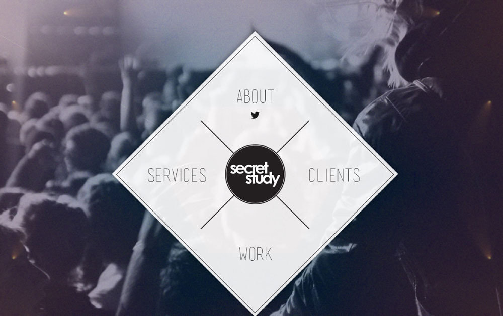
Image Source: Secretstudy.ca
Unique menu styles
Menus popping up due to the cursor movement, spread out navigation or the floating effect in menu are some of the creative styles to increase user engagement. The slide down or drop down menus are no longer in currency. Go creative.
12. Adventure
After 20 seconds of browsing through this website, I already started planning my adventure trip. Such was the impact of their design. It’s simple, authoritative and communicates to the target audience. Truth be told, they don’t need to search for their target viewer. If anyone enjoys adventure, they will be hooked. So please take a bow because this is one design you will fall in love with.

Image Source: Adventure.com
Human element
Wed design trends will come and go but there is something that keeps a web experience truly brilliant at all times and that happens when the user feels more connected to the layout design. Handwritten fonts, real-life images and catching the emotional side help the visitor to create a connection and association.
13. Cam
Cam – a stunning example of one-colored ambience! It’s hard to believe how monochromatic display can be captivating but this website is totally pulling off this unique idea. Although, the navigation needs improvement, but you will simply fall in love with the display design.

Image Source: Camoconnell.com
One color rules
A website is usually appreciated for the use of less but effective colors. However, there is something even better and it’s the use of one color. Nothing highlights the content the way a single color in the background does. The color becomes the brand identity and presents the buttons, icons and text in a crisp overlay.
14. Tiny Giant
The name more than just explains the brand and the typography does more than just displays the brand. The heading in giant font makes a visual statement hence prove large fonts do catch attention. The large typeface stands out on its own even if the image is small. Ask yourself and tell if this was difficult to miss?

Image Source: Madebytinygiant.com
Large typography
Typography, as we speak, can make or break your impression. When critics start to point out the mistakes in a layout, the first topic to come up is the choice of font. Whether anyone likes it or not, fonts are getting bigger especially when it comes to headings. The typography that make a visual statement is definitely in.
15. One Design Company
Simplicity doesn’t only involve minimizing unnecessary elements but it calls for the need to reduce cognitive load. Sometimes adding images produces an opposite effect but intuitive illustrations always give out the desired messages.

Image Source: onedesigncompany.com
Catchy illustrations
There is nothing new about adding illustrations in web design but the idea is still not phasing out. In fact, hand-drawn illustrations are becoming the center the attraction. Sometimes, illustrations explain the brand story or purpose or perhaps as a tool to connect with the visitor. In both cases, they make a statement, rather a good one.
So the next time you sit down for a web design, create a checklist that looks something like this:
- My website is optimized for all devices
- It communicates directly with the target audience
- Includes relevant call-to-actions
- It includes a dynamic layout
- It is periodically updated
Skim through your website as a user and update your checklist.