World’s Best Advertising Agency Logos and Their Brand Philosophies

Featured Image: iStock/DrAfter123
The most competitive and creative industry in the world is that of advertising, without a doubt. Some famous advertising agencies include Ogilvy & Mather, McCann World, JWT, and Saatchi & Saatchi.
In addition to these renowned agencies, it’s also important to recognize how niche services, such as marketing companies providing affordable book marketing services, create impactful logos that convey their unique brand philosophies. These logos often blend literary elements with modern design to signify their expertise in promoting books effectively and affordably. By understanding the thoughtful design behind these logos, we can gain insights into how specialized marketing services craft their identities to stand out and communicate value, much like the giants of the advertising world.
In this article, we will take a look at some of the best advertising agency logos and discuss their brand philosophies. We will explore the ingredients that allow them to stay consistently successful. In addition, we will learn if their stories inspire us to become better marketers, designers, and copywriters.
Let’s dive in!
Publicis Groupe
Publicis Groupe is an advertising agency in France, which has veins across the world. It is the largest group that caters to communication, marketing, and design in terms of its revenue.
The group was founded by the Blanchet family in 1926, and has always been owned by them. However, only a few years ago, in 2017, the agency was acquired by Altice.
The agency’s philosophy lies in the “power of creativity, intelligence, and technology to pioneer change.” The logo of the Publicis Groupe was created by its owner. Both the lion and the sun are symbols of power and courage. And indeed it takes fearlessness to stand out from the crowd in such a digitized world.
publicisgroupe.com/en/media-kit
WPP
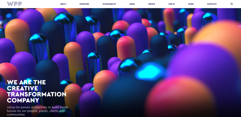
Image Source
Among the advertising giants is the WPP agency that specializes in public relations and advertising. They have a befitting philosophy for a world that thrives on technology.
They believe in using the immense ability of creativity to transform the future for everyone. To keep up with this belief, WPP invests in tech like IoT, VR, AR, and AI. In a world where everything depends on the touch of a finger, it is important to adapt to the changing landscape of business and advertising in order to remain relevant.
The logo of this advertising agency represents the many parts this brand name holds, and the dots help to encapsulate that meaning.
Deloitte Digital
Deloitte Digital is a digital agency that believes in the digital revolution, and that the digitalization of the industry will transform the way companies conduct their businesses.
The company stands by the limitless power that innovation and technology hold, and is constantly looking for ideas to harness these for their clients.
Thus, they are diligent about customer experience by making big strides in technology through creative design and strategy.
deloittedigital.com
As you can see, the Deloitte logo is simple in the sense that it is not as elaborate as Publicis Groupe logo design for example. Deloitte has a logotype with a bold and thin typeface. The unique thing about this logo is the green dot. The company’s spokesperson once described the dot as a symbol of security and safety. You may be wondering why an ad agency needs to portray itself as secure. Well, the real meaning behind the dot is that once someone becomes a client of Deloitte, they’re in safe hands.
Explore: Visual Trends 2021: Paid Social Advertising From Top Brands
Omnicom Group
Omnicom Group is a multinational advertising and marketing services company.
Omnicom Group was founded in 1963 by Arthur W. Ross, Sr., with the merger of his firm, Ross Agency, and DMB&B. The company has since grown to include more than 500 branches in 100 countries.
Omnicom’s philosophy is to create value for clients through its network of global talent and expertise in media planning and buying, creative services, data insights, digital marketing solutions, customer relationship management (CRM) software solutions, and strategic consulting services. In many cases, agencies also leverage data enrichment to enhance the accuracy and depth of their audience profiles, using tools like a social media checker to inform more precise creative and strategic decisions.
Sometimes companies keep their logos as simple as it can be because in a digital age they move forward with the belief that simple is better. The Omnicom Group logo is just a typeface written in a thick and thin font. The interesting thing here is the contrast in the weight of the font, which gives it a strong and linear look. When the logo of a company is this minimal, the idea is to accentuate the brand with its story, mission, and vision.
commons.wikimedia.org
BBDO
A worldwide communications and marketing agency, BBDO was set up in 1891 in New York. They’re known for their creative ads globally.
The BBDO logo is simply the company’s name, that is, Batten, Barton, Durstine, and Osborn. The name is written using a bold font in orange/red with no space between the letters. The color of this logo signifies determination, passion, and courage.
commons.wikimedia.org
Ogilvy
David Ogilvy founded the multinational Ogilvy advertising agency in 1948. As of now, it is present in over 120 countries. The agency believes in knowing the audience to produce creative, relevant, and lasting ads that impact and influence people.
Ogilvy believes that marketing and advertising should both be based on the needs and wants of the customer rather than the intention of the company, which is mostly to sell. The focus of Ogilvy is to embed a brand name and what it does, or offers into the minds of its target customers by implementing innovative and creative ideas.
The Ogilvy logo is designed using a serif font that looks stylized and feminine. Previously it used to be the signature of its founder. CEO John Seifert described the new logo as a sign of brand repositioning. The color red is associated with vigor, energy and intensity. It is a bright and vibrant red that stands out more than the black that made its old logo.
commons.wikimedia.org
Leo Burnett
One of the most successful and the oldest ad agencies in the world is the Leo Burnett group. Their philosophy is based on tying the knot of creativity and emotions to communicate with people. The idea is to make them feel good about themselves, and what they choose to buy for themselves.
The agency was later acquired by the Publicis Groupe but nevertheless stands true to its purpose.
The Leo Burnett logo is a stylized signature with a cursive font. Since the company keeps people at its core, having a signed brand name reveals a humanizing identity.
commons.wikimedia.org
Dentsu
commons.wikimedia.org
A worldwide communications and marketing company with headquarters in Tokyo. Dentsu was founded in 1923 and it is one of the largest advertising agencies in Japan.
Dentsu’s slogan is “We know people better than anyone else” and that means the company focuses on providing its clients with creative ideas that build a community of ideal buyers for the brands.
Sometimes when you look at logo designs, they don’t come off as having any meaning whatsoever. Same is the case with the Dentsu logo. For a company that thrives on creativity, having such a simple logo can only suggest that they want to represent themselves through their work and not a logo design. Nevertheless, the font looks modern and tech-driven.
Image Source
Explore: Designing The Perfect Ecommerce Sales Banner For Online Advertising In 2022
By now, you must have understood that logo design is a vital part of any company’s brand identity. It can be a wordmark, combination mark, or brand mark. It can be an emblem or even a mascot. The purpose of designing logos for advertising agencies is to give companies a unique identity that is recognizable and memorable. The logos can be minimal, but they are the best when they represent a company’s mission, vision, and culture.
Inspired yet?
Here are more advertising and promotion company logos for your inspiration.
Image Source
Image Source
Image Source
Image Source
Image Source

Image Source
Image Source
Image Source

Image Source
Image Source
Always remember that your logo is the first thing people see when they check out your website or visit your social media. And know that many times, first impression is the last impression. If you want to portray your company successfully to your audience then reflect your personality through the logo.
Is your advertising agency logo reflecting on your company?
