20 Farm Logo Designs For Your Inspiration
Featured Image: Freepik.com
When designing a farming logo, there are three ways you can approach the process: a) you can focus on your brand name if you’re a well-known farmer, b) make your produce the centerpiece of the design, and c) pay attention to the farming life and the land you live and work on and bring that into your design.
All these approaches have proven to be effective when curating a brand identity. A focus on the brand name (farm name) adds more recognition to your already strong equity. If you are focusing on the produce, you’re inviting your customers to learn why what you are selling is far healthier and good for the planet than what your competitor is selling. When done correctly, this approach brings a lot of distinctiveness to your brand. It ensures that your bag of apples will always have an elevated status than all the other apples in the produce aisle of the grocery store.
In the third approach, where you’re focusing on the land, you are giving a glimpse of a simpler, more organic life to your audience. You’re letting them see the land where their favorite apples are grown. This approach works best when your goal is to make people create connections with your brand.
Below, you will see a list of farm logo design ideas that we have specially collected to inspire you. We hope you can use these ideas as rough sketches of how you want to create your own designs.
1. Grapeland Hay Farms
It’s a simple design with muted colors. The produce is the focus here. Blades of wheat are featured on the green expanse which symbolizes earth.
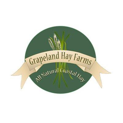
Image Source: ZillionDesigns
2. R. Fresh Farms
It’s a dairy farm logo and combines all the primary colors that designers usually go for when creating farm logos: green, white, and brown. The brown color symbolizes soil while the cow is featured in the negative space of white.
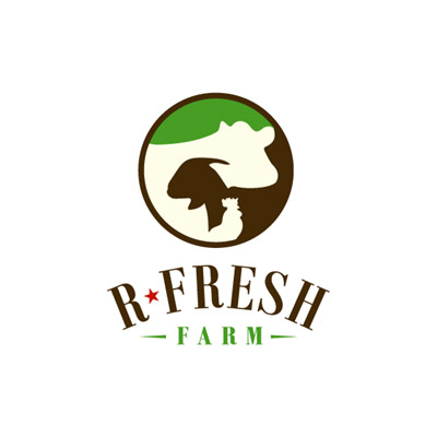
Image Source: ZillionDesigns
3. Mountain Meadows
Another dairy farm logo but here the designer has chosen to go with blue in the color palette too. The blue matches well with the color of the sky depicted in the logo and gives a fresh look to the whole design.
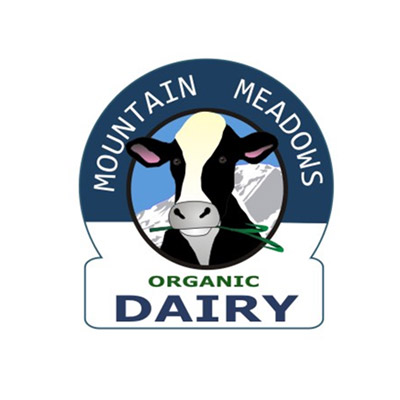
Image Source: ZillionDesigns
4. Great Escape Farm
In this logo, you can see the focus is on farm life. All the elements that we usually associate with farming and farm life have been featured here. Sun, soil, greenery, and cattle, all have been included in the design. It’s a good logo but would have been even perfect if the text could have been left alone without adding another cow in the letter ‘m’ of the ‘farm’. This makes the design look a bit forced.
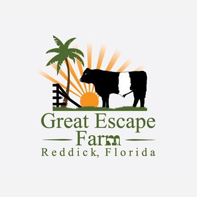
Image Source: ZillionDesigns
5. ALV Farms
It is a clean and simpler farm logo. Using gloss on the letters, a sense of freshness has been added to the design. The rising sun looks crisp and the leaves healthy and fresh.
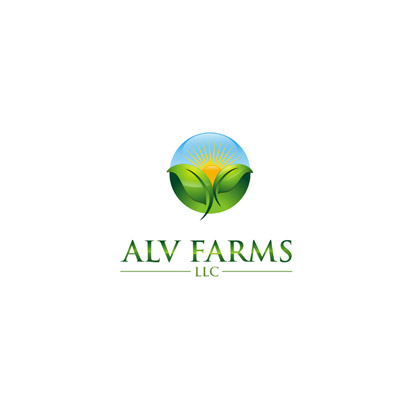
Image Source: ZillionDesigns
6. Serre Vineyard
It’s a line art logo, perfect for a vineyard visual. The color choice is smart. The flat green looks alive on the peach background and adds sophistication to the whole design.
7. Highland Farms
In the following logo design, the focus seems to be on the cow and her calf. And it’s fitting, too, as it’s a dairy produce logo. The inclusion of the animal on the logo hints at the freshness of the produce.
8. Righteous Farms
It is an imposing logo with a very direct feel to the whole design. It looks raw, rustic, and very realistic. Keeping the farm itself as the main focus of the design, the intent is to make the audience build a connection to the place.
9. Dutch Valley Farm
It is one of those farm logos that look like real farms. The textured and weather-beaten surface of the logo makes the design look highly authentic. The elements have been kept simpler and rustic.
10. Hidden Valley Farm
Another line art logo on the list. It bodes well with the rest of the design as the lines in the icon keep the icon simplified while the imposing typography rises as the main feature of the logo.
11. Happy Farm
It’s a cartoonish and child-like depiction of a farm logo concept. As a playful brand with a casual voice and a cheery disposition, this logo represents you perfectly. With this logo as your brand mascot, you won’t have trouble attracting schools to consider you a destination for school trips.
12. Sparta Farm
Another child-like depiction of farm logo but this time it’s a fish farm. The fins of the fish are designed to look like the crest of the Sparta helmet.
13. C & J Farm Honey
It’s a honey farm logo featuring the color and texture of honey. The background contains color and design details that are made to look like unprocessed honey in a jar. And don’t forget the honey dipper on the wind direction tool.
14. Readington Brewery & Hop Farm
The typography, colors, and iconography in this design make this logo look fancier and more posh than any other design on this list. If you run an exclusive farm that’s on invite-basis only, this is the logo you should choose as your brand ambassador.
15. Forest Hill Farm
Minimalist presentation of fir trees in this farm logo keeps the design unfussy and de-cluttered. The shade of the green used represents the forest feel adding a layer of meaning to the overall design.
16. The Better Farm
While designs usually opt for iconography in their farm logo designs, some artists forgo it in the favor of wordmark logos to make the design look more distinct. With no symbology to aid the design, careful selection of typography gives strong architecture to the logo.
17. DAK Farm
The single seed in line art design featured here keeps the design looking organic and effortless. The color choice, especially, looks phenomenal. The simple elegance of the design adds a layer of nuance in the concept.
18. Wholesome Meats
For this design, the focus is on grass and soil. The ‘w’ in the icon is crafted using the blades of the grass while layers of the earth have been depicted using multiple lines. The Sans Serif font increases the wholesomeness of the design and the neat layout makes the design and the brand look fresh.
19. Snake River Trailblazers Farm
This logo design takes a different approach to its brand identity and incorporates a well-known location into its brand name. If your business is also located in a well-known vicinity, try using that to your advantage in your branding too.
20. Avigan
This, here, is one of the most comprehensive design pieces on this list. The farm logo uses not only one but multiple animal icons to show off the variety of their cattle and farming. The yellow as the accent color highlights nicely against the muted green and adds a nice finish to the design.
To Conclude:
Feeling sufficiently inspired yet? We hope you do. By no means exhaustive, this is certainly a comprehensive guide to help you create a superb art brief for your farm logo design ideas. Following the trends and design approaches we have discussed here, we hope you feel equipped enough to create a unique farm logo identity that will resonate with your clients and their clients alike.
Organic Farm Logos
Agriculture Farm Logos
Animal Logos
Environmental Care Logos
Park Logos
Resort Logos

